Websites by industry11 / 12
Real estate agent websites that bring in sellers as well as buyers
For estate agents, agencies and brokers. A property site has to help a buyer find a place, and help an owner choose you to sell theirs. It should make searching easy, show each home at its best, and bring both kinds of enquiry to the right agent.
What goes on a real estate website
10 parts, top to bottom. Each one has a job in the sale, and each is shown on a real site that does it well. None of these sites is my work. Most are picked for how they look as well as what they say; the few picked only for what they say are marked.
Part 01 / 10
Your area, and two ways in
Two kinds of people arrive: someone looking for a home, and someone who owns one. The first screen names the area you know and gives each of them a door, a search for buyers and renters and a valuation for owners, side by side.
Where it goes wrongA big search box for buyers, and nothing for the owner who pays the fee.
Picked for the design and what it says
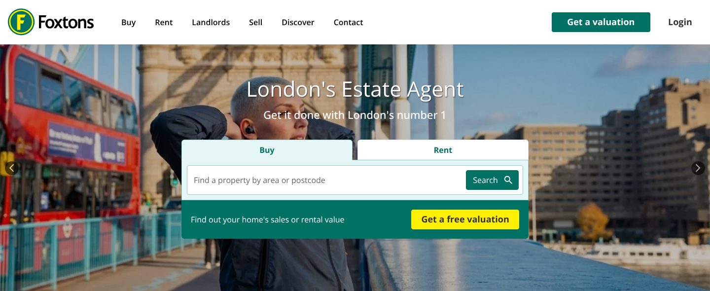
Example Foxtons. A first screen that names its city and puts the search and the valuation in one box.
- 1
The menu is sorted by who is visiting: Buy, Rent, Landlords, Sell.
- 2
The only filled button in the top bar is for owners: Get a valuation.
- 3
The headline names the place, London’s estate agent, and the line under it makes the claim: London’s number 1.
- 4
Buy and Rent as two tabs over one field: find a property by area or postcode.
- 5
The owner’s way in sits in the same box: find out your home’s sales or rental value, with a yellow button for a free valuation.
Part 02 / 10
A search that filters like a buyer thinks
Buyers look through an agent’s homes many times before they book a viewing. Filters in their words, price, location, type and bedrooms, and cards that show the photo, the place, the price and the tenure, let them narrow hundreds of homes down on your site rather than on a portal.
Where it goes wrongListings that open on a portal, or one long list with no filters.
Picked for the design and what it says
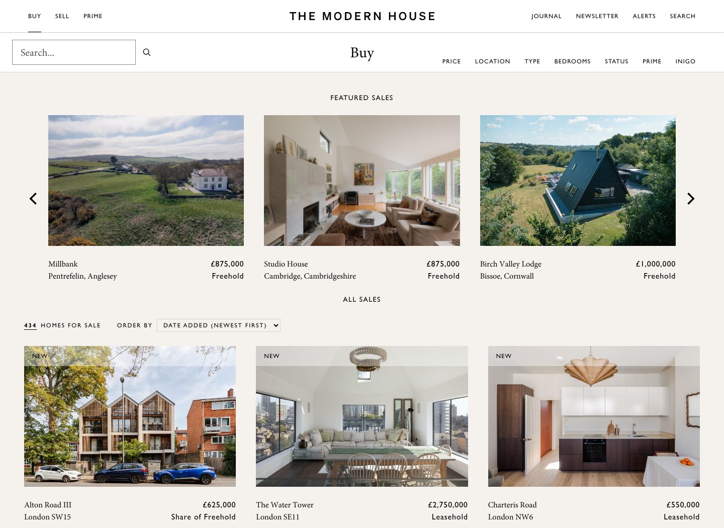
Example The Modern House. All 434 homes for sale, with five filters on one line and cards that say just enough.
- 1
A search box at top left, for the visitor who already knows what they want.
- 2
Filters in plain words on one line: price, location, type, bedrooms, status.
- 3
Featured homes first, each with a name, a place, a price and the tenure.
- 4
The count in plain sight, 434 homes for sale, and an order the buyer can change: newest first.
- 5
One large photo per home, a New label, and the facts a buyer scans: street, area, price, tenure.
Part 03 / 10
A property page that leads to a viewing
A buyer decides from the photos and a few facts whether a home is worth a viewing. The page opens on the home at its best, puts the price and the key facts beside it, and offers the next step right there: a viewing, the documents, or a call.
Where it goes wrongA gallery of dark phone photos, with the contact form at the very bottom.
Picked for the design and what it says
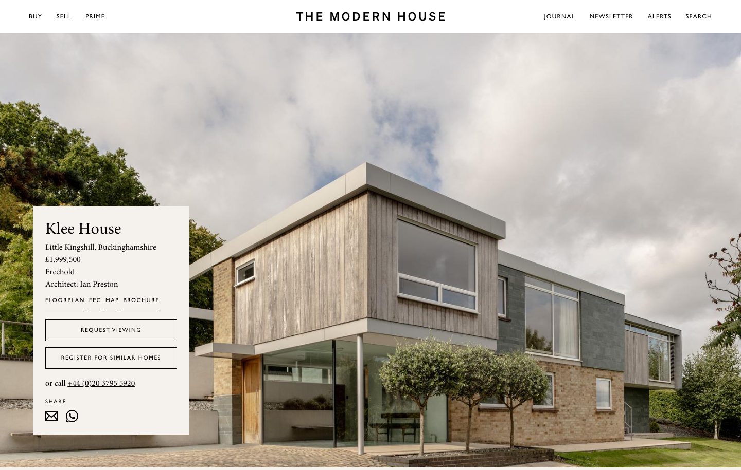
Example The Modern House. One large photo, the facts in a small card, and three ways to act on them.
- 1
The house fills the screen, shot whole and in daylight, before a word of description.
- 2
The facts in the order a buyer checks them: name, place, price, tenure, and, unusually, the architect.
- 3
Links to the floorplan, the map and the brochure sit right under the price.
- 4
Two next steps: request a viewing, or register for similar homes, for the buyer who likes the style but not this house.
- 5
And a phone number, for the buyer who would rather call.
Part 04 / 10
What you have sold
An owner choosing an agent wants to know one thing: will you sell my home, and for how much. A page of everything you have sold, searchable by area and with prices where you can show them, answers that with evidence rather than adjectives.
Where it goes wrong“Award-winning agents”, and not one sold home in sight.
Picked for the design and what it says
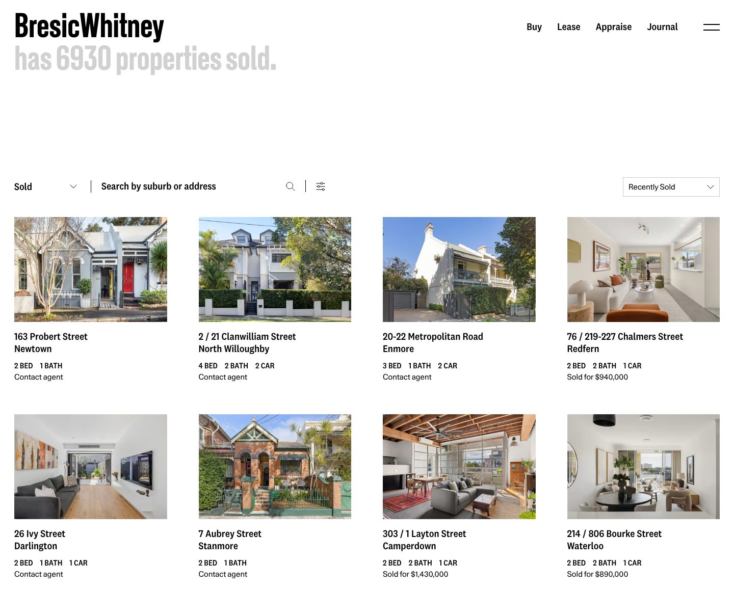
Example BresicWhitney. Every home sold, with the running total as the headline.
- 1
The headline is the track record: BresicWhitney has 6930 properties sold.
- 2
The same search as for homes on sale, by suburb or address, so an owner can look up sales on their own street.
- 3
Sorted by recently sold, so the newest results come first.
- 4
Some cards show the price achieved, sold for $940,000; the rest say contact agent.
Part 05 / 10
A valuation request for owners
Most owners start by asking what their home is worth, long before they decide to sell. A short request, the address first and then a name and a number, turns that question into a visit, and the agent who values a home is often the one who sells it.
Where it goes wrongA contact page with one general form, and no word about a valuation.
Picked for the design and what it says
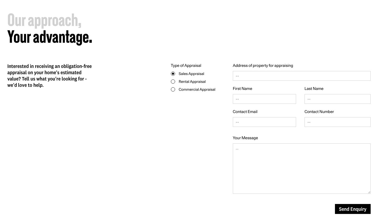
Example BresicWhitney. An obligation-free appraisal, asked for in a short form that starts with the address.
- 1
A heading about the owner’s gain: our approach, your advantage.
- 2
One line says what the owner gets, and that it binds them to nothing: an obligation-free appraisal of their home’s estimated value.
- 3
Three kinds of appraisal on one form: sales, rental and commercial.
- 4
The first field is the address of the property to be appraised.
- 5
Then a name, an email and a phone number, with a box for a message after them.
Part 06 / 10
Guides to the neighbourhoods
People choose an area before they choose a house. Guides to the neighbourhoods you cover, with real photos and a line on what each place is like, help newcomers decide, show owners you know their streets, and bring searches for the area to your site.
Where it goes wrongA list of postcodes you cover, and nothing about what it is like to live there.
Picked for the design and what it says
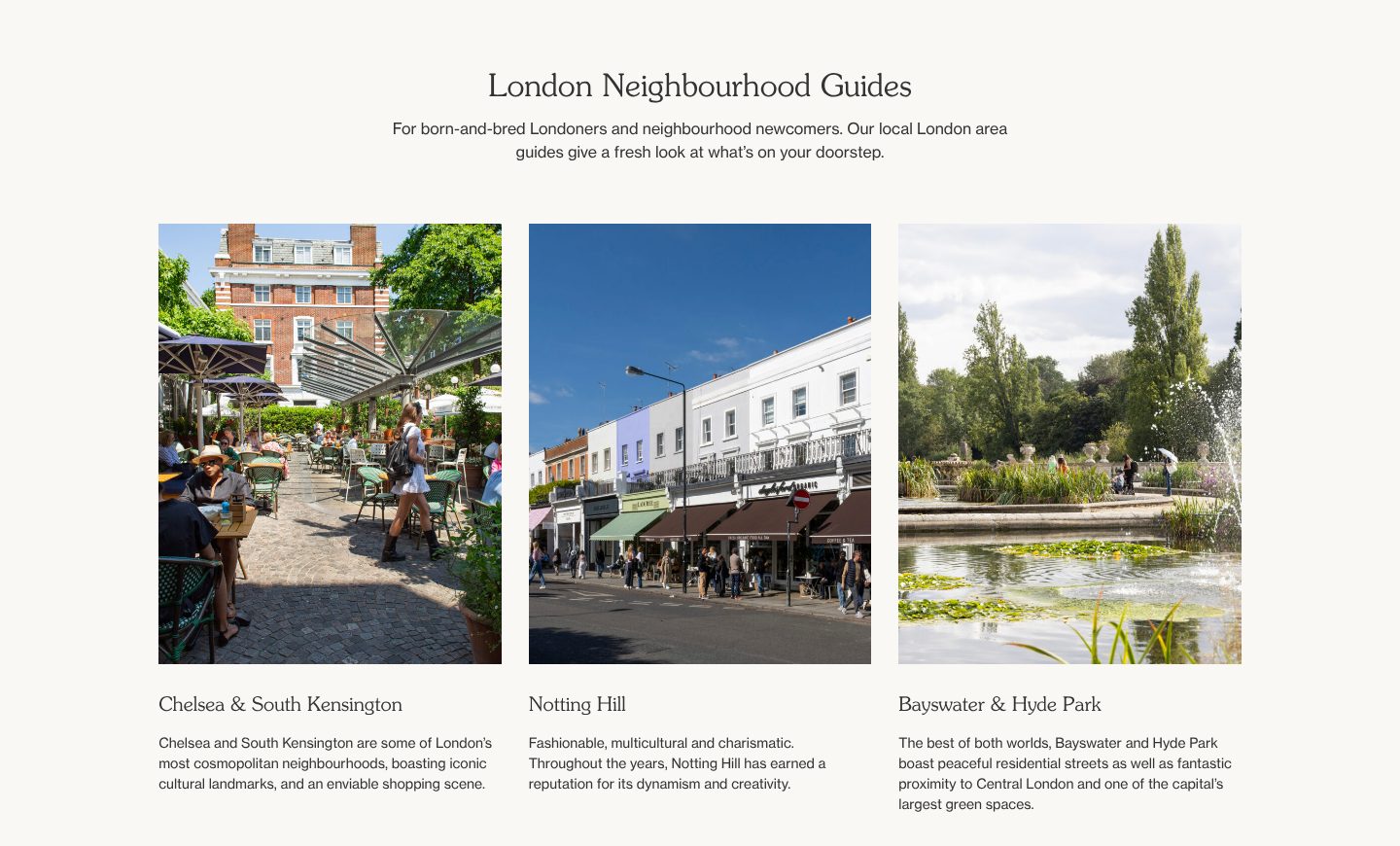
Example Domus Nova. London neighbourhoods, each with a street photo and one line on its character.
- 1
A heading, and a line on whom the guides are for: born-and-bred Londoners and neighbourhood newcomers.
- 2
Each area opens on a photo of its streets as people use them: tables outside a restaurant in Chelsea.
- 3
Under each name, one line on its character: Notting Hill, fashionable, multicultural and charismatic.
- 4
And what it offers: Bayswater and Hyde Park, peaceful streets close to central London and one of its largest green spaces.
Part 07 / 10
Agents with faces and numbers
An owner hands their biggest asset to a person, not a brand. A page with everyone in the team, photographed the same way, with a role and a direct number, lets them pick that person and call them without going through reception.
Where it goes wrongA group photo from the office party, and one switchboard number.
Picked for the design and what it says
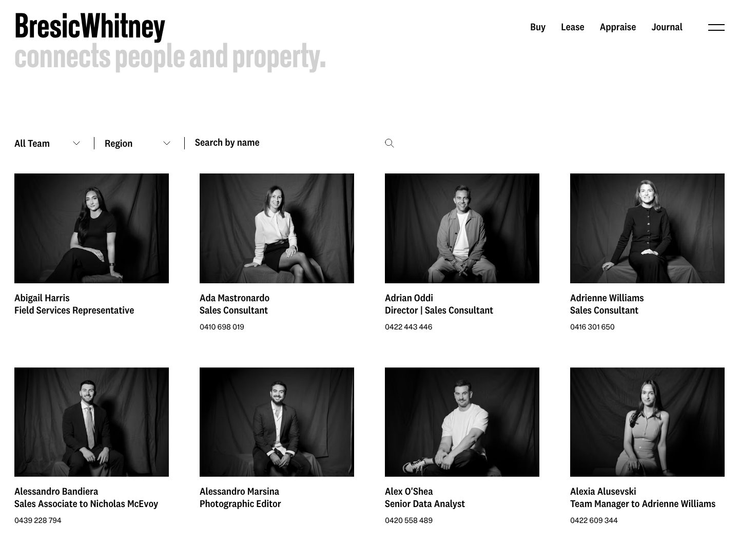
Example BresicWhitney. The whole team in one style of portrait, each with a role and a direct number.
- 1
The line under the name says what the team is for: connects people and property.
- 2
Filters by team and region, and a search by name.
- 3
Every portrait made the same way: black and white, the same backdrop, the same seat.
- 4
Each card gives a name, an exact role and a direct number: Adrian Oddi, Director and Sales Consultant.
- 5
Roles show who works with whom: Sales Associate to Nicholas McEvoy.
Part 08 / 10
Sellers and buyers, in their own words
An owner wants to hear from someone who sold through you, a buyer from someone who bought. Longer quotes signed with a name and with whether they sold or bought, beside a photo of the person, say what a star rating cannot: how it felt to work with you.
Where it goes wrongFive stars from “J.” with no word on whether they sold, bought or rented.
Picked for the design and what it says
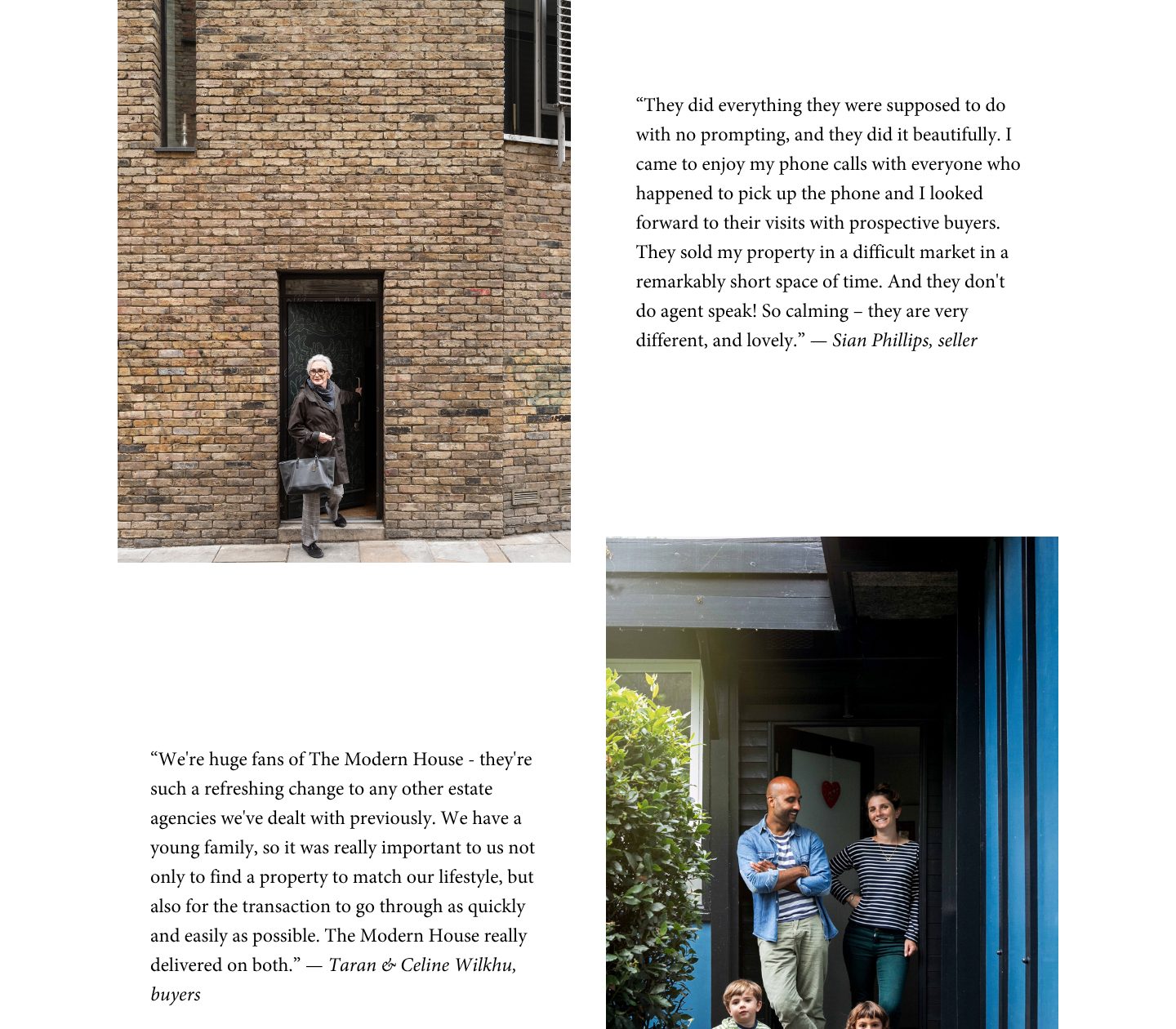
Example The Modern House. A seller and a family of buyers, each with a full quote, a name and a portrait.
- 1
A photo beside each quote, taken outside a home rather than in an office.
- 2
The seller says what the agent did, in her own words, and signs with her name and her role: they sold my property in a difficult market in a remarkably short space of time. Sian Phillips, seller.
- 3
A family photo next to the buyers’ quote.
- 4
Buyers get a voice too, on what mattered to them: a home to fit their lifestyle and a purchase that went through quickly. Signed Taran & Celine Wilkhu, buyers.
Part 09 / 10
Market reports with numbers
Owners watch prices for years before they sell. A short report on your market, dated, with the figures and a named author, shows you know where prices are heading, and a newsletter brings the reader back until they are ready.
Where it goes wrongA news page of “Just sold” posts, last updated two years ago.
Picked for the design and what it says
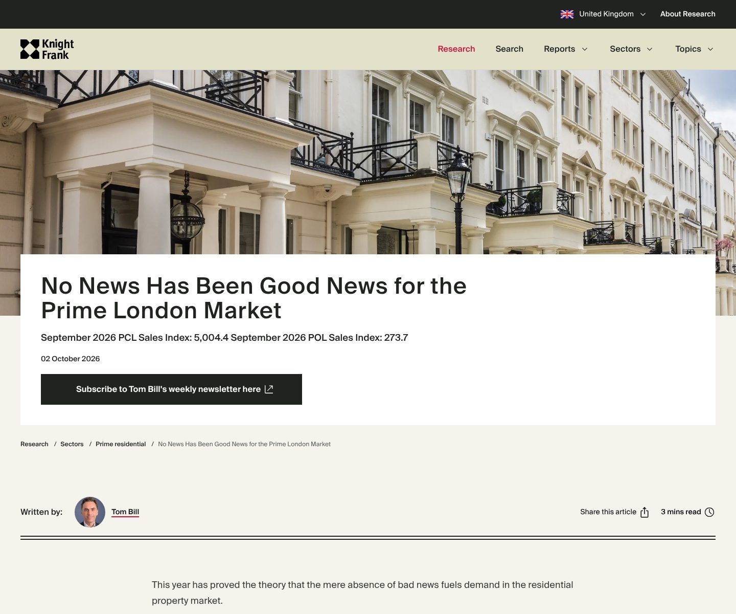
Example Knight Frank. A short market report with index figures under the headline, a date and a named author.
- 1
A headline with a view on the market, not a press release: no news has been good news for the prime London market.
- 2
The figures right under it, two sales index numbers for September 2026, and the date: 2 October 2026.
- 3
A weekly newsletter from the author, offered on the report itself.
- 4
A named author with a photo: Tom Bill. A view on prices is easier to trust from a person.
- 5
A read time, 3 minutes, so a busy owner knows what they are starting.
Part 10 / 10
Offices in the areas you serve
Owners prefer an agent who is round the corner, and buyers want to know whom to call about a street. Every office with its area’s name, an address and a direct number says where you are strong, and gets each call to the right desk.
Where it goes wrongOne head office address in the footer, and a contact form.
Picked for the design and what it says
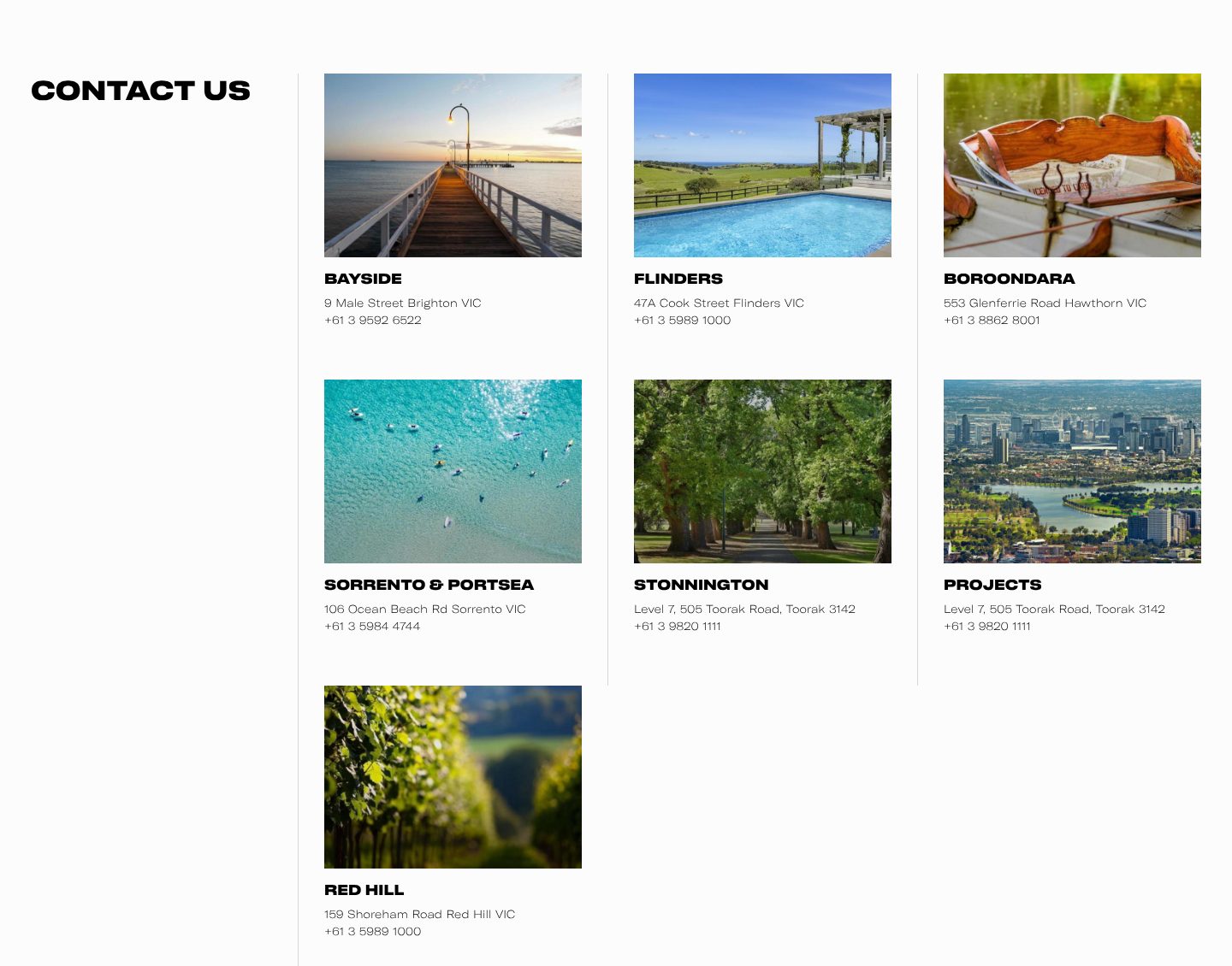
Example Kay & Burton. Seven offices, each named after its area, with a photo of the place, an address and a phone number.
- 1
A plain heading, Contact us, with every office beside it.
- 2
Each office shows its area rather than its shop window: a pier at sunset for Bayside.
- 3
Under it, the area’s name, a street address and a direct phone number.
- 4
Each place gets its own picture, such as swimmers in clear water for Sorrento & Portsea.
The examples belong to their owners and are shown to explain an idea; the numbered frames are mine. Screenshots taken on 6 October 2026; the sites may have changed since.
Ask this about your site
Can a buyer find a property, and an owner a reason to call you?
A quick way to judge the site you have. Most agency sites serve buyers and forget the owners, who are where the business starts.
- 01
Does your first screen name your area and give owners a way in, not only buyers?
- 02
Can a visitor filter listings by what matters to them?
- 03
Does each property have good photos, a plan and the key facts in one place?
- 04
Can an owner see what you have sold, and where?
- 05
Do enquiries reach the right agent, with the property attached?
What makes a real estate website sell
Lesson 01
Photos sell the viewing
A buyer decides in seconds whether to come and see. The first image does most of that work.
Lesson 02
Win the owner, not only the buyer
Buyers bring the traffic, owners bring the fee. Every page a buyer sees should also give an owner a reason, and a way, to ask for a valuation.
Lesson 03
Know the area better than the portals
Portals carry every agent’s homes. Your site wins on what they cannot show: neighbourhood guides, local market figures and the people who work those streets.
What a good real estate website gives you
01
Viewings booked from the page
A visitor who likes a property asks for a viewing in one step, and the agent gets the details.
02
Owners who choose you
Sold prices, local knowledge and a clear valuation offer, for the owner comparing three agencies.
03
Listings that stay current
Properties come from your own system, so nobody updates the site by hand.
What you get
An agency site that brings in valuations, and that your team can keep current.
Designed around how owners choose an agent and built in Webflow, so listings, sold homes, agents and area guides change without a developer. When the site needs more than Webflow gives, such as a live feed from your property software or a search on a map, I build it in code. A fixed price after a short brief.
The pages
A home page built on the parts above, search and property pages, sold, valuation, area guides, team, reports and offices.
Listings that stay current
Homes for sale and to let as CMS items, or fed from your property software, with filters for price, area, type and bedrooms.
Valuation requests
A short valuation form wherever owners look, sent to the right office or straight into your CRM.
Agents and offices
A profile for every agent and a page for every office, linked to the homes and the areas they cover.
Found in every area
Area and office pages with titles, descriptions and structured data for each place and each home, on pages fast enough for Google.
Help with the words
I shape the structure and edit your text, so it sounds like your agency and not like a portal.
How a real estate website should look and sound
Spacious, visual and precise.
These are rules of thumb. The site itself is built around your brand, your clients and your taste.
Photos do the selling
Large, well cropped and fast to load. The design should step back.
One style of portrait
Every agent photographed the same way, so the team reads as one agency.
Facts in the same place every time
Price, size, rooms, location. A buyer comparing ten listings should never have to hunt.
The words of the area
Street names, neighbourhoods and plain language, not “stunning” and “must view”.
Questions
How do I know whether our site brings in buyers and sellers?
Count viewing requests and valuation requests separately. Many agencies get the first and neglect the second.
Buyers find our homes on the portals. Why invest in our own site?
The portals show every agent’s homes side by side. Your site is where an owner compares you with the agent down the road before asking for a valuation, and where a buyer who likes your homes signs up for the next ones.
Can the listings come from our property software?
Yes. Most property software can send listings out as a feed, and the site can read it, so a home goes live on the site when you publish it there. If you list only a few homes, the team can add them in the CMS instead.
Can the site hold all our properties?
That depends on how many there are and on your Webflow plan. I check both before we start, and say so if another setup fits better.
Should we show what we have sold, and for how much?
Show what you have sold, with the area, wherever you can, and the price where the seller agrees. It is the proof owners look for first.
We cover several towns. Do we need a page for each?
For each area where you want more listings, yes. A page with the homes, the sold results, the office and the agents there gives Google a reason to show you in that area, and gives owners there a reason to call.
What it usually takes
New site or redesign
A new Webflow site, or a redesign of the one you have, designed and built by one person. Structure, copy, CMS and launch included.
Service
Integrations
Your Webflow site connected to the tools the company already runs on: forms into the CRM, analytics that measures the right things, and consent that holds tags back.
Service
CMS and SEO at scale
Collections and templates that generate a page for every city, service or product, each with its own text, metadata and structured data.
Service
Your site
Want me to look at your site?
Next
Beauty and wellness
12 / 12