Websites by purpose05 / 09
Launch websites that fill the waitlist
For founders and teams about to launch a product. A good launch site makes the product real before anyone can buy it, gives people a reason to sign up now, and says plainly when, how much, and what happens to their money.
What goes on a launch website
7 parts, top to bottom. Each one has a job in the sale, and each is shown on a real site that does it well. None of these sites is my work. Most are picked for how they look as well as what they say; the few picked only for what they say are marked.
Part 01 / 07
The product, the promise and one step
Before launch, the page has to make something people cannot buy yet feel real. Show it, say in one line what makes it different, and give one thing to do: join, reserve or preorder. A price or a date, even an approximate one, makes the promise believable.
Where it goes wrongA teaser with a logo, a countdown and no picture of the product.
Picked for the design and what it says
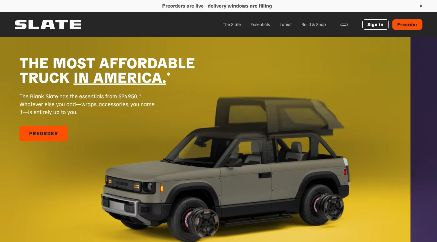
Example Slate. A first screen with the claim, the price, the product and one button.
- 1
A bar above everything carries the news and the urgency in one line: preorders are open and delivery windows are filling.
- 2
A claim nobody else can make: the most affordable truck in America. The category and the reason to care in six words.
- 3
The price is on the first screen before the product exists: from $24,950. Then the idea behind it, everything else is up to you.
- 4
One action in a strong colour: preorder. The same button waits in the menu, so it is never more than a glance away.
- 5
The product itself, large and specific, in a colour you could order. A render is enough before launch, as long as it shows the real thing.
Part 02 / 07
A reason to sign up now
People join a list when joining now is better than joining later. A small, countable reward for the first ones in turns “maybe later” into an email address today.
Where it goes wrong“Sign up for updates”, with nothing in it for the person signing up.
Picked for the design and what it says
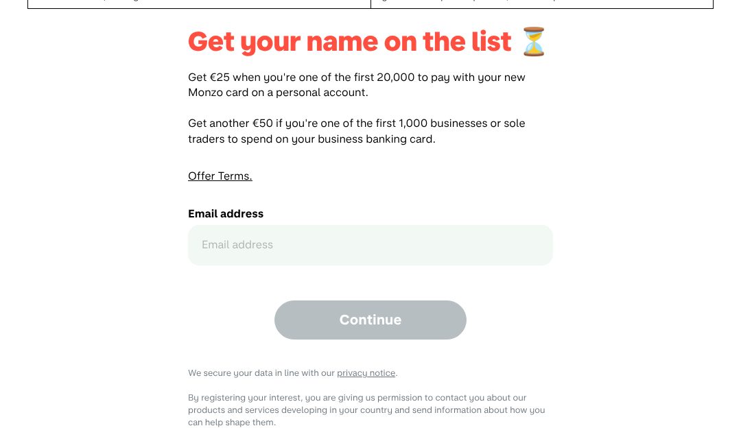
Example Monzo. A waitlist with a reward that has a number and a limit.
- 1
The ask in plain words, with an hourglass: get your name on the list. Time is part of the offer.
- 2
A reward with a number and a limit: €25 for the first 20,000 people. The limit is what makes waiting cost something.
- 3
A second reward for a second audience: €50 for the first 1,000 businesses. One list, two reasons to join.
- 4
The terms are one click away, right under the offer. A reward with its rules on show reads as real, not as bait.
- 5
One field, an email address. Nothing else is needed to hold a place in line.
Part 03 / 07
How it fits into their day
Before launch nobody can try the product, so the page walks them through using it. Steps that follow the user’s day, before, during and after, sell better than a list of features.
Where it goes wrongA grid of feature icons that never shows the product being used.
Picked for the design and what it says
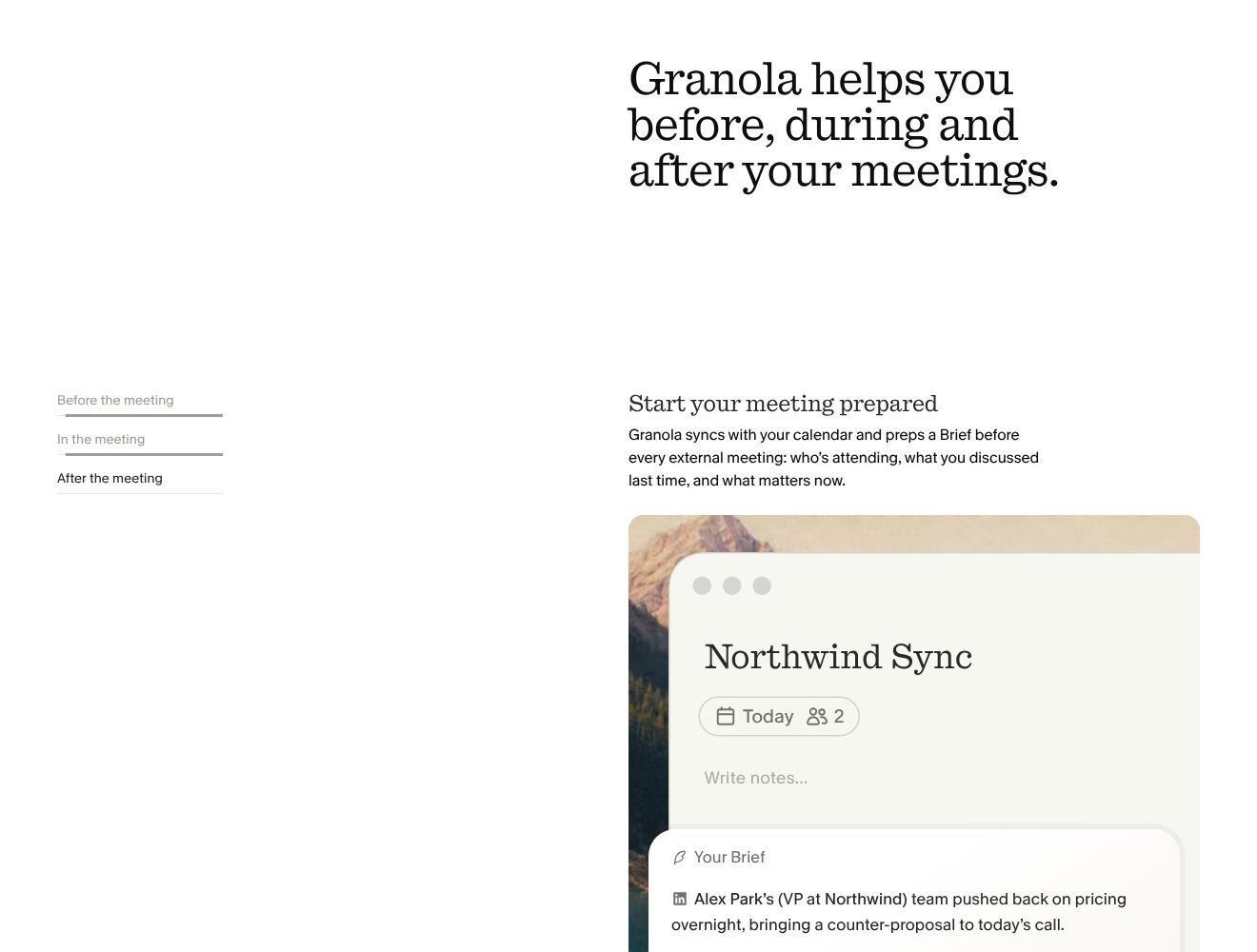
Example Granola. The product explained through one ordinary meeting, before, during and after.
- 1
The promise follows the user’s day, not the feature list: before, during and after your meetings.
- 2
Three tabs for three moments of the day. The reader moves through a meeting instead of reading specifications.
- 3
Each step has a plain heading and one sentence on what happens: it reads your calendar and prepares a brief before the meeting.
- 4
The product shown doing exactly that step: a real-looking note with the brief inside. Seeing it work is the closest thing to trying it.
- 5
Even the sample content is specific: a named VP, a push-back on pricing overnight. Details like these make the product feel used, not mocked up.
Part 04 / 07
Early users, with names
Before launch, the strongest proof is someone the reader respects who has already used it. A name, a role, a company and a face make the quote count.
Where it goes wrongAnonymous early-access quotes, or a sign-up counter nobody can check.
Picked for the design and what it says
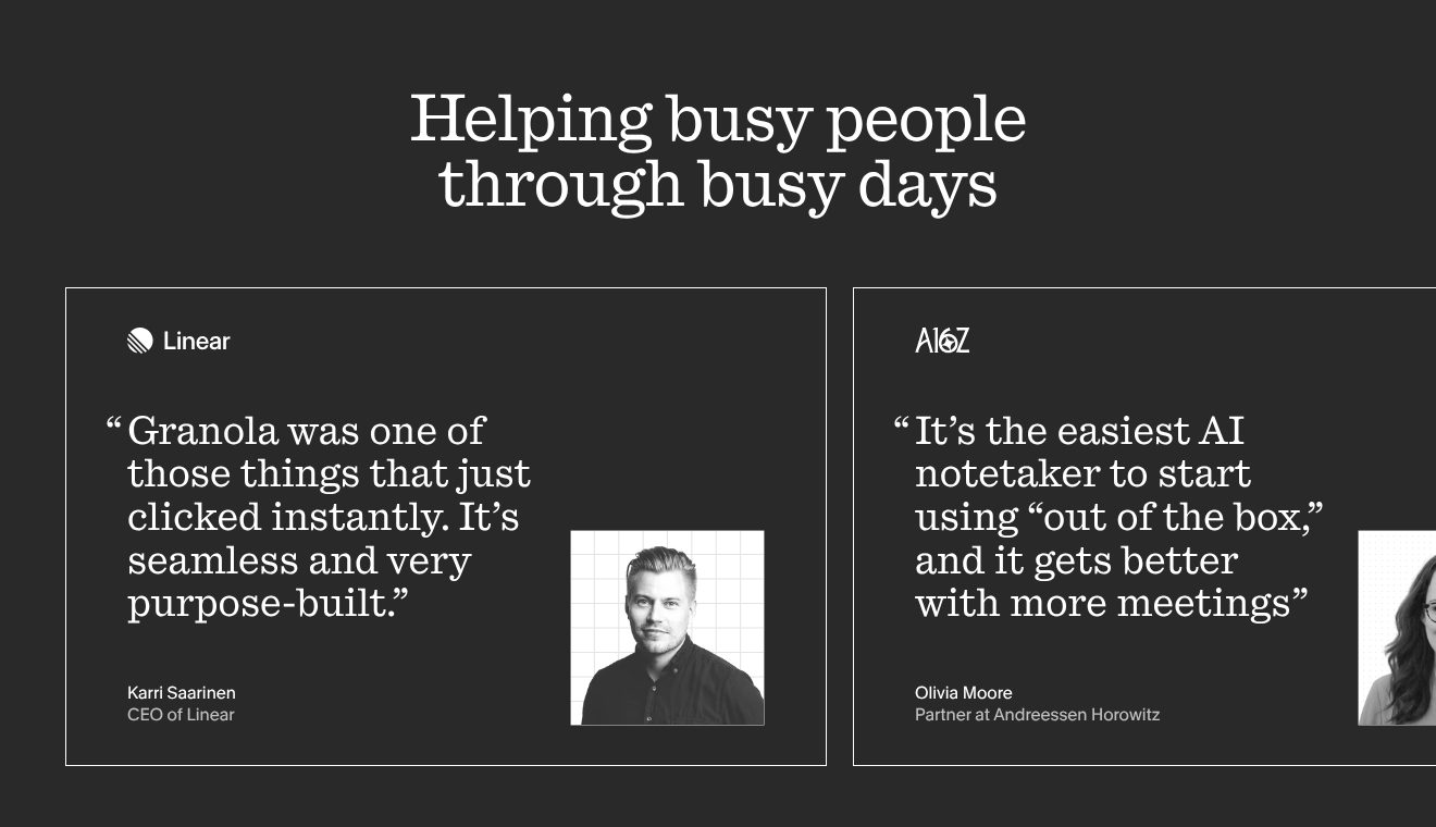
Example Granola. Two quotes from people the audience looks up to, each with a logo, a role and a face.
- 1
The heading is about the users, not the tool: busy people, busy days.
- 2
The company logo comes first, above the quote. A reader in tech knows Linear before reading a word.
- 3
A short quote about how it feels to use, “clicked instantly”, not a list of features.
- 4
A face and a title: the CEO of Linear. Proof from someone the reader would like to be.
- 5
The second quote comes from a partner at Andreessen Horowitz, from people who judge products for a living.
Part 05 / 07
Press before launch
A product nobody can buy yet borrows trust from people who have looked at it closely. The names of the outlets that covered it, set quietly, tell a visitor this is real and worth watching.
Where it goes wrong“As seen on” over logos of outlets that never wrote about you.
Picked for the design and what it says
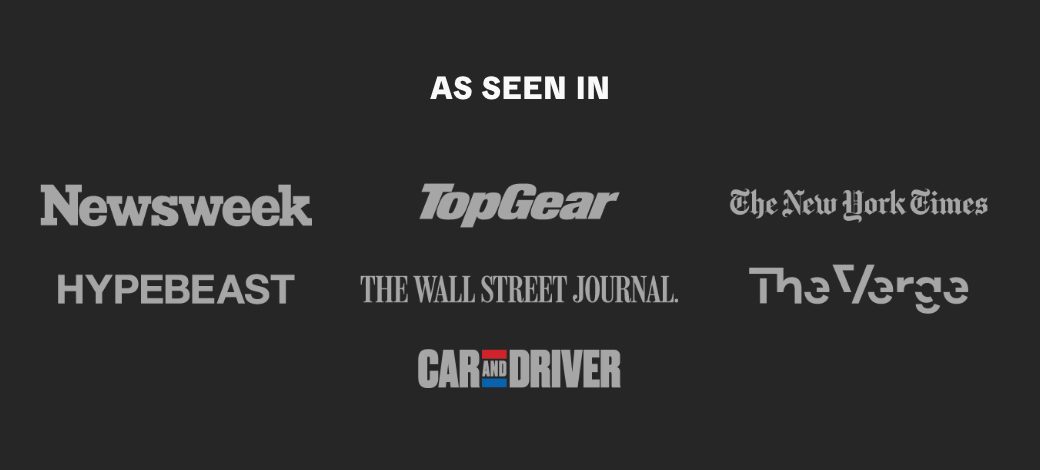
Example Slate. Seven outlets in one grey, chosen to cover specialists, news and culture.
- 1
Three plain words and no adjectives. The names do the talking.
- 2
Specialist press first: Top Gear, and Car and Driver below. For a truck, the opinion of people who test cars counts most.
- 3
Then general news, The New York Times and The Wall Street Journal. They tell a wider audience the launch is news, not an advert.
- 4
And culture, Hypebeast and The Verge. A cheap truck sold as something cool, and the press list says so too.
- 5
Every logo in the same grey, none louder than the others. The list reads as coverage, not as sponsorship.
Part 06 / 07
The questions about money and dates
Before people pay for something that does not exist yet, they need to know exactly what happens to their money. Say what each step costs, what is refundable and what is not, and when they will get it.
Where it goes wrongA deposit with the refund rules hidden in the terms.
Picked for the design and what it says
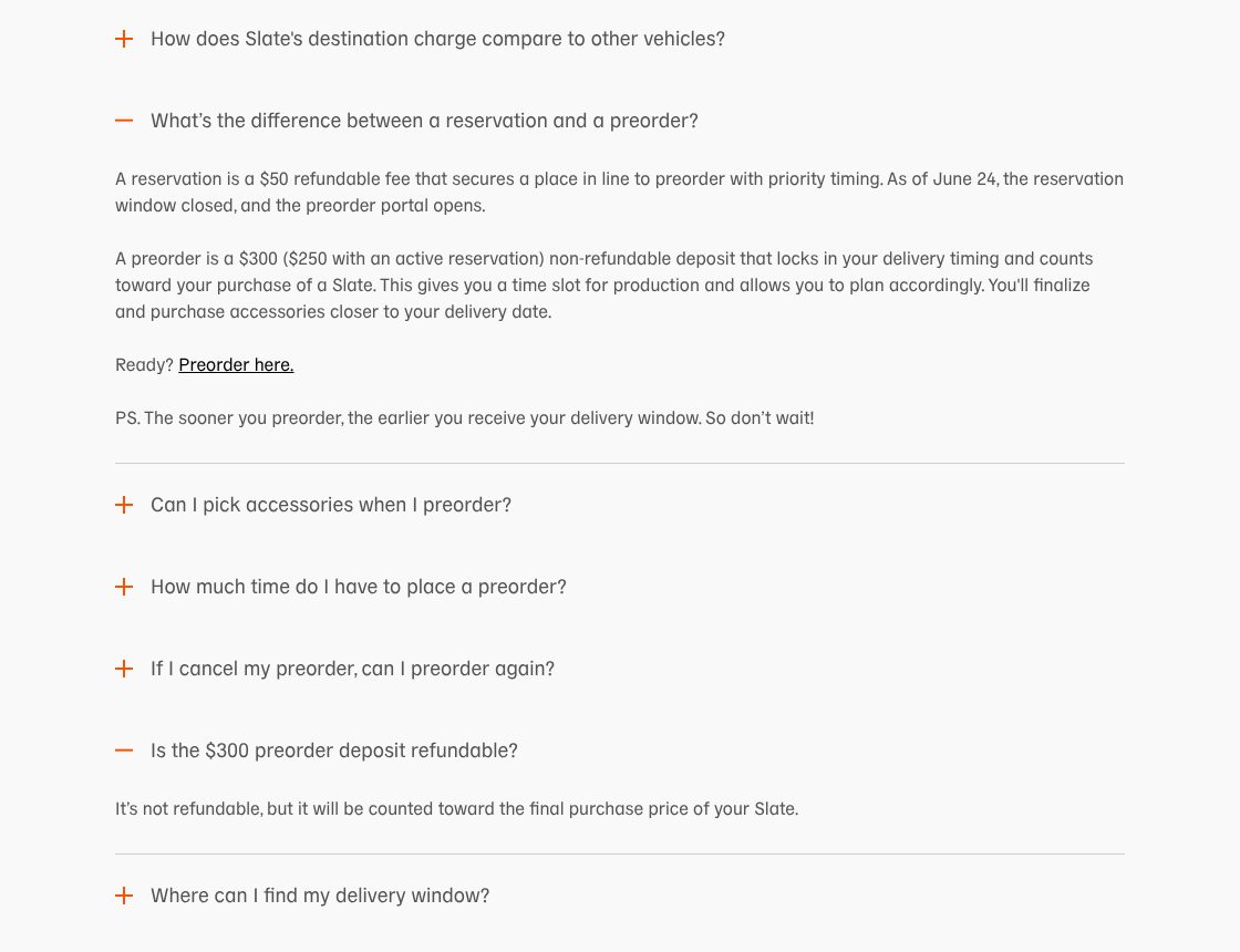
Example Slate. An FAQ that answers the money questions in plain numbers, including the unwelcome answer.
- 1
The question every early buyer asks, in their words: what is the difference between a reservation and a preorder.
- 2
Each step has its price and its rule: a reservation is a $50 fee to hold a place, and it is refundable.
- 3
The next step costs $300, is not refundable and counts toward the price. Saying plainly what is not refundable is what makes the rest believable.
- 4
A gentle push at the end: the sooner you preorder, the earlier your delivery window. Urgency stated as a fact, not a countdown.
- 5
The hardest question gets its own line and a straight answer: not refundable, but counted toward the final price.
Part 07 / 07
For those not ready yet
Most visitors will not reserve today. A sign-up for news keeps them close until launch day, when the same people are the first to buy.
Where it goes wrongA launch site with one button and nothing for people who are only curious.
Picked for the design and what it says
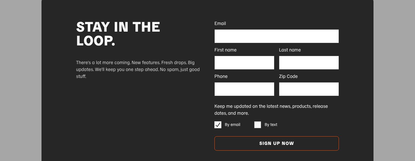
Example Slate. A sign-up for the curious, with the channel left to the visitor.
- 1
Plain and friendly: stay in the loop. No pressure to buy, only to stay close.
- 2
What they will get, in short sentences: features, drops, updates, and no spam.
- 3
Email comes first, alone on its line. It is the field that matters.
- 4
Name, phone and zip code as well. Every extra field costs sign-ups, so ask only for what you will use, as a carmaker with regional deliveries does.
- 5
The visitor chooses how to hear from them: by email, by text, or both.
The examples belong to their owners and are shown to explain an idea; the numbered frames are mine. Screenshots taken on 6 October 2026; the sites may have changed since.
Ask this about your site
Would someone sign up before they can try it?
A launch site has to make a product feel real before anyone can touch it. These questions show whether yours does.
- 01
Does your first screen show the product, not only the logo?
- 02
Is there a reason to sign up today rather than next month?
- 03
Can a visitor see how they would use it on an ordinary day?
- 04
Is there at least an approximate date and price?
- 05
Is it clear what happens to a deposit, and whether it comes back?
What makes a launch website sell
Lesson 01
Make it real before it exists
Show the product, name a date and a price, even approximate ones. People sign up for things they can picture, not for teasers.
Lesson 02
Give a reason to join now
A small reward for the first ones in, or an earlier delivery, turns curiosity into an email address today.
Lesson 03
Be plain about money
Say what is refundable and what is not, on the page itself. Early buyers are taking a risk; clear rules are what make them take it.
What you get
A launch site that fills the list, and grows with the launch.
Designed around your product and built in Webflow, so new dates, updates and press go live without a developer. When the launch needs more than Webflow gives, such as a waitlist with places and referrals, I build it in code. A fixed price after a short brief.
The pages
A launch page built on the parts above, an FAQ, and a thank-you page that says what comes next.
Sign-ups that go somewhere
Forms connected to your email tool, such as Kit, Mailchimp or Loops, or to a waitlist tool with queue positions and referral links.
Preorders and deposits
Buttons connected to your checkout, such as Stripe, with the deposit and refund rules written beside them.
Updates you can post
News and press as CMS items, so the page keeps moving between the announcement and the launch.
Fast and easy to share
Light pages that load quickly on a phone, with titles and previews that look right when people share the link.
Help with the words
I shape the structure and edit your text, so the promise stays short and clear.
How a launch website should look and sound
Bold, specific and about the product.
These are rules of thumb. The site itself is built around your brand, your clients and your taste.
The product, large
Real renders, screens or prototypes on the first screen. If it is not built yet, show the closest honest picture.
One colour for action
The sign-up or preorder button in one strong colour, used for nothing else.
Numbers in plain sight
Price, date and rewards set large enough to find without reading.
Calm urgency
Real limits and real dates instead of countdowns that reset.
Questions
We are months from launch. Is it too early for a site?
No. The months before launch are when the list is built. A simple page with the product, a date and a sign-up starts collecting the people who will buy on day one.
Should we take deposits or just emails?
Emails are the smaller step and fill the list faster; a deposit shows who is serious. Many launches start with emails and open preorders later, and the site can grow with that.
Can people move up the list by inviting friends?
Yes, with a waitlist tool connected to the form. Say plainly what moving up gives them, and what it does not.
Can we change the date or the price ourselves?
Yes. Dates, prices and updates are content you can edit, so a change is filling in a form.
What happens to the site after launch?
It becomes the product site. The product view, the proof and the questions stay; the sign-up turns into buy or download.
What it usually takes
New pages and CMS templates
Landing pages, subpages and CMS templates, built from your Figma file or extended from what the site already has.
Service
Integrations
Your Webflow site connected to the tools the company already runs on: forms into the CRM, analytics that measures the right things, and consent that holds tags back.
Service
New site or redesign
A new Webflow site, or a redesign of the one you have, designed and built by one person. Structure, copy, CMS and launch included.
Service
Your site
Want me to look at your site?
Next
Mobile app website
06 / 09