Websites by purpose06 / 09
Mobile app websites that turn visitors into downloads
For teams with an iOS or Android app, from a first release to a growing product. A good app site shows the app at work, lets others vouch for it, says what it costs and puts the download one tap or one scan away.
What goes on an app website
10 parts, top to bottom. Each one has a job in the sale, and each is shown on a real site that does it well. None of these sites is my work. Most are picked for how they look as well as what they say; the few picked only for what they say are marked.
Part 01 / 10
The promise, with the app in hand
Most visitors give an app site a few seconds. The first screen says what the app does for them in one line, shows it running on a real phone, and gives one line of proof, such as an award or a rating, next to the way to get it.
Where it goes wrongA clever slogan that never says what the app does, beside a phone with nothing real on it.
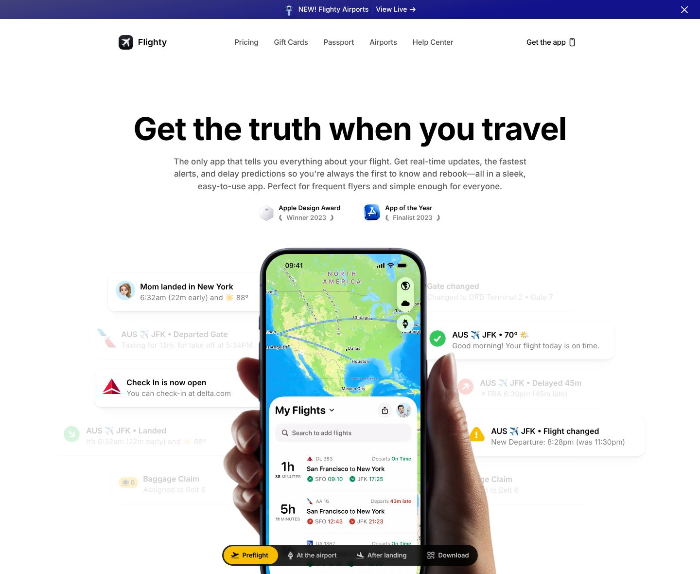
Picked for the design and what it says
Example Flighty. A six-word promise, two awards from Apple, and the app in a hand with its alerts around it.
- 1
A promise in six words, about the trip rather than the app: get the truth when you travel.
- 2
One sentence on what that means: real-time updates, the fastest alerts and delay predictions, so you are the first to know and rebook.
- 3
Proof right under it, with the year: an Apple Design Award winner and an App of the Year finalist, both 2023.
- 4
Around the phone float the alerts it sends on a trip: mom landed in New York, check in is now open, flight changed.
- 5
Four tabs under the phone follow a trip from start to end: preflight, at the airport, after landing, and download.
Part 02 / 10
The app at work
People install what they can already picture using. A demo on the page, a short screen recording or screens that change as you click show what using the app is like faster than any list of features.
Where it goes wrongGlossy renders of a phone at an angle that never show what the app does.
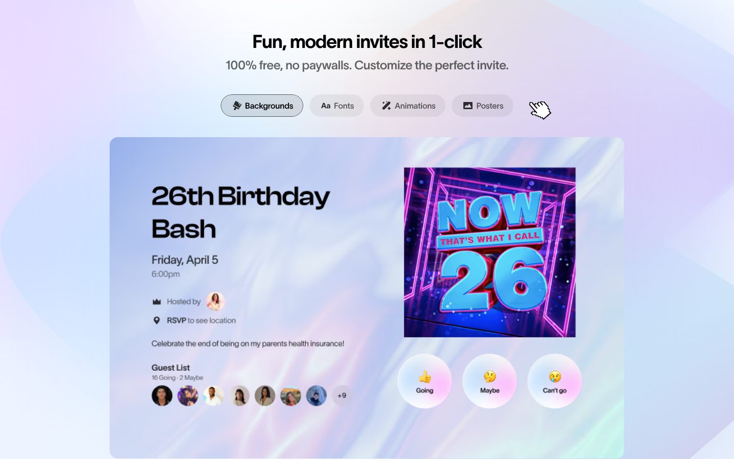
Picked for the design and what it says
Example Partiful. The invite the app makes, full size on the page, with tabs for what a host can change.
- 1
A heading on what the app makes, and a line that settles the price at once: 100% free, no paywalls.
- 2
Four tabs name what a host can change, backgrounds, fonts, animations and posters, with a hand cursor beside them that asks for a click.
- 3
The invite itself, full size, as a guest would see it: a title, a date, the host, a line of fun and the guest list.
- 4
The guest’s side is on the page too: three big buttons, Going, Maybe and Can’t go.
Part 03 / 10
Features shown as real screens
A feature is easier to believe when you can see it. Each one gets a short name, one sentence on what it does for the user, and the real screen from the app with real numbers on it.
Where it goes wrongA grid of icons with words like “powerful” and “smart”, and not one screen.
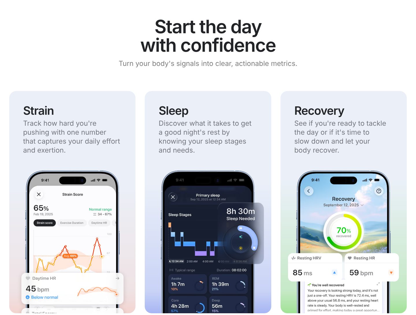
Picked for the design and what it says
Example Bevel. Three features, each with a one-word name, one sentence and the screen that shows it.
- 1
A heading about the user’s morning, start the day with confidence, and a line on what the app does: turn your body’s signals into clear, actionable metrics.
- 2
Three features, each with a one-word name and one sentence in plain words: strain, sleep and recovery.
- 3
Under each, the real screen from the app with real numbers on it: a strain score of 65%, 70% recovered.
- 4
The key number is lifted off the screen, so it reads at a glance: 8h 30m of sleep needed.
Part 04 / 10
Who it is for
A visitor needs to see their own reason to download: their kind of event, their routine, their job. Showing the range of uses through examples, rather than a list, lets each of them find theirs.
Where it goes wrong“For everyone”, which reads as for no one in particular.
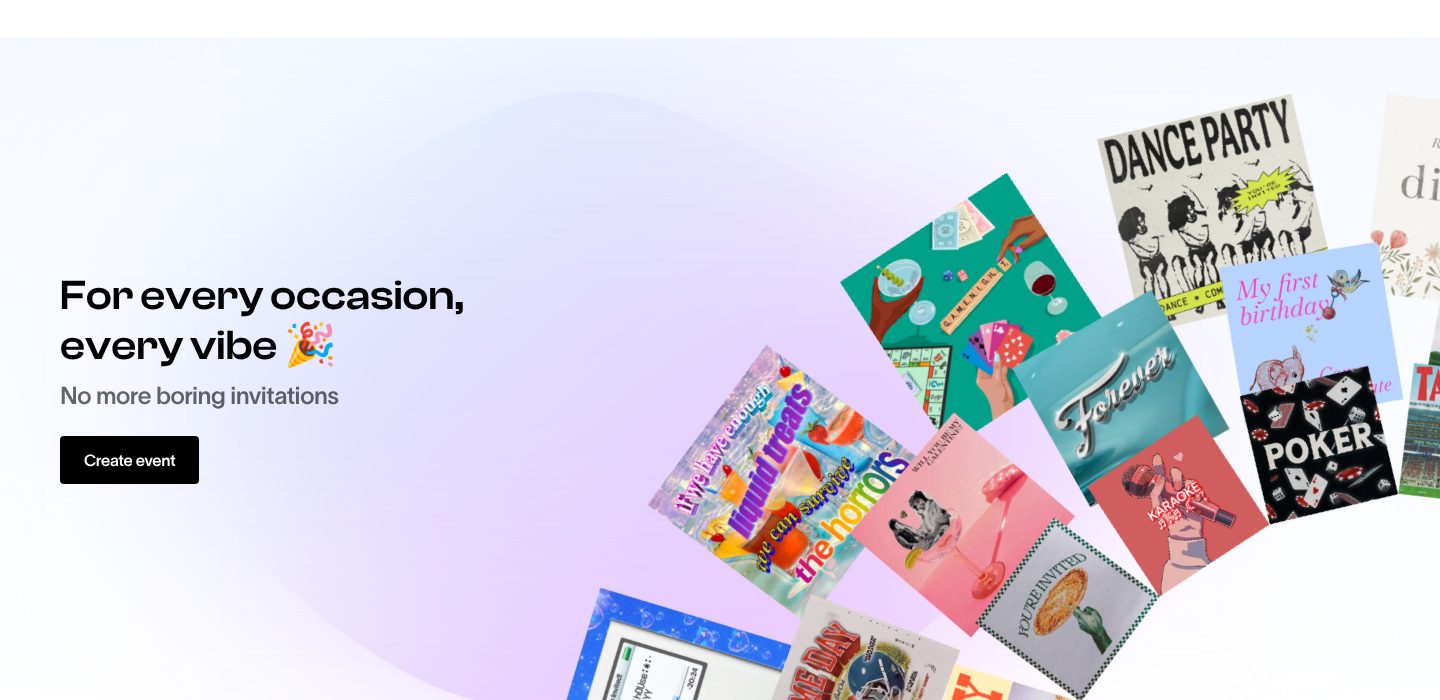
Picked for the design and what it says
Example Partiful. A heading for every kind of host, and a fan of real invites that shows the occasions.
- 1
A heading for every kind of host at once: for every occasion, every vibe.
- 2
One line on what it replaces, boring invitations, and one button to begin: create event.
- 3
A fan of real invites shows the occasions instead of listing them: a dance party, a game night, a first birthday, karaoke, poker.
Part 05 / 10
Awards and press
An app store holds millions of apps, and an award or a story in a known title is the quickest way to stand out. Name each award with its year and category, and show the press by their logos, close to the promise.
Where it goes wrong“Award-winning app”, with no award named.
Picked for the design and what it says
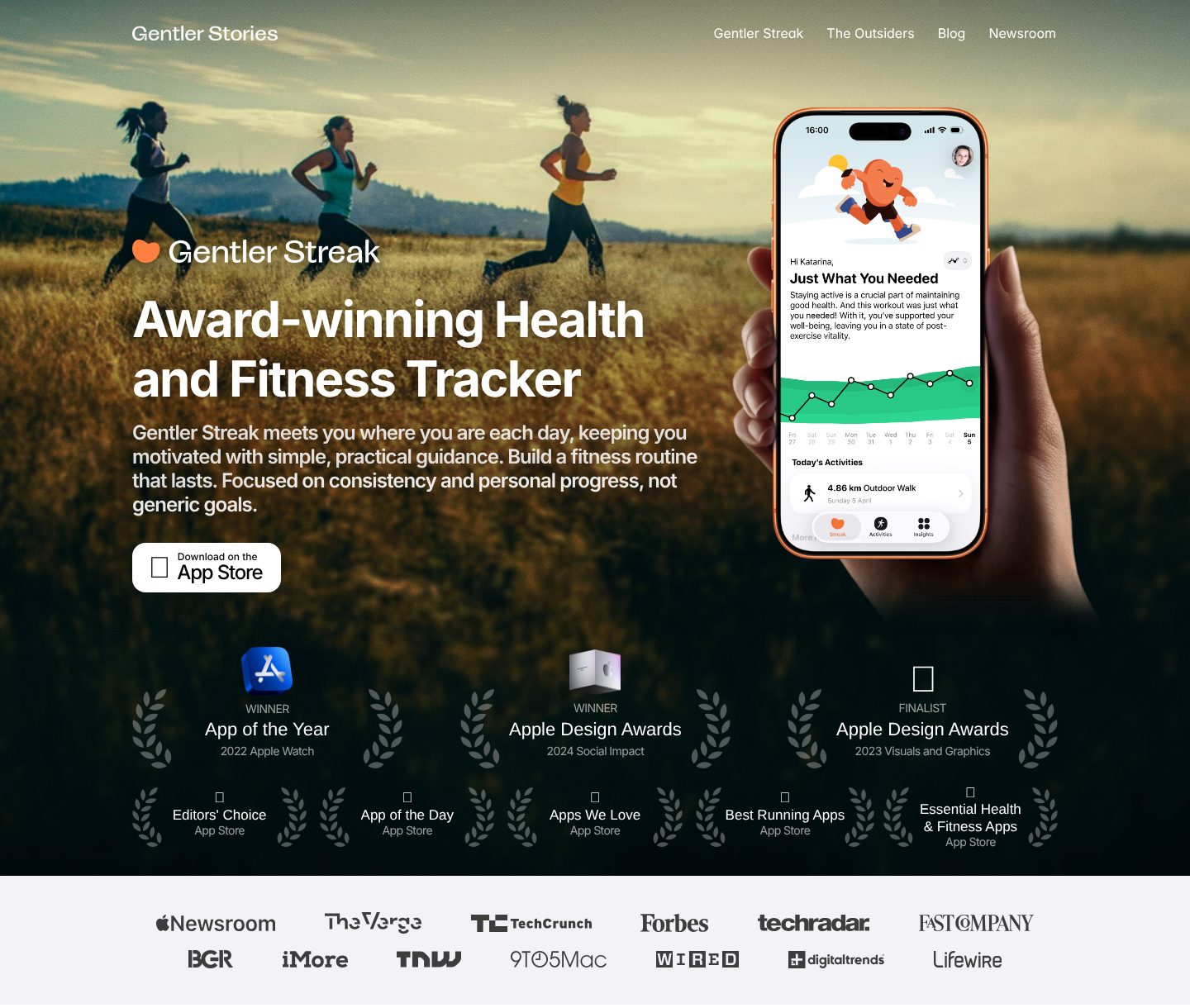
Example Gentler Streak. A headline that claims the awards, and the proof right under it: three Apple awards, five App Store picks and a row of press.
- 1
The headline carries the proof in one word: an award-winning health and fitness tracker.
- 2
Three big awards, each with its year and category: App of the Year 2022 for Apple Watch, an Apple Design Award for Social Impact in 2024, a finalist for Visuals and Graphics in 2023.
- 3
Smaller App Store picks in a second row: Editors’ Choice, App of the Day, Apps We Love, Best Running Apps.
- 4
Then the press, as a row of names a reader knows: Apple Newsroom, The Verge, TechCrunch, Forbes, Wired.
Part 06 / 10
Reviews from real users
Before installing, people check what other users say. Reviews with names, faces, dates and stars, from the App Store and from social posts, read as real, and the best ones answer a new user’s doubts, such as whether the app is worth paying for.
Where it goes wrongThree short quotes with first names only and no source.
Picked for the design and what it says
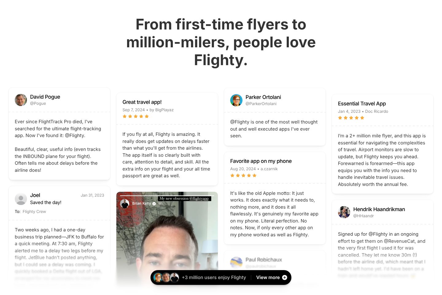
Example Flighty. A wall of App Store reviews and posts with names, faces and dates, and the number of users under it.
- 1
A heading that names the range of people who love it: from first-time flyers to million-milers.
- 2
Posts from people with a name and a face, the first from David Pogue: now I’ve found it, @Flighty.
- 3
App Store reviews sit beside the posts, each with a title, a date, a name and five stars: great travel app.
- 4
A review that answers the doubt about price: a 2+ million mile flyer calls the app absolutely worth the annual fee.
- 5
Under the wall, the scale in one line: +3 million users enjoy Flighty, with a link to view more.
Part 07 / 10
Free, and what you pay for
The first question about any app is whether it costs money. Say what is free, what the paid plan costs a month and a year, and how to try it first, so the price never comes as a surprise in the app.
Where it goes wrong“Free” on the site, and a paywall on the second screen of the app.
Picked for the design and what it says
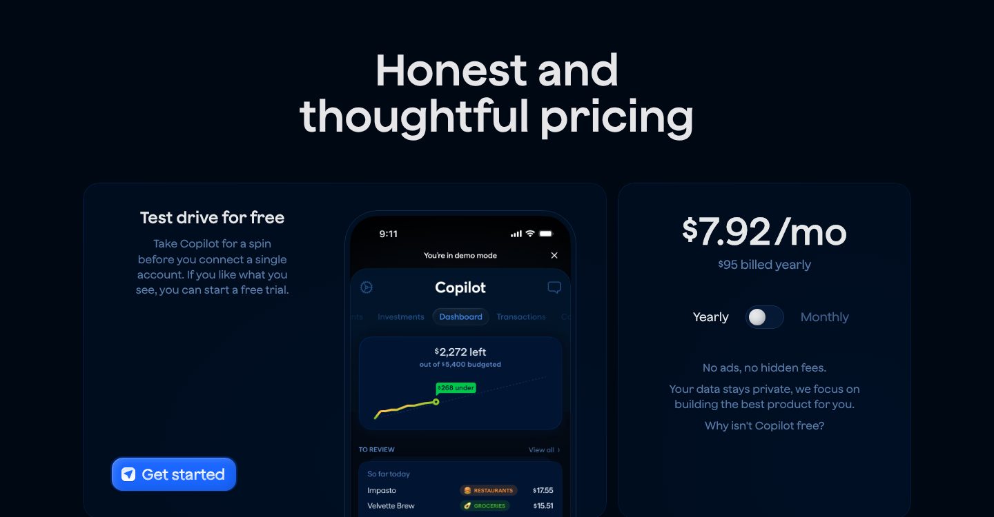
Example Copilot Money. A free test drive on one side, one clear price on the other, and an answer to why the app is not free.
- 1
A heading that sets the tone before any number: honest and thoughtful pricing.
- 2
The free way in comes first: take the app for a spin before you connect a single account, then start a free trial.
- 3
A real screen in demo mode, so the test drive is shown, not only promised.
- 4
One price a month, with the yearly total under it and a switch to monthly: $7.92 a month, $95 billed yearly.
- 5
Then the answer to the doubt behind any paid app: no ads, no hidden fees, and a line that asks why it isn’t free.
Part 08 / 10
What is new
Users, reviewers and the press want to see an app that keeps getting better. A changelog with a headline for each release, the version, the date and a few plain lines per change shows the work, and gives people a reason to come back.
Where it goes wrong“Bug fixes and performance improvements”, release after release.
Picked for the design and what it says
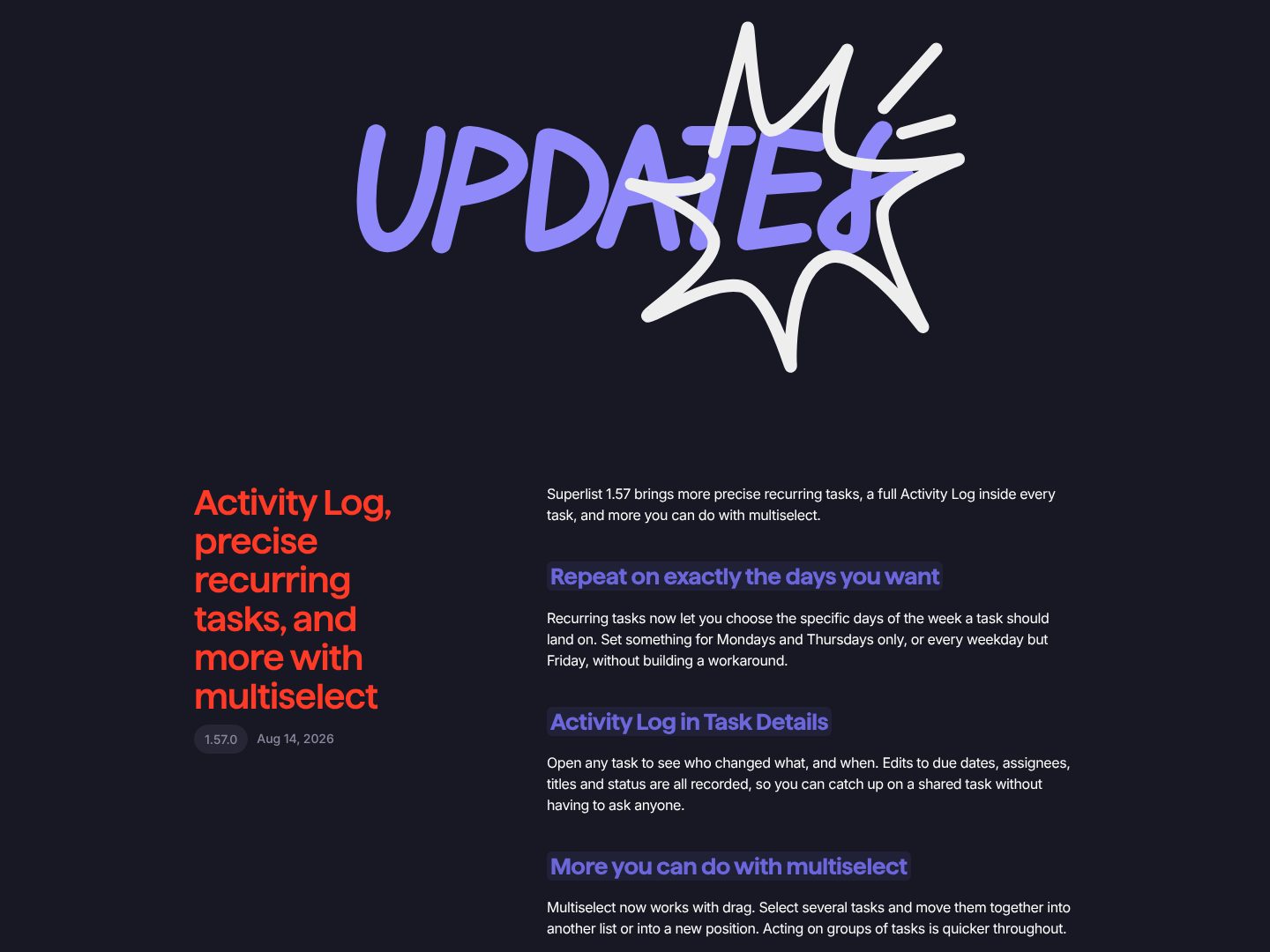
Example Superlist. Each release with a plain headline, a version, a date and a short note per change.
- 1
A page of its own for what is new, with its title set in playful hand lettering.
- 2
Each release has a headline in plain words, then the version number and the date: 1.57.0, 14 August 2026.
- 3
One sentence sums up the release before the details.
- 4
Every change gets a short heading and a few lines on what it means for the user: repeat on exactly the days you want.
Part 09 / 10
Help, before the support email
Most questions about an app are the same few: it does not work, how do I do this, how do I cancel. A help page with search and the common questions first answers them at once, and keeps a stuck user from leaving a bad review.
Where it goes wrongA support email address, and nothing else.
Picked for the design and what it says
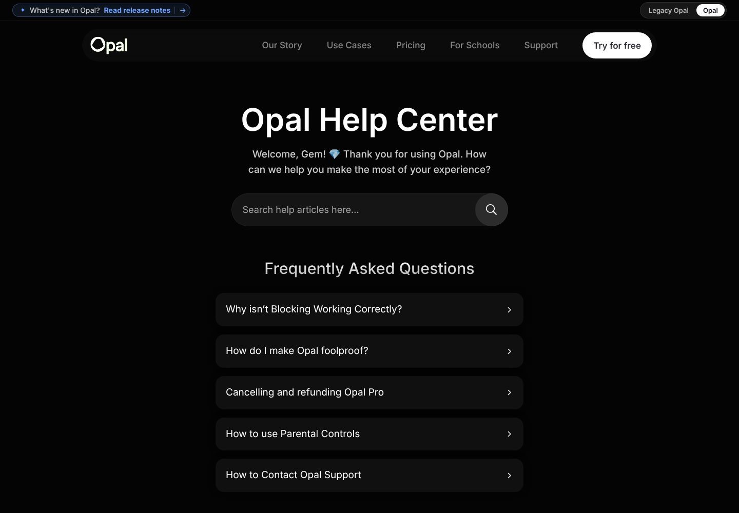
Example Opal. A help centre with search and five common questions first, cancelling and refunds among them.
- 1
Even the help page points to what has changed: what’s new in Opal, read release notes.
- 2
A welcome for people who already use the app, and a search box for their question.
- 3
Five common questions first, in the user’s words: why isn’t blocking working correctly, how do I make Opal foolproof.
- 4
The question about money is answered in the open: cancelling and refunding Opal Pro.
- 5
And a way to reach a person: how to contact Opal support.
Part 10 / 10
From any screen to the phone
Many people first hear of an app while on a laptop, where they cannot install it. A QR code to scan with the phone, or a way to send the link to it, takes them from the desk to the download without a search in the store.
Where it goes wrongStore badges only, so a desktop visitor has to look the app up again on the phone.
Picked for the design and what it says
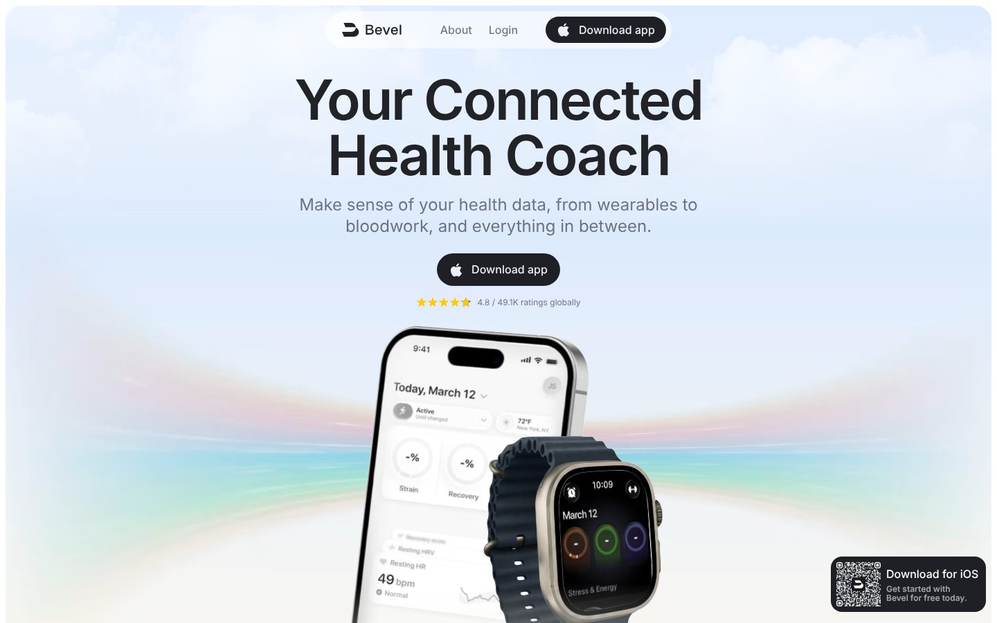
Example Bevel. A download button and a rating under the promise, and a QR code in the corner for visitors on a laptop.
- 1
Download app stays in the top bar, dark, set apart from the two other links.
- 2
One download button under the promise, with the Apple logo on it.
- 3
The rating right under it, with the count: 4.8 from 49.1K ratings globally.
- 4
For the visitor on a laptop, a QR code in the corner to scan with the phone: download for iOS, get started with Bevel for free today.
The examples belong to their owners and are shown to explain an idea; the numbered frames are mine. Screenshots taken on 6 October 2026; the sites may have changed since.
Ask this about your site
Would a visitor download your app after one visit?
People decide about an app in seconds, often on a laptop when they first hear of it, and then compare it with others in the store. These questions show whether your site gets them to the download.
- 01
Does your first screen say what the app does, and show it on a phone?
- 02
Can a visitor see the real screens, or the app at work, before installing?
- 03
Are your awards, ratings and reviews named, with where they come from?
- 04
Is it clear what is free and what the paid plan costs?
- 05
Can someone on a laptop get the app onto their phone in one step?
What makes an app website sell
Lesson 01
Show, then tell
An app is easier to show than to describe. Real screens, the app at work and real numbers do more of the selling than any headline.
Lesson 02
Let others vouch for it
Awards, ratings and reviews from named users say what your own words cannot. Put them close to the download button, where the decision is made.
Lesson 03
Every visit ends on a phone
The download happens on a phone, but the visit often starts on a laptop. A QR code or a link sent to the phone keeps that visitor from getting lost on the way.
What you get
An app site that brings downloads, and that your team can keep up to date between releases.
Designed around how people choose an app and built in Webflow, so screens, features, reviews and release notes change without a developer. When the site needs more than Webflow gives, such as an interactive demo of the app or a download link that opens the right store on each phone, I build it in code. A fixed price after a short brief.
The pages
A home page built on the parts above, a page for each main feature, pricing, what’s new, help, a press kit and contact.
Screens and motion
Real screens of the app in device frames, short screen recordings and animations, kept light so the page stays fast.
Downloads from any screen
Store badges that go straight to the App Store and Google Play, and a QR code for visitors on a laptop.
Release notes and help
What’s new and help articles as CMS collections, so a release note goes live the day the update ships.
Found in search
Titles, descriptions and structured data for the app, on pages fast enough for Google, so people who search for what it does find it.
Help with the words
I shape the structure and edit your text, so it says what the app does in the words your users use.
How an app website should look and sound
Clean, confident and built around the app itself.
These are rules of thumb. The site itself is built around your brand, your clients and your taste.
The app is the hero
Real screens, large and sharp, with real content in them, not empty frames or blurred mock-ups.
The app’s own look
The colours, type and icons of the app, so the site and the app feel like one product.
Motion with a purpose
Animation that shows how the app works, not effects for their own sake.
Few words
One idea per section, a line or two each. People read an app site to decide, not to study it.
Questions
People find us in the App Store. Do we need a website?
The store page is short and looks like every other one. The site is where press, partners and people who heard of you elsewhere go first, and where you can show the app, the reviews and the price your own way.
Can we show the app moving, not only screenshots?
Yes. Short screen recordings, animated screens or an interactive demo, kept small so the page still loads fast on a phone.
We ship updates every few weeks. Can we keep the site current ourselves?
Yes. Features, screens, reviews and release notes are CMS items, so updating them is filling in a form.
Should the site show our pricing?
At least what is free, what the paid plan costs and how to try it. People who know the price before they install do not feel tricked when they meet the paywall.
Can the site send people to the right store for their phone?
Yes. Badges for the App Store and Google Play, a QR code for laptops, and one link that opens the right store on each phone.
What it usually takes
New site or redesign
A new Webflow site, or a redesign of the one you have, designed and built by one person. Structure, copy, CMS and launch included.
Service
Animation and interactions
Scroll effects, transitions and motion that explains the product, built with GSAP and Webflow Interactions, and tested on phones.
Service
Technical SEO
Broken links, missing redirects, thin metadata and pages Google skips: found, fixed and checked in Search Console.
Service
Your site
Want me to look at your site?
Next
Event website
07 / 09