Websites by purpose07 / 09
Event websites that fill the room
For conferences, summits and meetups. A good event site answers what, when and where on the first screen, shows who will be in the room, and sells each visitor the ticket that fits them before the price goes up.
What goes on an event website
10 parts, top to bottom. Each one has a job in the sale, and each is shown on a real site that does it well. None of these sites is my work. Most are picked for how they look as well as what they say; the few picked only for what they say are marked.
Part 01 / 10
What, when, where, and a ticket
Visitors arrive with three questions: what is it, when, and where. Answer all three on the first screen with the button to register beside them, and someone who already knows the event can buy in seconds.
Where it goes wrongA beautiful video and no date until the third scroll.
Picked for the design and what it says
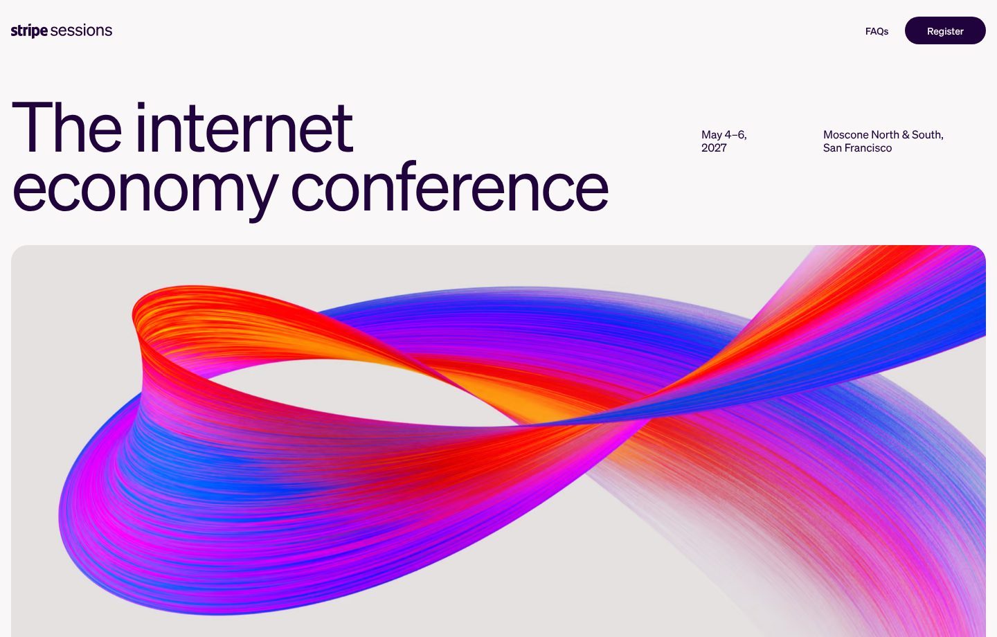
Example Stripe Sessions. A first screen with the idea, the dates, the venue and one button, and nothing else.
- 1
What it is, in one line: the internet economy conference. It tells a visitor at once who will be in the room.
- 2
Dates and venue on the first screen, set apart and easy to find: May 4–6, Moscone North and South, San Francisco.
- 3
The menu holds two links only, the questions and registration. Nothing competes with the one thing to do.
- 4
A large abstract image in the brand’s colours instead of a stock photo of a crowd. The event looks like the company behind it.
Part 02 / 10
Last year, in numbers
Numbers from the last edition prove the event is worth the trip. The best ones count what people got out of it, meetings and deals, not only how many came.
Where it goes wrongA count of attendees with nothing about what they did there.
Picked for the design and what it says
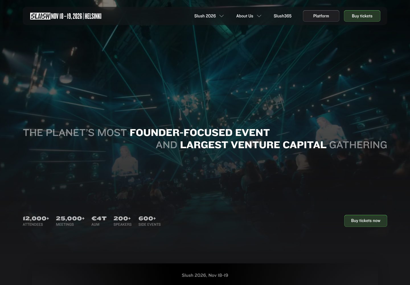
Example Slush. A first screen that pairs one bold claim with five numbers and the ticket button.
- 1
Dates and city are part of the logo: Nov 18–19, 2026, Helsinki. Wherever the eye lands first, the when and where are there.
- 2
A claim with two audiences in it: the most founder-focused event and the largest gathering of venture capital. Founders and investors each read their reason to come.
- 3
Last year in five numbers that count results, not only heads: 25,000+ meetings, €4T managed by the investors in the room, 600+ side events.
- 4
The ticket button sits on the same line as the numbers. The proof and the purchase are read together.
Part 03 / 10
Who will be in the room
People buy a conference ticket to meet other people. Show who comes, by role and in numbers, so every visitor sees both their own group and the people they came to meet.
Where it goes wrong“Thousands of industry leaders”, with no idea who they are.
Picked for the design and what it says
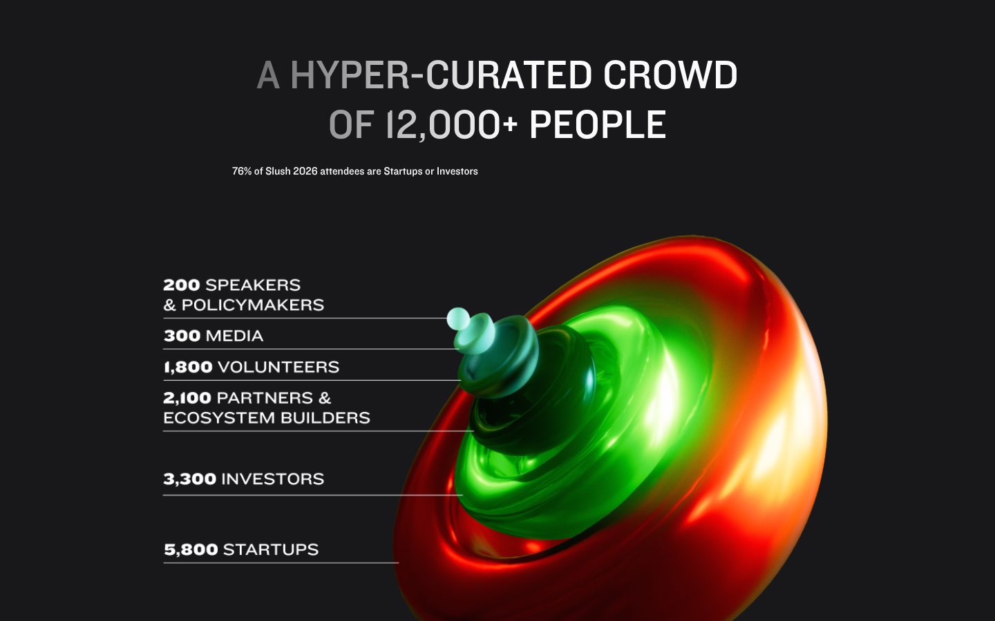
Example Slush. The crowd broken down by role, each group with its number.
- 1
The size is in the headline, but the word that matters is curated: the crowd was chosen, not just counted.
- 2
One line says who most of them are: 76% are startups or investors. That is the reason a founder or an investor buys a ticket.
- 3
Even the people around the stage are counted: 200 speakers, 300 media, 1,800 volunteers. Numbers like these make the scale concrete.
- 4
The two numbers that sell the ticket come last and stand apart: 3,300 investors and 5,800 startups. Each side sees how many of the other will be there.
- 5
A glossy, strange object instead of yet another photo of a crowd. It makes the numbers memorable and the brand recognisable.
Part 04 / 10
Speakers, as people
Speakers prove the level of an event and are the main draw for many visitors. A clean grid with faces, names and companies lets people find the names they came for.
Where it goes wrongA wall of company logos instead of people, or speakers listed by name only.
Picked for the design and what it says
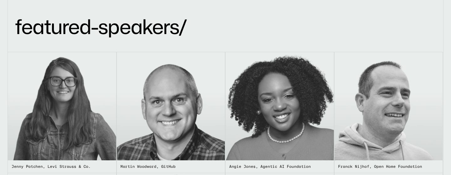
Example GitHub Universe. A grid of matching portraits, each with a name and a company.
- 1
Speakers get their own section near the top, under a plain heading in the site’s code-like style.
- 2
Every speaker in the same black-and-white portrait, the same size and crop. A uniform grid makes a varied line-up look like one programme.
- 3
Each portrait names the person and the company: Jenny Patchen, Levi Strauss & Co. Visitors look for names they know and companies like theirs.
- 4
The line-up mixes GitHub’s own people with a jeans company and two open-source foundations. It promises more than a product launch.
Part 05 / 10
The programme, day by day
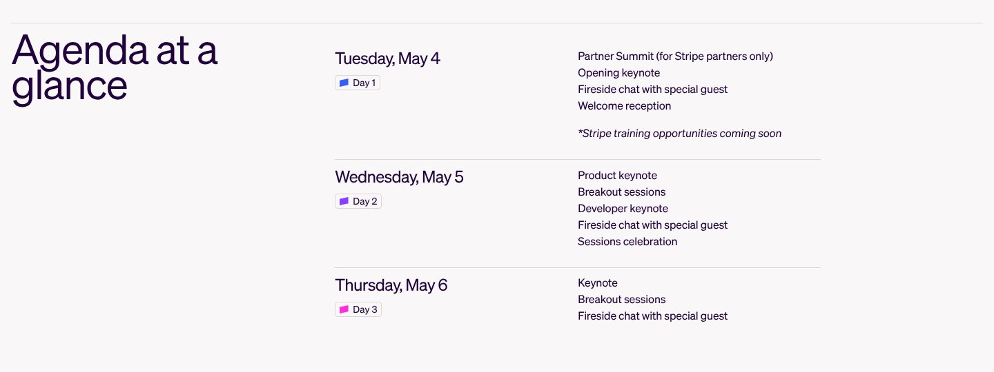
Before booking travel, people need to know what happens on which day. A short agenda with dates and the main moments, the social ones included, is enough to decide; the full schedule can come later.
Where it goes wrong“Agenda coming soon” for months, with nothing to plan around.
Picked for the design and what it says
Example Stripe Sessions. Three days on one screen, each with its date and its main moments.
- 1
The whole programme at a glance, long before the full schedule exists.
- 2
Each day has a date and a number. A visitor can plan travel from this alone.
- 3
Each day lists its main moments in plain words: the opening keynote, a fireside chat with a special guest.
- 4
The social side is in the programme too: a welcome reception on day one, a celebration on day two. For many people the evenings are the reason to come.
- 5
What is not ready yet is said plainly: training is coming soon. An honest gap reads better than a polished blank.
Part 06 / 10
Tickets by who you are
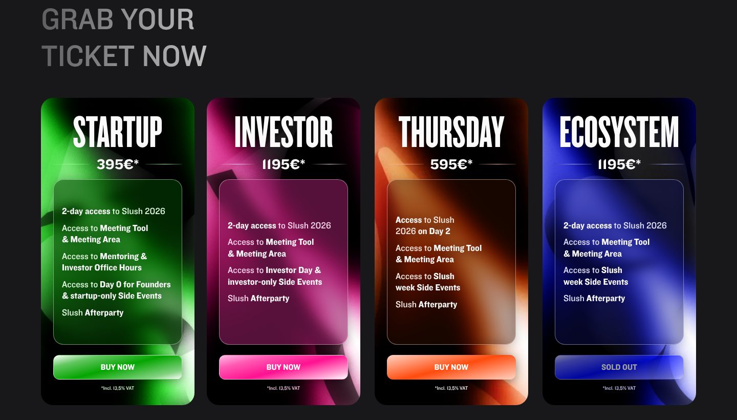
Ticket names should describe the visitor, not a package level. When each ticket says who it is for and exactly what it opens, people pick in seconds and fewer end up with the wrong one.
Where it goes wrongBronze, silver and gold tickets that differ in ways nobody can remember.
Picked for the design and what it says
Example Slush. Four tickets named after the people who buy them, each with its price and what it opens.
- 1
Tickets are named after who you are: startup, investor, ecosystem. Nobody has to work out which one is theirs.
- 2
Prices differ by who you are: 395 € for a startup, 1,195 € for an investor. Those who get more out of the room pay more.
- 3
Each card lists exactly what it opens: the meeting tool, office hours with investors, side events, the afterparty.
- 4
A cheaper ticket for the second day only. A smaller yes for people who cannot take two days off.
- 5
One ticket is already sold out, and the page keeps it on show. It tells everyone else that tickets do run out.
Part 07 / 10
A deadline on the price
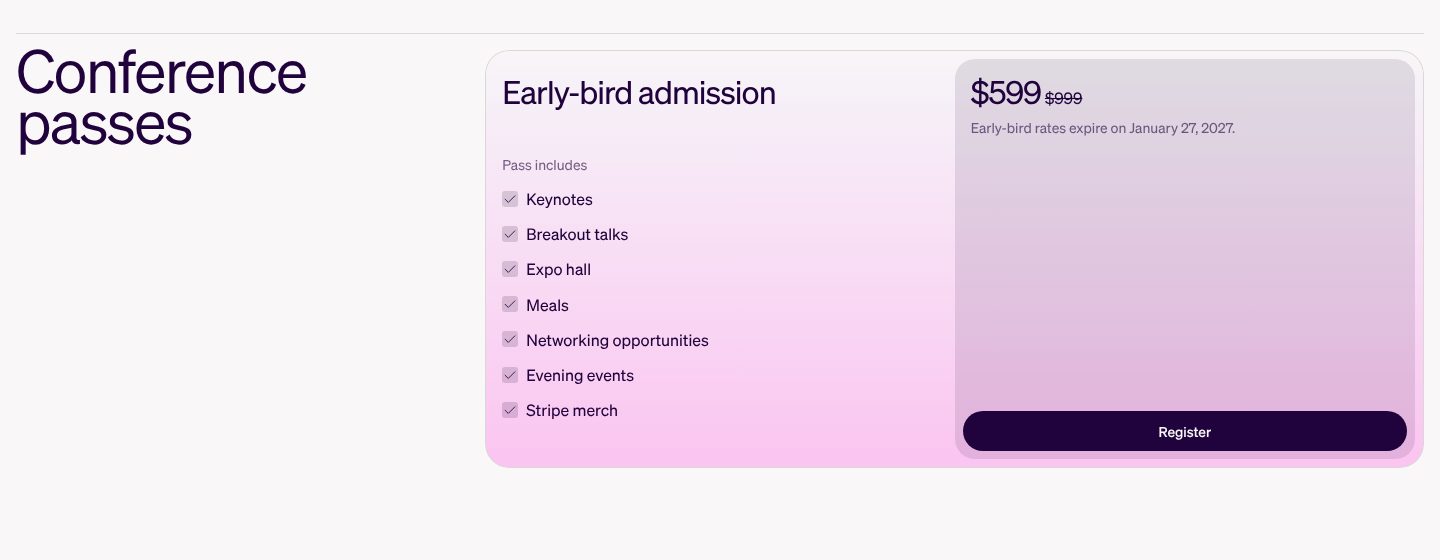
An early price with a real end date moves people who would otherwise wait until the last week. Show the saving and the date it ends, next to the button.
Where it goes wrongA countdown that resets, or “prices go up soon” with no date.
Picked for the design and what it says
Example Stripe Sessions. One pass, its early price, the full price struck through and the date the offer ends.
- 1
One pass and a list of what it includes: keynotes, talks, the expo, meals, evening events. The buyer sees the whole day before paying.
- 2
The early price with the full one struck through beside it: $599 instead of $999. The saving needs no arithmetic.
- 3
A real deadline with a date: early-bird rates end on January 27, 2027. Urgency anyone can check, not a timer.
- 4
The button sits under the price at the end of the card. The decision and the action are in one place.
Part 08 / 10
Help them get approval
At work events, the person who wants to come is rarely the one who pays. Give them a ready argument for their manager, and you help them buy.
Where it goes wrongAssuming every visitor can put a $1,000 ticket on their own card.

Picked for the design and what it says
Example GitHub Universe. A ready-made letter for the attendee’s manager, one click from the ticket.
- 1
A section named after the attendee’s real problem: convince your boss. Many people need a manager’s yes before they can buy.
- 2
The heading is the task itself, in the site’s code-like style: get approval.
- 3
One line on what the template does: shows the return, the impact on the team and why it matters. The arguments a manager asks for.
- 4
A document to download and forward, so the attendee does not have to write the request from scratch.
Part 09 / 10
Partners in tiers
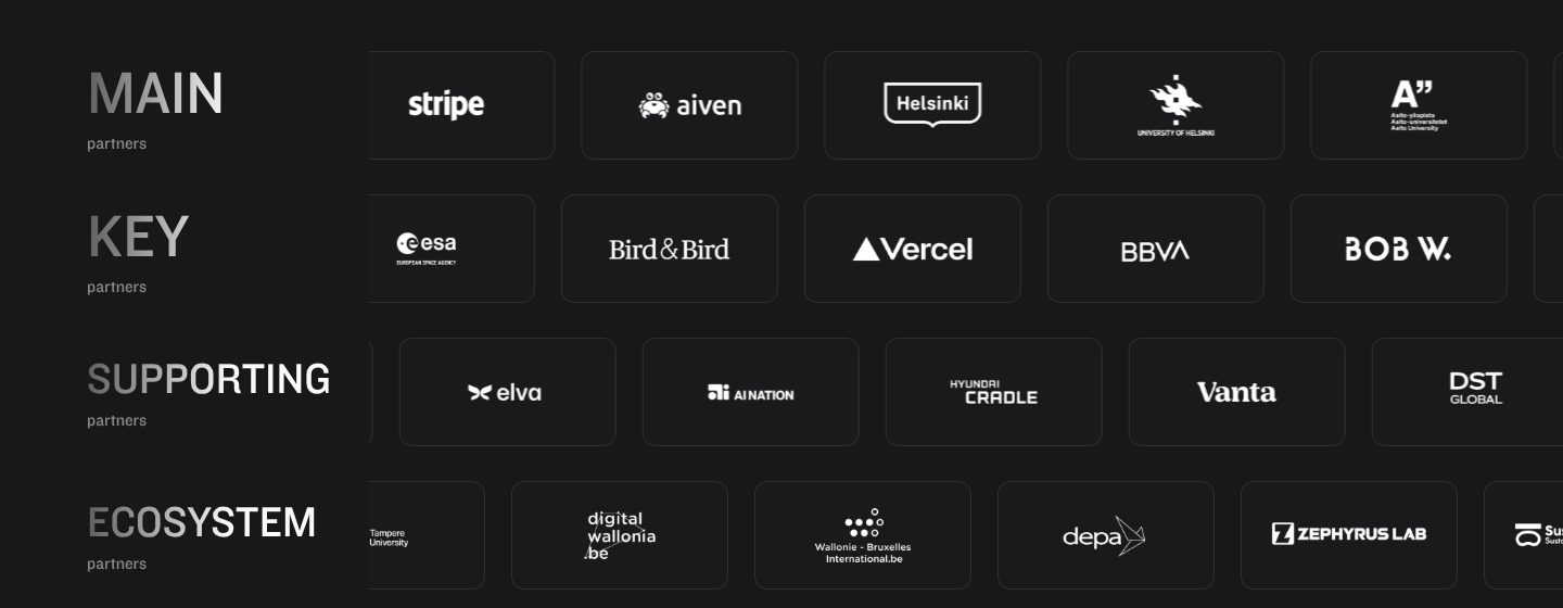
Partners show that the event is backed, and tiers show future sponsors what each level gets. Named tiers keep the list orderly and give every level a reason to be there.
Where it goes wrongOne endless strip of logos where nobody can tell who supports what.
Picked for the design and what it says
Example Slush. Partners in named rows, from main to supporting, every logo on the same tile.
- 1
Partners in named tiers: main, key, supporting. Each sponsor knows its place, and visitors see who carries the event.
- 2
The main partners take the first row.
- 3
Big names such as Vercel and BBVA sit in the second row, so the tiers read by role at the event, not by fame alone.
- 4
Lower tiers are named too, which gives smaller partners a reason to take part.
Part 10 / 10
The practical questions
The last doubts are practical: access needs, age, passing a ticket to a colleague, cancelling. Answer them on the page, and the people who would have written simply buy.
Where it goes wrongAn FAQ about the mission of the event, while the question about refunds goes unanswered.
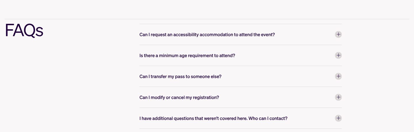
Picked for the design and what it says
Example Stripe Sessions. Five short questions, all of them practical, the first one about access.
- 1
The first question is about accessibility. Putting it first tells everyone they are expected.
- 2
Then the questions people would otherwise email about: an age limit, passing a ticket to a colleague.
- 3
Changing or cancelling is a question in plain sight, not something to dig for in the terms.
- 4
The last question is a way out: who to contact for anything not covered here.
The examples belong to their owners and are shown to explain an idea; the numbered frames are mine. Screenshots taken on 6 October 2026; the sites may have changed since.
Ask this about your site
Would a visitor buy a ticket without writing to you?
An event site has to answer when, where, who and how much on its own. These questions show whether yours does.
- 01
Are the dates, the city and the ticket button on the first screen?
- 02
Do your numbers from last year show what people got out of it?
- 03
Can a visitor see who will be in the room, by role?
- 04
Does every ticket say who it is for and what it includes?
- 05
Is there a date on every price that will change?
What makes an event website sell
Lesson 01
Answer when and where first
Every visitor checks the dates and the place before anything else. Put them where nobody has to look.
Lesson 02
Sell the room, not the stage
Most people come to meet others. Show who will be there, by role and in numbers.
Lesson 03
Prices with real dates
An early price works when its end date is real and visible. It is honest urgency, and people act on it.
What you get
An event site that sells tickets, and that your team can update every week.
Designed around your event and built in Webflow, so speakers, sessions and partners go live without a developer. When the event needs more than Webflow gives, such as a personal agenda or a speaker portal, I build it in code. A fixed price after a short brief.
The pages
A home page built on the parts above, plus speakers, programme, tickets, venue and questions.
Speakers and sessions
CMS collections, so a new speaker or a change in the programme is filling in a form.
Tickets
Buttons connected to your ticketing, such as Tito, Eventbrite or Luma, with prices and deadlines shown on the page.
Partners by tier
A partner list with tiers, and a page for future sponsors on what each tier gets.
Every edition kept
Past editions stay online with their speakers and talks, so the site keeps its value between events.
Help with the words
I shape the structure and edit your text, so the page answers the questions people ask.
How an event website should look and sound
Bold, clear and full of people.
These are rules of thumb. The site itself is built around your brand, your clients and your taste.
Dates nobody can miss
Dates and city in large type on the first screen and in the menu.
Real people
Speaker portraits and photos from the last edition, not stock crowds.
One identity, every edition
A strong look that can change with each year while the structure stays the same.
Tickets one click away
The same ticket button in the menu and after every section.
Questions
When should the site go live?
As soon as the dates and the city are fixed. An early page with a sign-up for the first tickets builds the list that buys the early-bird.
Can we add speakers and sessions ourselves?
Yes. They are CMS items, so publishing is filling in a form.
Which ticketing platform works with it?
Most of them. The page links to or embeds the checkout of the platform you already use, such as Tito, Eventbrite or Luma.
What happens to the site after the event?
It becomes the archive of that edition, with talks and photos, and starts selling the next one.
Do we need a new site for every edition?
No. One site can hold every edition, with the current one on the home page.
What it usually takes
New site or redesign
A new Webflow site, or a redesign of the one you have, designed and built by one person. Structure, copy, CMS and launch included.
Service
Integrations
Your Webflow site connected to the tools the company already runs on: forms into the CRM, analytics that measures the right things, and consent that holds tags back.
Service
New pages and CMS templates
Landing pages, subpages and CMS templates, built from your Figma file or extended from what the site already has.
Service
Your site
Want me to look at your site?
Next
Careers website
08 / 09