Websites by purpose08 / 09
Careers websites that attract the right people
For companies that are hiring. A good careers site tells the right people why they would want the job and the wrong ones why they would not, then shows the roles, the pay and the process before anyone has to ask.
What goes on a careers website
9 parts, top to bottom. Each one has a job in the sale, and each is shown on a real site that does it well. None of these sites is my work. Most are picked for how they look as well as what they say; the few picked only for what they say are marked.
Part 01 / 09
Why here, said as a filter
The first screen of a careers site decides who keeps reading. A line that describes the people you want, and admits what the job asks of them, draws the right ones in and saves everyone else an application.
Where it goes wrong“Join our amazing team” over a photo of an office.
Picked for the design and what it says
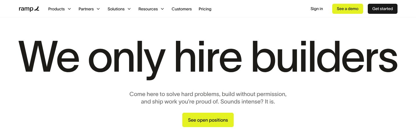
Example Ramp. A first screen that chooses its candidates in four words.
- 1
The headline is a filter, not an invitation: we only hire builders. The right people lean in; the rest leave early, which saves both sides time.
- 2
What builders get, in their own terms: hard problems, no permission needed, work to be proud of. Then a warning: “Sounds intense? It is.”
- 3
One button straight to the open roles. A candidate who already agrees does not have to scroll.
Part 02 / 09
People, and what they built
Candidates want to know who they would work with. Real colleagues, each shown with one thing they did, say more about the job than any list of values.
Where it goes wrongStock photos of smiling people, or employees with a job title and nothing else.

Picked for the design and what it says
Example Ramp. Real employees, each introduced by one thing they built.
- 1
A first name and an initial only. The person is real, but the story is the work.
- 2
Each person is introduced by something they built, not a title: an offer coach that raised the accept rate by 10%.
- 3
The achievements are concrete and could only happen here: the record for code commits in a month.
- 4
Some are about money for customers: card payments turned into millions in cashback. A candidate sees what impact looks like here.
Part 03 / 09
A letter from the founders
A letter in the founders’ own voice tells a candidate what the company really values, including what will be hard. Honesty about the downside is what makes the rest believable.
Where it goes wrongA message from the CEO that any company could have written.
Picked for the design and what it says
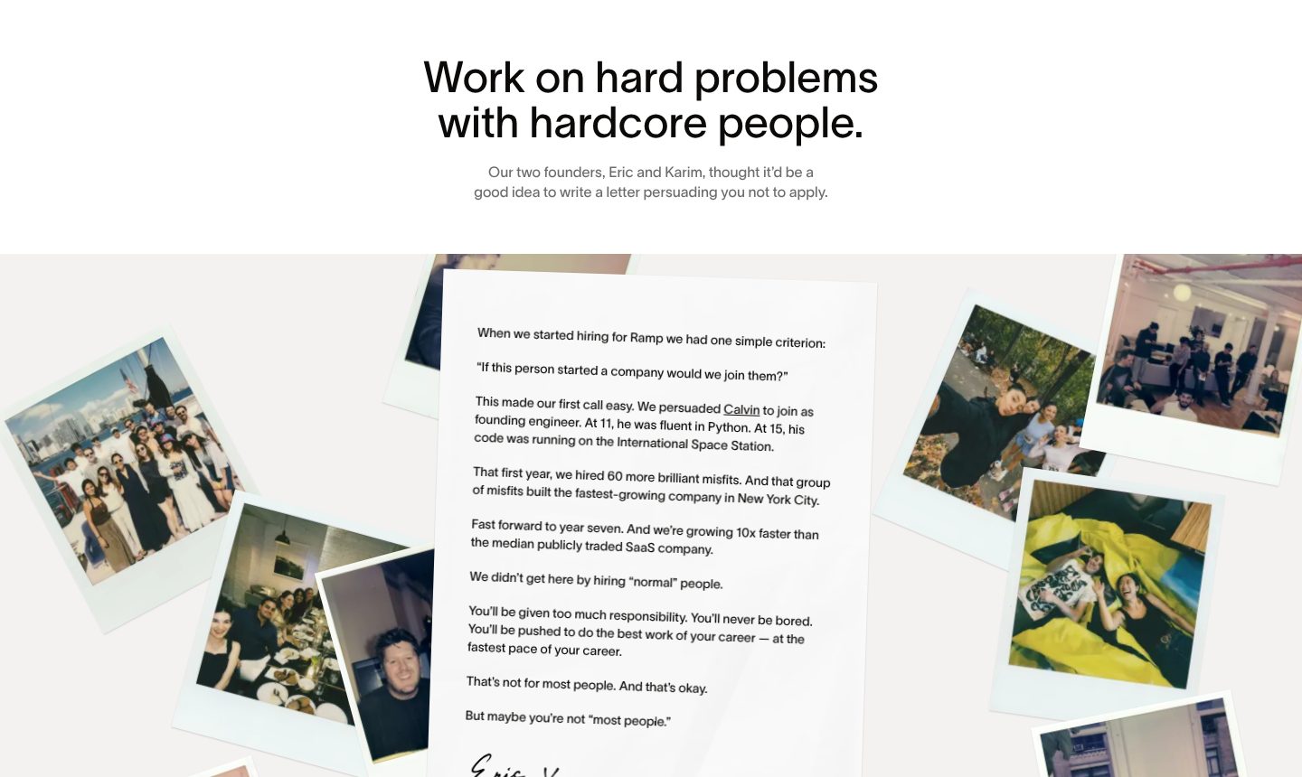
Example Ramp. A signed letter whose stated aim is to talk you out of applying.
- 1
The founders say it outright: this letter is meant to talk you out of applying. Nothing filters harder, or reads more honestly.
- 2
One test for every hire, quoted: would we join this person if they started a company? A candidate can measure themselves against it.
- 3
The warning is plain: too much responsibility, never bored, the fastest pace of your career. The people it puts off were never going to stay.
- 4
It ends with a dare instead of a call to action: maybe you are not most people. The right reader takes it personally.
- 5
Snapshots of the team around the letter, informal and real. It reads as written by people, not by a recruiting department.
Part 04 / 09
How the team works
Principles a candidate can remember show how decisions are made day to day. Short names, one line each, and some that say what the team will not do.
Where it goes wrongValues like “integrity” and “excellence” that every company claims.
Picked for the design and what it says
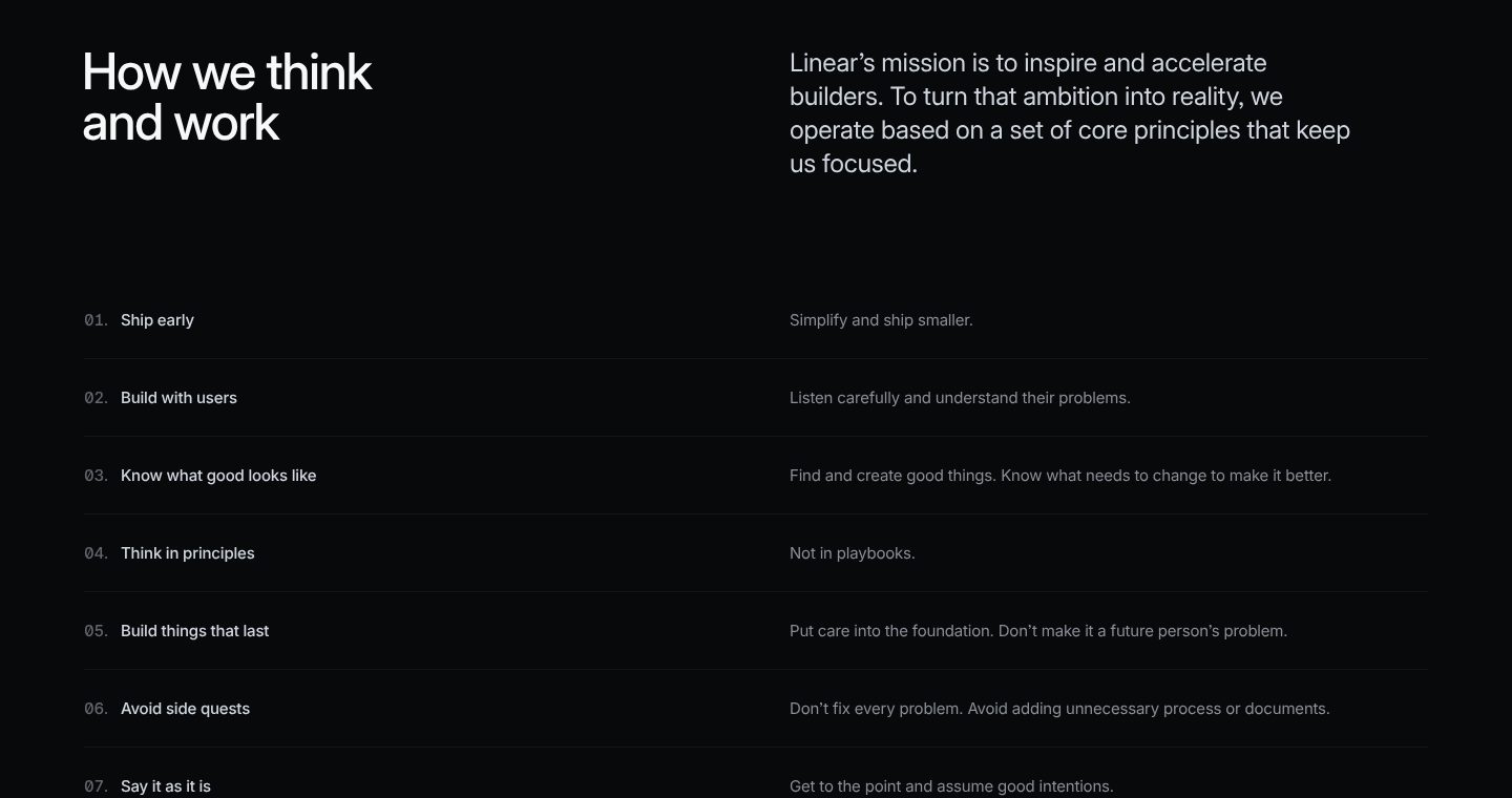
Example Linear. Seven numbered principles, each two or three words with one line of explanation.
- 1
The heading promises a way of working, not perks: how we think and work.
- 2
The principles are introduced by the mission they serve: to inspire and accelerate builders.
- 3
Each principle is a few words a candidate can remember, with one line beside it: ship early, simplify and ship smaller.
- 4
Some are rules about thinking: think in principles, not in playbooks.
- 5
Some say what they will not do: avoid side quests, don’t fix every problem. A candidate learns what is not rewarded as well.
Part 05 / 09
The team in numbers
A few numbers about the team, its size, the countries it works from, how remote it is, answer questions candidates hesitate to ask, and show the team is real.
Where it goes wrongA team page that is only a headcount, or no sign of the team at all.
Picked for the design and what it says
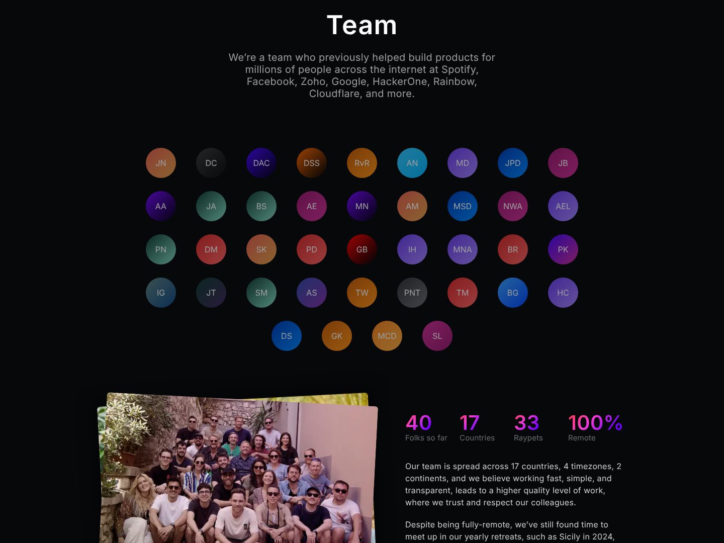
Example Raycast. The whole team as initials, a retreat photo and four numbers, one of them a joke.
- 1
The team introduces itself through the products it built before: Spotify, Facebook, Google, Cloudflare. Experience shown through names a candidate knows.
- 2
Everyone on the team as a circle with initials, all forty of them. The size is visible at a glance, and every circle is someone you would work with.
- 3
Four numbers, one of them a joke: 40 people, 17 countries, 100% remote, and 33 pets. Facts and tone in one line.
- 4
A real photo from a team retreat. A fully remote company shows that the team still meets.
- 5
The paragraph says how they work across countries and time zones, and mentions the yearly retreats that keep them close.
Part 06 / 09
Pay in the open
Pay is the first thing most candidates want to know. A range, a formula or a public table brings the right applicants and ends the guessing on both sides.
Where it goes wrong“Competitive salary”, and nothing else.
Picked for the design and what it says
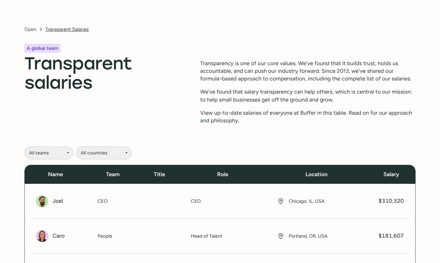
Example Buffer. The salary of everyone at the company, in a table anyone can filter.
- 1
The page title is the policy: transparent salaries.
- 2
Why they do it, in one paragraph: transparency builds trust, and they have shared their formula and every salary since 2013. A long record makes the promise believable.
- 3
Filters for team and country, so a candidate finds people like them in seconds.
- 4
The first row is the CEO, with his salary: $310,320. Starting at the top shows they mean it.
- 5
Salary is a column beside role and location. A candidate can compare their own pay before applying.
Part 07 / 09
Benefits, with numbers
Benefits only count when they are specific. Days, months and amounts turn “great perks” into something a candidate can weigh against an offer from elsewhere.
Where it goes wrongA ping-pong table and “unlimited holidays” with no number anywhere.
Picked for the design and what it says
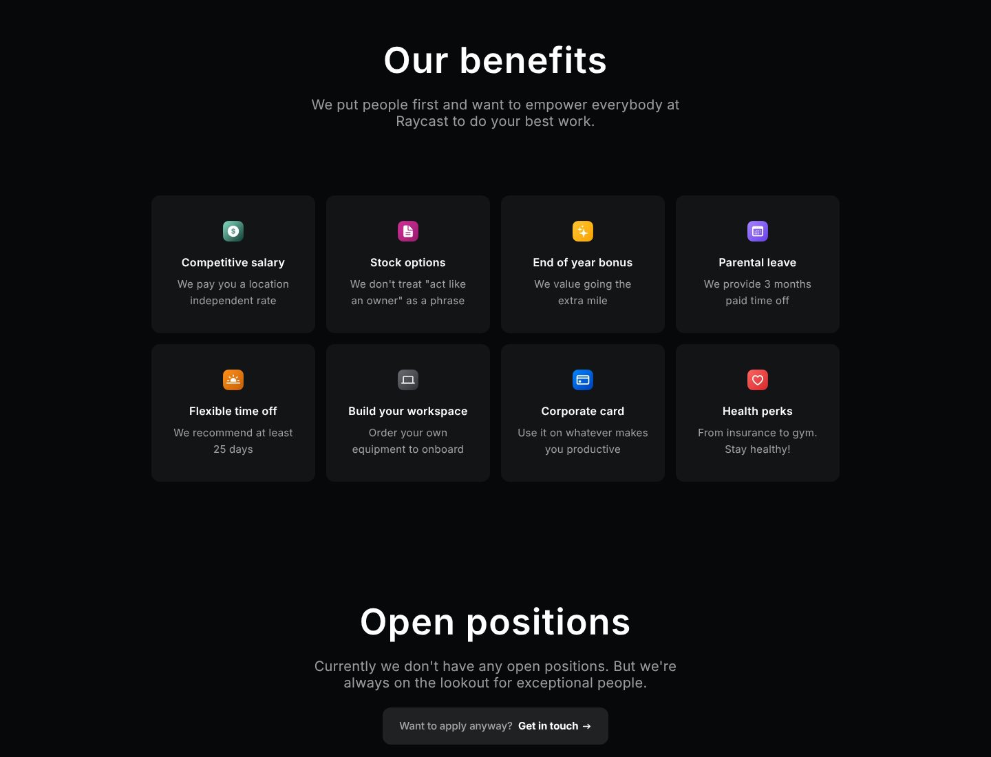
Example Raycast. Eight benefits, each with one plain line, and an honest note when no role is open.
- 1
Pay is the first card, and it says how it is set: one rate wherever you live.
- 2
Each benefit has one line in the company’s voice: stock options, because they do not treat “act like an owner” as a phrase.
- 3
Numbers where they matter: three months of paid parental leave.
- 4
Even flexible time off gets a number: they recommend at least 25 days. A vague benefit becomes a promise.
- 5
When nothing is open, the page says so and still invites a message: want to apply anyway? Get in touch. Good candidates are not turned away.
Part 08 / 09
Open roles you can search
For a company with many roles, the list is the product. Search, filters and rows with title, team and place let a candidate find their job in seconds.
Where it goes wrongA wall of job titles with no way to filter, each one a PDF.
Picked for the design and what it says
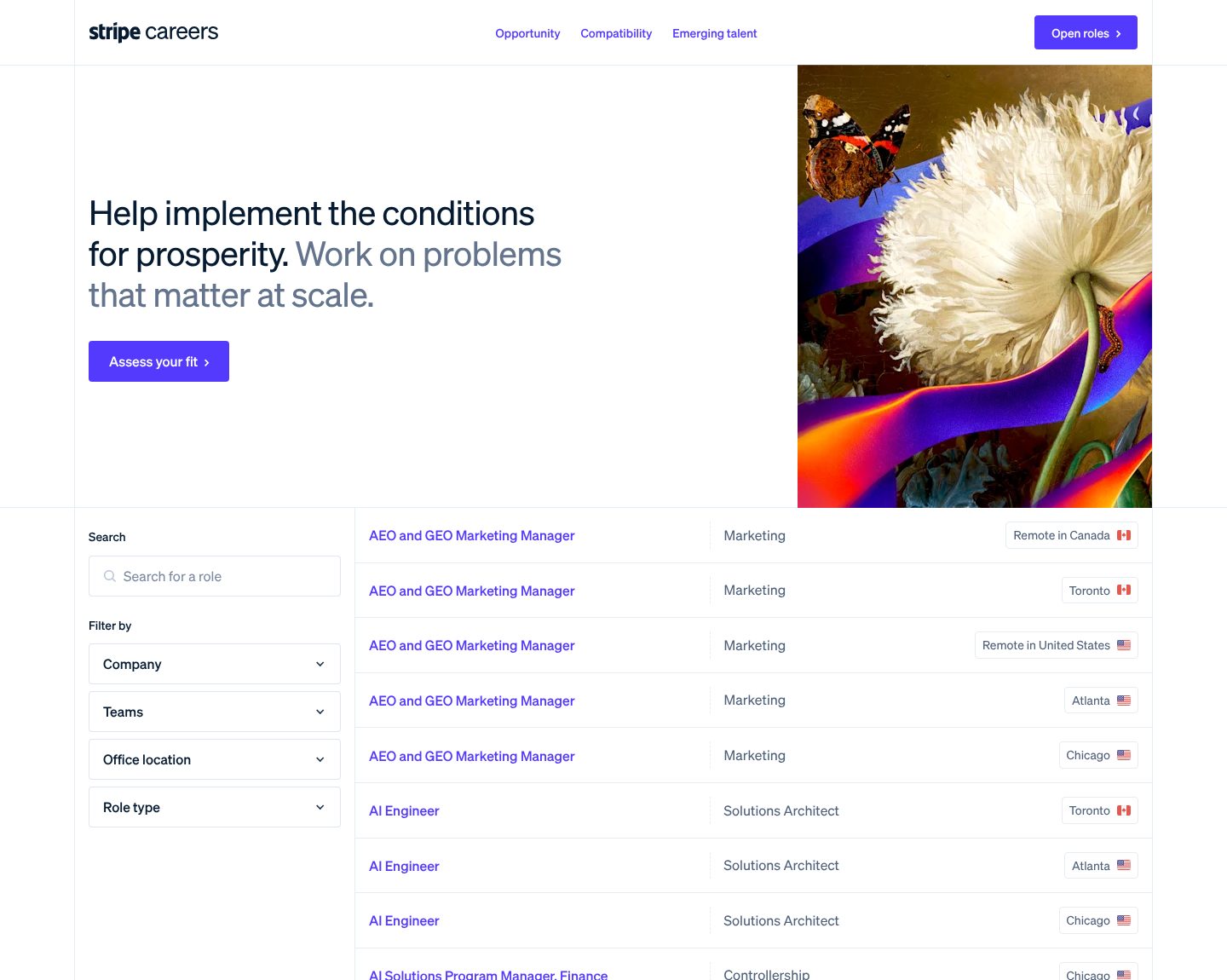
Example Stripe. A job search with filters on the left and rows that show title, team and place.
- 1
The mission comes before the list, in two tones: the conditions for prosperity, then the work itself, problems that matter at scale.
- 2
A tool before the list: assess your fit. The candidate checks themselves before they browse.
- 3
Search and filters on the left: company, team, office, type of role. With hundreds of roles, finding yours is the main job of the page.
- 4
Each row gives the three things a candidate checks first: title, team and place.
- 5
Places come with a flag, and remote roles sit beside city offices. Where you can work is clear without opening the role.
Part 09 / 09
The hiring process, step by step
Applying is a risk for someone who already has a job. Showing every step, what it involves and who they will meet, makes it easier to start.
Where it goes wrong“We will be in touch”, and nothing about what happens next.
Picked for the design and what it says
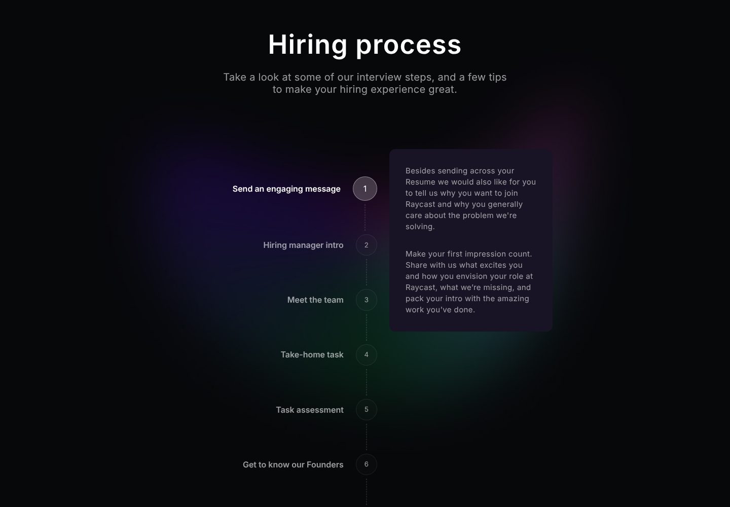
Example Raycast. Every interview step named in advance, with advice on how to do well.
- 1
The process is public before anyone applies: the interview steps, plus tips to do well in them.
- 2
Steps are numbered and named in plain words, from the first message to meeting the founders.
- 3
The first step comes with advice: say why you want to join and what you would change, and show work you are proud of. Candidates are told how to stand out.
- 4
A take-home task is announced up front, so nobody is surprised halfway through.
- 5
The last step before the offer is meeting the founders. A candidate knows who they will end up talking to.
The examples belong to their owners and are shown to explain an idea; the numbered frames are mine. Screenshots taken on 6 October 2026; the sites may have changed since.
Ask this about your site
Would the right person apply after one visit?
Good candidates compare several companies before they apply. These questions show whether your careers site answers them first.
- 01
Does your first screen say who you want, not only that you are hiring?
- 02
Can a candidate see real colleagues and what they have done?
- 03
Is pay on the page, at least as a range?
- 04
Do your benefits have numbers on them?
- 05
Is every step of the hiring process on the page?
What makes a careers website sell
Lesson 01
Say who it is not for
A careers site that puts some people off draws the rest in more strongly. Being clear about what the job demands filters before the first interview.
Lesson 02
Show the work, not the office
Candidates choose colleagues and problems, not furniture. Show what people built and how they work.
Lesson 03
Answer pay and process up front
Every candidate wants to know how much and what happens next. Answering both on the page brings more of the right applicants.
What you get
A careers site that brings the right applicants, and that your team can keep up to date.
Designed around your company and built in Webflow, so roles, stories and benefits change without a developer. When the site needs more than Webflow gives, such as a salary calculator or a role finder fed by your hiring tool, I build it in code. A fixed price after a short brief.
The pages
A careers home built on the parts above, team and culture, benefits, process, and a page for each role.
Roles from your hiring tool
Open roles pulled from the tool you already use, such as Ashby, Greenhouse or Lever, so the list is never out of date.
People’s stories
Employee stories as a CMS collection, so a new one goes live by filling in a form.
Pay and benefits
Ranges, tables or a calculator, built so your team can change the numbers.
Found by candidates
Role pages with the structured data Google reads for job listings, so they can appear in its job search.
Help with the words
I shape the structure and edit your text, so it sounds like your team and not like a template.
How a careers website should look and sound
Honest, specific and full of real people.
These are rules of thumb. The site itself is built around your brand, your clients and your taste.
Your people, photographed well
Real colleagues, shot the same way, instead of stock images.
Numbers in plain sight
Pay, days off and team size set large enough to find without reading.
Your own voice
Write the way your team talks, including about the hard parts.
One way to the roles
The same link to the open roles at the top and after every section.
Questions
We are a small team with one opening. Do we need a careers site?
One good page is enough: who you are, how you work, the role, the pay and the steps. It keeps working when nothing is open, as a place for people to introduce themselves.
Should we show salaries?
At least as ranges. They bring applicants who fit on pay and spare everyone a surprise late in the process.
Can the site show roles from our hiring tool?
Yes. Roles can come straight from tools such as Ashby, Greenhouse or Lever, so you post a role in one place.
Can we add employee stories ourselves?
Yes. They are CMS items, so publishing is filling in a form.
Will our roles show up in Google’s job search?
Each role page can carry the structured data Google reads for job listings, which gives it a chance to appear there.
What it usually takes
New site or redesign
A new Webflow site, or a redesign of the one you have, designed and built by one person. Structure, copy, CMS and launch included.
Service
Integrations
Your Webflow site connected to the tools the company already runs on: forms into the CRM, analytics that measures the right things, and consent that holds tags back.
Service
Technical SEO
Broken links, missing redirects, thin metadata and pages Google skips: found, fixed and checked in Search Console.
Service
Your site
Want me to look at your site?
Next
Real estate development website
09 / 09