Websites by purpose01 / 09
Expert websites that bring in clients
For consultants, coaches and advisers who sell what they know. A good expert site does the first meeting for you: the right person sees you can solve their problem, finds proof, and books a call.
What goes on an expert website
9 parts, top to bottom. Each one has a job in the sale, and each is shown on a real site that does it well. None of these sites is my work. Most are picked for how they look as well as what they say; the few picked only for what they say are marked.
Part 01 / 09
Who you help, and with what
A visitor decides in a few seconds whether a site is for them. The first screen has to name the client, the result they want and, ideally, the doubt that holds them back, next to a real face. The right person recognises themselves; the wrong one leaves, and that is useful too.
Where it goes wrongA slogan about passion and excellence that would fit any consultant in any field.
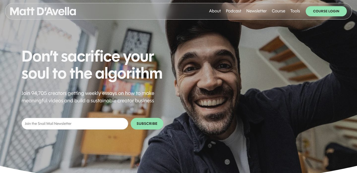
Picked for the design and what it says
Example Matt D’Avella. A first screen that names the reader’s fear, the promise and the smallest next step, beside a face.
- 1
It opens with the doubt his readers carry: that growing on YouTube means selling your soul to the algorithm. The promise is written against that fear.
- 2
Who and what in one line: 94,705 creators, weekly essays, meaningful videos and a business that lasts. The exact number reads as true and shows how full the room is.
- 3
The smallest yes on the first screen: an email address and a button beside it. A visitor not ready for the course still stays in touch.
- 4
His face fills half the screen, smiling at the camera. When you buy from one person, seeing them is the first answer.
- 5
The only coloured button in the menu is for people who have already bought: course login. It tells new visitors, quietly, that there is a course worth buying.
Part 02 / 09
Proof at a glance
Before they read a word, visitors look for signs that others already trust you. Names they recognise work fastest, because the reader borrows the judgement of companies they respect. The closer those names are to the reader’s own world, the stronger the effect.
Where it goes wrong“Trusted by leading companies”, with no names under it.
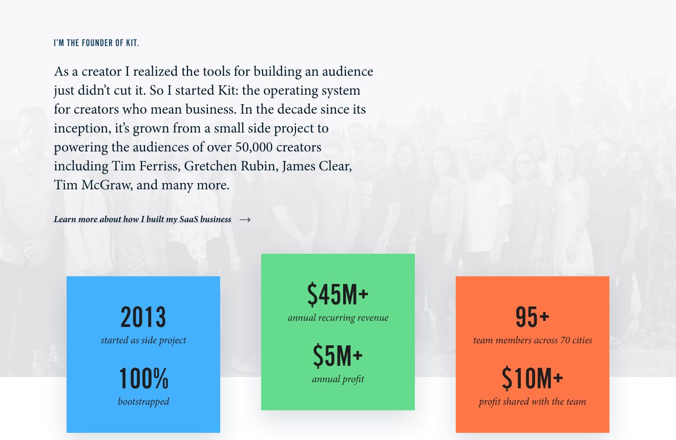
Picked for the design and what it says
Example Nathan Barry. Proof told as a short story with famous names, then in numbers anyone can repeat.
- 1
A small label does the bragging, founder of Kit, so the paragraph under it can tell the story calmly.
- 2
A creator who built the tool he needed, now behind 50,000+ creators. The names come last and do the heavy lifting: Tim Ferriss, Gretchen Rubin, James Clear.
- 3
A link for whoever wants the whole story. The page does not have to tell it all.
- 4
Proof in coloured tiles: started as a side project, $45M+ in annual recurring revenue, $5M+ in profit. Numbers that read in a second and that anyone can repeat.
- 5
One number is about how he treats people, not how much he earns: $10M+ of profit shared with the team. It says something about working with him that a testimonial could not.
Part 03 / 09
The problem, in the client’s words
People hire the expert who seems to understand their situation best, and they judge that by how precisely you describe it. Use the words a client would use with a colleague, not the terms of your trade. When the reader thinks “that is exactly us”, the rest of the page reads as the answer.
Where it goes wrongOpening with your biography. The visitor came with a problem, not to read about you.
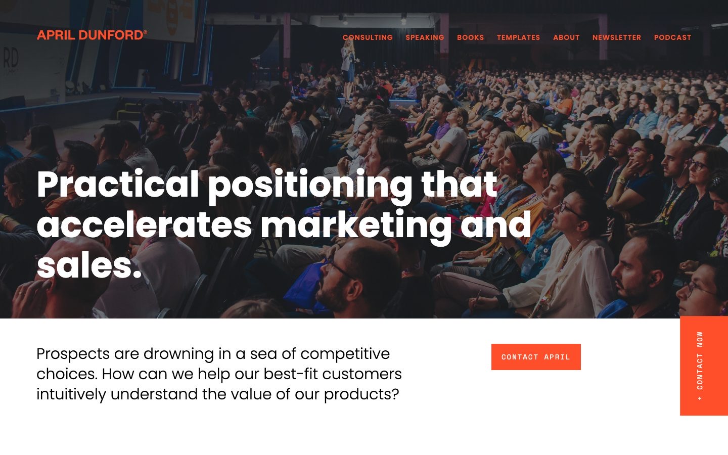
Picked for the design and what it says
Example April Dunford. The headline promises the result; the line under it states the problem the way her clients put it to themselves.
- 1
The result in the buyer’s terms: marketing and sales, the two teams that pay for positioning and feel it when it is missing.
- 2
April on stage in front of a full hall. The photo does the bragging, so the text does not have to.
- 3
The problem as the client asks it, with “we” and “our products”. A head of marketing reads their own question, word for word.
- 4
The button sits beside the problem, at the moment the reader agrees with it, not at the bottom of the page.
Part 04 / 09
An offer with a price
An expert who sells “consulting” makes every buyer start from zero. A named offer that says what happens, for whom and for how much can be compared, approved and passed on. The price works too: it keeps away people who cannot afford you, and tells the right buyer how senior the work is.
Where it goes wrongTwelve services in a list and no hint of price, so every question needs an email.
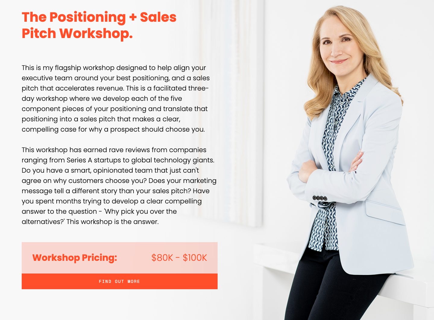
Picked for the design and what it says
Example April Dunford. One flagship offer, described like a product, with its price in plain sight.
- 1
A named product instead of “services”. Something with a name can be bought, budgeted and recommended to a colleague.
- 2
What happens, concretely: three days, the five parts of positioning, and a sales pitch at the end. The buyer can picture the work.
- 3
Questions that describe the buyer’s situation: a smart team that cannot agree, marketing and sales telling different stories. The reader checks whether they are in it.
- 4
The price, in public: 80 to 100 thousand dollars. It ends the talks that would fail on budget, and tells the right buyer what level of work this is.
- 5
Her portrait beside the offer. The buyer is paying for her, not for a firm, and the page never lets them forget it.
Part 05 / 09
How the work goes
Hiring an expert feels risky because the work is invisible until it is done. A process laid out step by step, with what the client does and what you do, turns that risk into a plan. It also explains the fee: the buyer sees the sessions and decisions behind it.
Where it goes wrongA trademarked framework with a clever name and no word on what actually happens.
Picked for what it says, not for the look
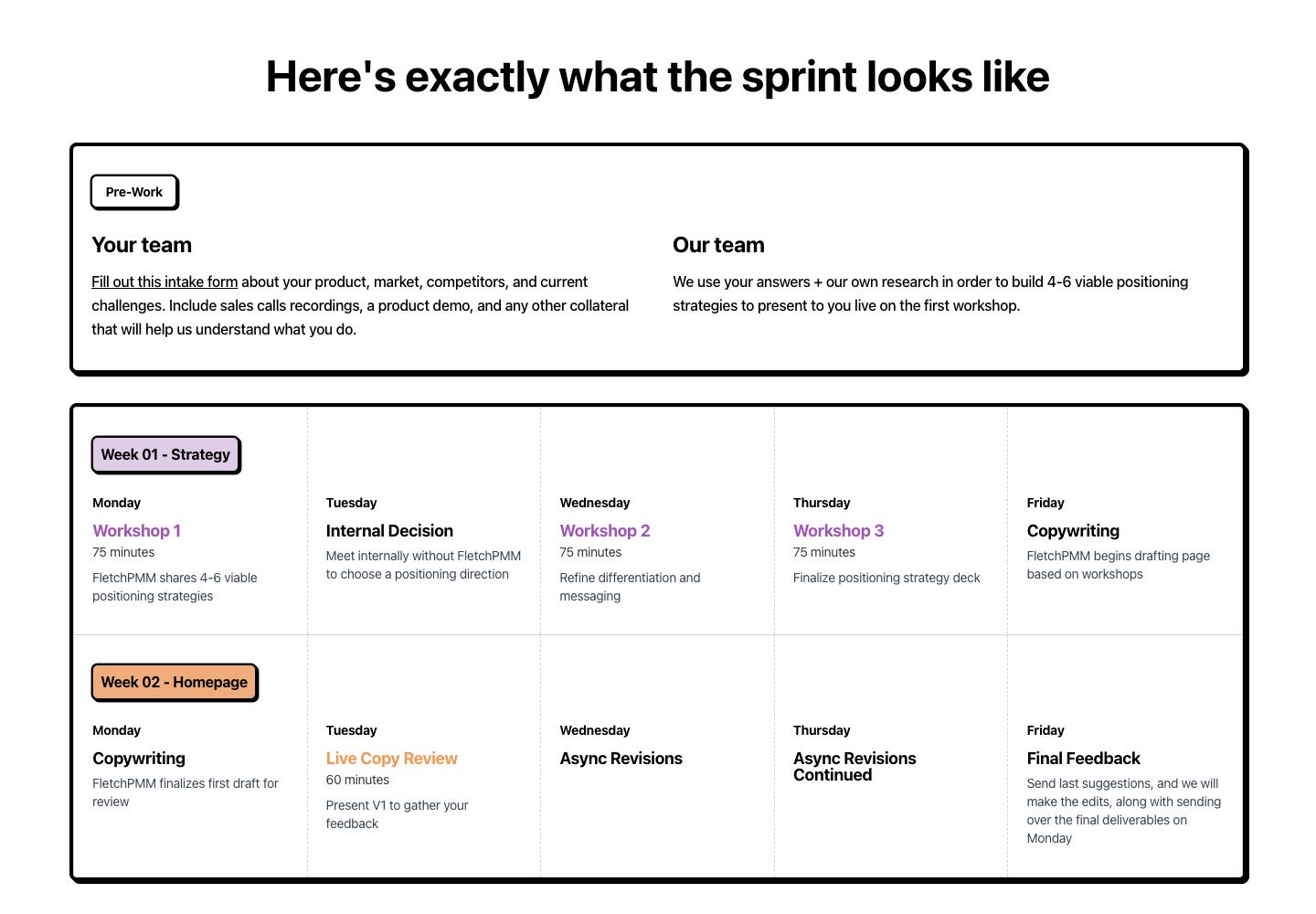
Example FletchPMM. Two weeks laid out like a calendar, so a buyer sees their own part before the first call.
- 1
“Exactly” is the promise: no black box. The heading answers the question every buyer has, what will actually happen.
- 2
Split into “Your team” and “Our team”. The buyer knows how much of their own time it takes before they sign.
- 3
Every session has a length: 75 minutes. A buyer can block calendars and plan around it.
- 4
The one step without them: the client decides alone. The choice stays theirs, and the page says so.
- 5
A clear end: last feedback on Friday, final files on Monday. Buyers relax when they know when it stops.
Part 06 / 09
Results, with names
Your own claims get discounted; your clients’ words do not, as long as they can be checked. A name, a face, a role and a company make a quote believable, and a result inside it makes it useful. Readers scan for people like themselves.
Where it goes wrongAnonymous praise signed with initials, which reads as invented.
Picked for what it says, not for the look
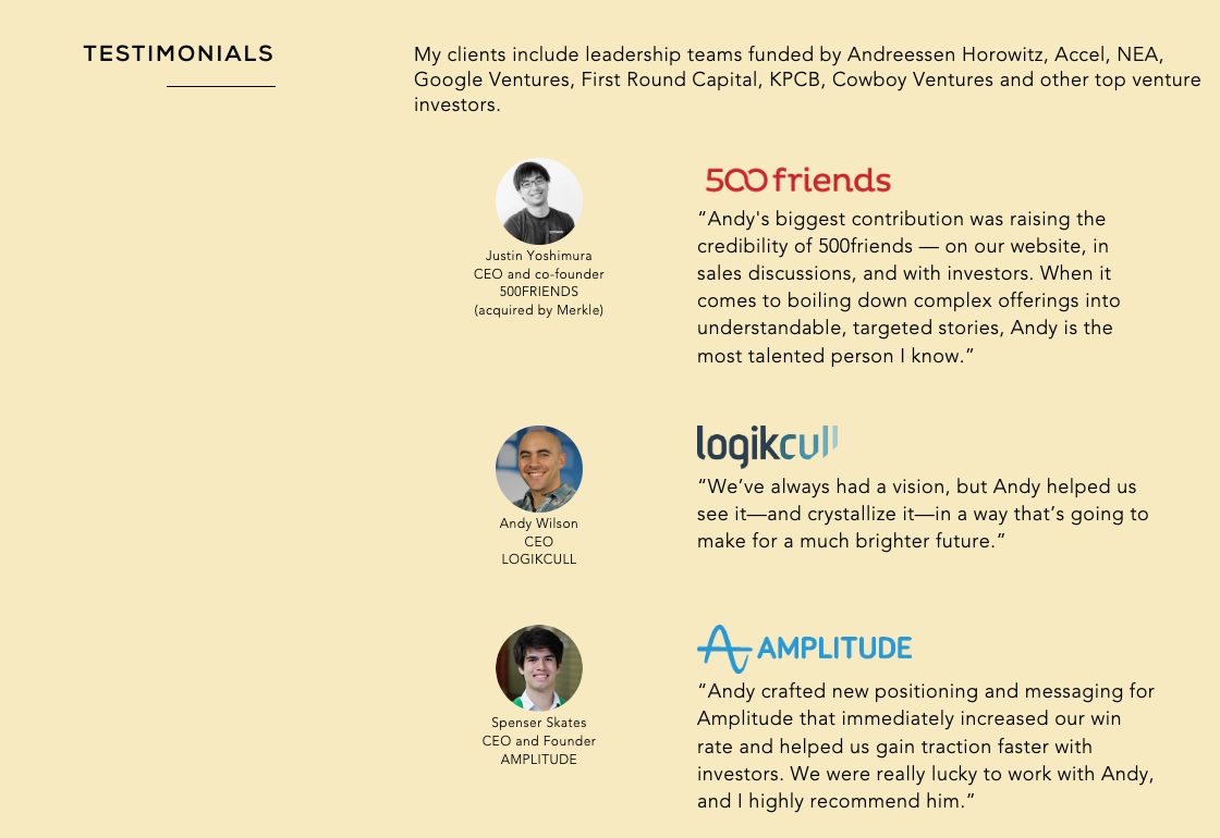
Example Andy Raskin. A long wall of testimonials from founders and executives, each one checkable.
- 1
Before the first quote, who his clients are backed by: Andreessen Horowitz, Accel, Google Ventures. For a startup CEO these names are the peer group.
- 2
Photo, name, title and company. Four details that make a quote checkable, and so believable.
- 3
The company logo above each quote. Readers scan the logos first and read the words of the companies they know.
- 4
A result, not a compliment: new positioning that “immediately increased our win rate”. This is the line a buyer remembers.
Part 07 / 09
You, as a person
At some point the reader stops asking “can they do it” and starts asking “do I want to work with them”. A biography rarely answers that; a point of view does. Say what you believe about your field, in your own voice, and the people who agree will pick you over someone with a longer CV.
Where it goes wrongA CV of job titles, or a page with no photo at all.
Picked for the design and what it says
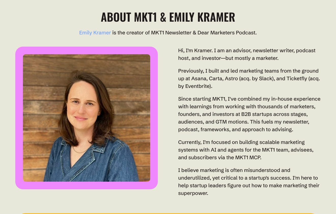
Example MKT1, Emily Kramer. An adviser’s about section that moves from her own voice to her record to what she believes.
- 1
The section names the person behind the brand. Buyers of advice want to know who will be on the call.
- 2
A large, warm portrait in the brand’s own pink. The person and the brand read as one thing.
- 3
It opens in her own voice, with a small joke at the end: advisor, writer, host and investor, but mostly a marketer.
- 4
The record comes second and stays concrete: marketing teams she built at Asana and Carta, at two companies later acquired.
- 5
It ends on a belief, not a list: marketing is misunderstood, and she is here to make it a superpower. A founder who agrees has found their adviser.
Part 08 / 09
Your thinking, in public
Articles, guides, talks and podcasts let a stranger test how you think before paying, at no risk to either side. They also bring visitors: each piece answers a question someone searches for. Over time they are why people arrive already convinced.
Where it goes wrongA blog last updated two years ago. No blog is better than a dead one.
Picked for the design and what it says
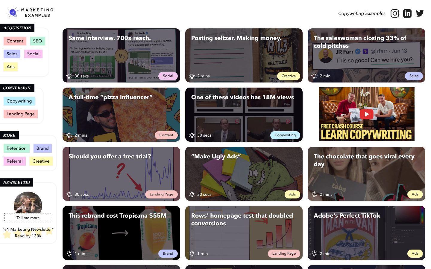
Example Marketing Examples, Harry Dry. A home page that is the body of work itself: short lessons, each titled with its result.
- 1
Each piece is titled with its result in a few words: same interview, 700x reach. The reader learns something before clicking.
- 2
Every piece says how long it takes: 30 seconds, 2 minutes. A clear, small cost makes it easy to read one more.
- 3
Topics down the side in the reader’s terms: content, SEO, sales, ads. A visitor goes straight to their own problem.
- 4
Among the short pieces sits a free crash course, styled like the rest. A reader who wants more finds the next step without leaving the page.
- 5
The newsletter in the sidebar, with its reach: read by 130k. Every visit can end in a subscription.
Part 09 / 09
A small first step
Most people who visit an expert’s site are not ready to hire this month. Without a small step they leave and forget you; with one, they stay within reach until the problem becomes urgent. The step has to be smaller than a call: an email address in exchange for something they want.
Where it goes wrongA contact form with eight fields and no word on what happens after you press send.
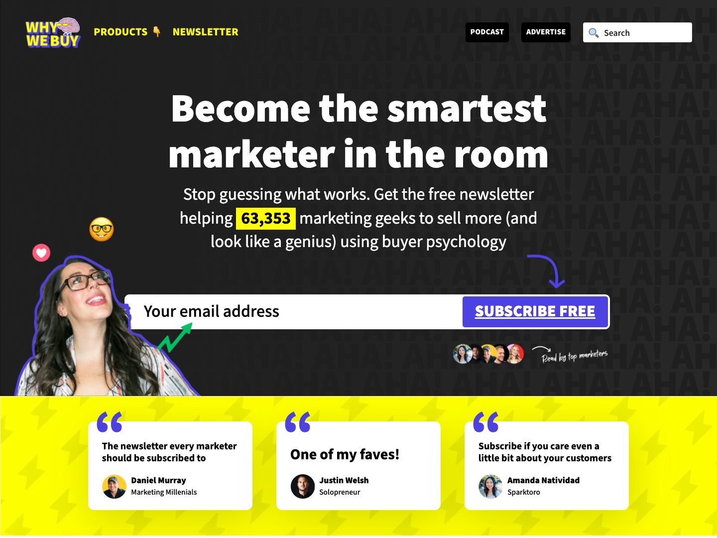
Picked for the design and what it says
Example Why We Buy, Katelyn Bourgoin. A first screen that asks for one thing, an email, and makes it easy to say yes.
- 1
It sells who the reader becomes, the smartest marketer in the room, not “a newsletter”.
- 2
A precise number, highlighted: 63,353. A precise figure reads as true, and that many readers lowers the risk of joining.
- 3
One field and one button that says free. The smallest step on the site, on the first screen.
- 4
Her photo, looking up at the words, cut out playfully. A person stands behind the newsletter, and the tone matches the brand.
- 5
Three named readers right under the form. Proof exactly where the doubt appears, just before pressing subscribe.
The examples belong to their owners and are shown to explain an idea; the numbered frames are mine. Screenshots taken on 6 October 2026; the sites may have changed since.
Ask this about your site
Does your site do the first meeting for you?
Most people who hire an expert look them up before they write. These questions show whether your site turns that visit into a call.
- 01
Would the right client recognise their problem on your first screen?
- 02
Is there proof a stranger can check: names, numbers, work they can read?
- 03
Is it clear how to work with you, and roughly what it costs?
- 04
Do you sound like yourself, or like every other consultant?
- 05
Can a reader who is not ready yet stay in touch?
What makes an expert website sell
Lesson 01
The site is the first meeting
Most clients check you before they write. Whatever they would ask on a first call, who you work with, how and for how much, the site should answer first.
Lesson 02
Specific beats impressive
A precise picture of one client’s problem sells better than a list of everything you can do. The right people feel it was written for them, and the wrong ones leave early, which saves you calls.
Lesson 03
Your voice is the difference
Two experts with the same skills sell differently because they sound different. Your own words and your own face are the one thing no competitor can copy.
What a good expert website gives you
01
Calls with people who already trust you
A visitor who has read your thinking arrives half convinced, and the first call is about the work.
02
A list you own
Readers who leave an email stay within reach, whatever happens to the platforms you post on.
03
Fees that hold
A site that shows depth makes the price a question of value, not of comparison.
What you get
A site that sells you, and that you can run yourself.
Designed around your brand and built in Webflow, so an article, a case or a new date goes live without me. When the site needs more than Webflow gives, such as a client area or no monthly platform fee, I build it in code. A fixed price after a short brief.
The pages
A home page built on the parts above, an about page, a page for each offer, and contact.
Cases and articles
As CMS collections, so publishing is filling in a form.
Booking
Your calendar tool, such as Calendly or Cal.com, on the page, with the agenda of the first call.
A list you own
A sign-up form connected to your newsletter tool, such as Kit, Mailchimp or Beehiiv.
Found by name and by topic
Titles, descriptions and structured data about you, on pages fast enough for Google.
Help with the words
I shape the structure and edit your text, so it still sounds like you, only shorter.
How an expert website should look and sound
Personal, calm and confident.
These are rules of thumb. The site itself is built around your brand, your clients and your taste.
Your face, more than once
A real, recent photograph on the first screen and on the about page. Stock photos of handshakes say nothing about you.
Type that carries authority
Strong headings, plenty of space and one or two colours. Confidence looks calm, not busy.
Your words, not a template’s
Write the way you talk to a client: short sentences, your own examples, no buzzwords.
One button, everywhere
The same next step on every page, in the same words, so nobody has to look for it.
Questions
How do I know whether my site brings in clients?
Ask each new client what they looked at before they wrote. If the answer is never the site, it is working as a business card and not as a salesperson.
I get clients from referrals and LinkedIn. Do I need a site?
A referral or a post starts the interest. The site is where people check you before they write, and where you keep in touch with those who are not ready yet.
Should the site carry my name or a brand name?
If you sell yourself, your name usually works better: it is what people search for after they meet you. A brand name makes sense when you plan to grow a team.
Should I show prices?
At least a starting point. A “from” price keeps away people who cannot afford you and saves both sides a call. The exact figure can wait for the proposal.
I have no case studies yet. What goes there?
Start with what you have: the story of one result, a quote from a client, a talk or an article. One honest example beats a page of general claims.
Can I add articles and cases myself?
Yes. They are CMS items, so publishing is filling in a form.
What it usually takes
New site or redesign
A new Webflow site, or a redesign of the one you have, designed and built by one person. Structure, copy, CMS and launch included.
Service
Technical SEO
Broken links, missing redirects, thin metadata and pages Google skips: found, fixed and checked in Search Console.
Service
Integrations
Your Webflow site connected to the tools the company already runs on: forms into the CRM, analytics that measures the right things, and consent that holds tags back.
Service
Your site
Want me to look at your site?
Next
Personal website
02 / 09