Websites by purpose02 / 09
Personal websites that bring the next job, talk or reader
For developers, designers, speakers, writers and founders whose name is the brand. A good personal site says who you are and what you do now, shows the work, and gives everyone who looks you up a clear next step.
What goes on a personal website
10 parts, top to bottom. Each one has a job in the sale, and each is shown on a real site that does it well. None of these sites is my work. Most are picked for how they look as well as what they say; the few picked only for what they say are marked.
Part 01 / 10
Who you are, and what you do now
People reach a personal site after hearing your name: from a talk, a post or a colleague. The first screen confirms they found the right person and says, in a line or two, what you do and what you are doing now. A recruiter, an organiser and a reader all need that before anything else.
Where it goes wrongA clever tagline and a scroll arrow, with no word on what you actually do.
Picked for the design and what it says
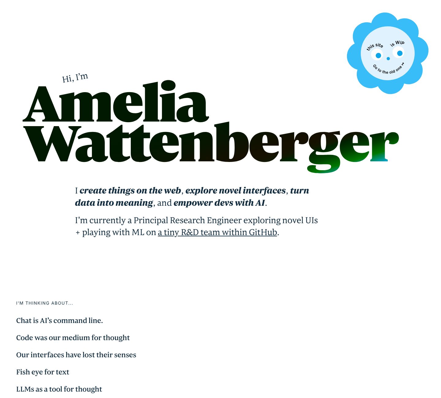
Example Amelia Wattenberger. A first screen that is the name, one line on her craft and one on her current job.
- 1
The name is the headline, set huge after a small “Hi, I’m”. On a personal site the name is the brand, and the visitor knows at once they are in the right place.
- 2
What she does, in four short phrases of her own: create things on the web, explore novel interfaces, turn data into meaning, and help developers with AI.
- 3
What she does now, with a link: a principal research engineer on a tiny R&D team within GitHub. Her level and her employer, in one line.
- 4
Under it, what she is thinking about, as a list of links: chat is AI’s command line, code was our medium for thought. Her ideas come before her CV.
Part 02 / 10
What you are doing now
A personal site can go stale in a year, and visitors notice. A short, dated “now” section or page says what you are working on, reading and thinking about this month. It keeps the site alive with a few lines of writing, and gives a stranger something to start a conversation with.
Where it goes wrongAn about page that still names a job you left two years ago.
Picked for the design and what it says
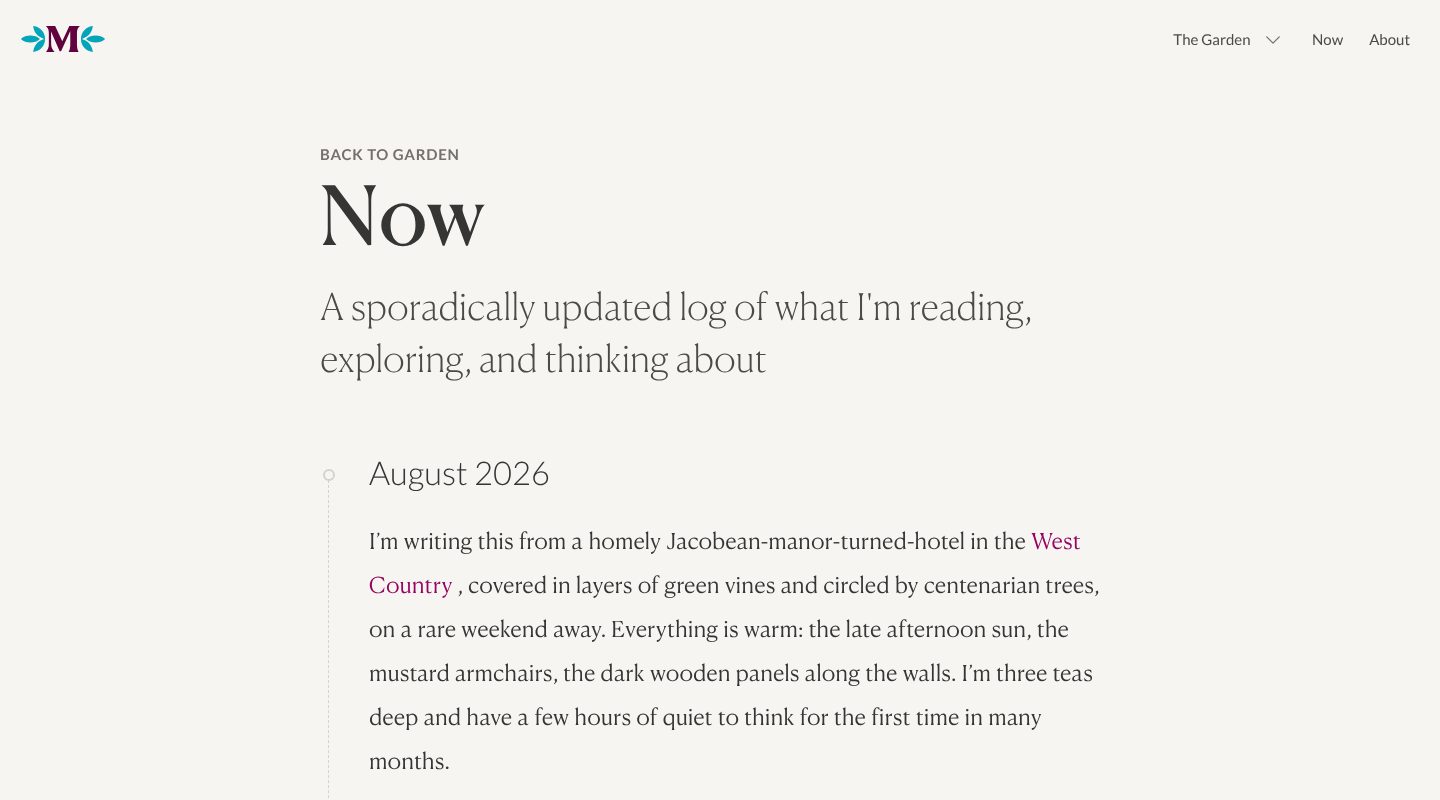
Example Maggie Appleton. A now page kept as a dated log and written like a letter.
- 1
Now has its own place in the main menu, between the garden of her writing and the about page.
- 2
The page says what it is in one line: a log of what she is reading, exploring and thinking about. “Sporadically updated” sets an honest expectation.
- 3
Every entry has a date, August 2026, so a visitor sees at once how fresh it is.
- 4
Then it reads like a letter, about life as well as work: she is writing from a hotel in the West Country on a rare weekend away. A stranger meets a person, not a CV.
Part 03 / 10
Selected work
For developers and designers the work is the proof, and the person hiring wants to see it, not read about it. A short selection, each with a picture, a line on what it is and a number that shows people use it, says more than a list of skills. The rest can wait in an archive.
Where it goes wrongEvery project since university, with no picture and no word on what came of it.
Picked for the design and what it says
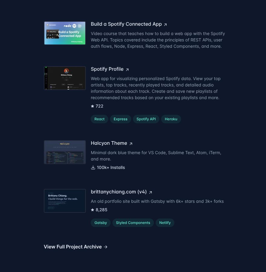
Example Brittany Chiang. Four projects, each with a screenshot and a line on what it is, most with a number that shows people use it.
- 1
A small screenshot of each project. The visitor sees the work before reading a word about it.
- 2
A name and a sentence or two on what it is: a video course on building a web app with the Spotify Web API.
- 3
Proof from the people who use it: 722 stars on GitHub.
- 4
And from a marketplace: 100k+ installs of her editor theme. A number from outside weighs more than any adjective.
- 5
Four projects on the home page, and the rest one link away: view full project archive.
Part 04 / 10
Where you have worked
Names a reader already knows do the convincing for you. A short history with dates, the company, the role and a few lines on what you did there lets a recruiter or a client place you in seconds. Links to the work, and to what others wrote about it, back up each line.
Where it goes wrongJob titles with no company named, or a PDF CV as the only record.
Picked for the design and what it says
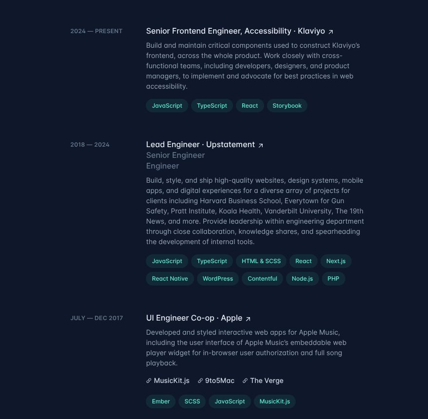
Example Brittany Chiang. A work history as a timeline, with companies, clients and press named.
- 1
The current role first, with the company named: senior frontend engineer for accessibility at Klaviyo.
- 2
Promotions in one place: engineer, senior engineer, then lead engineer at the same agency, Upstatement, from 2018 to 2024.
- 3
The agency years are told through the clients: Harvard Business School, Pratt Institute, Vanderbilt University, The 19th News.
- 4
A name everyone knows, even for a six-month co-op: UI engineer at Apple, working on Apple Music.
- 5
Links to the work and to the press about it: MusicKit.js, 9to5Mac and The Verge. Someone else’s article backs up her line.
Part 05 / 10
Writing, sorted for the reader
Articles are how most strangers find a personal site, because each one answers a question someone searched for. On the home page, the newest pieces with a line on what each teaches, the topics as tags and the most read guides let a visitor choose by interest. A reader who learns something from you remembers your name.
Where it goes wrongA blog sorted only by date, with titles that make sense only to the author.
Picked for the design and what it says
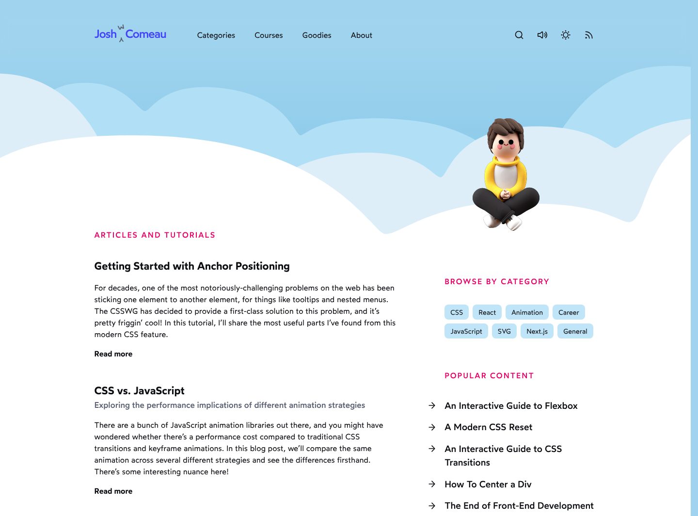
Example Josh W. Comeau. A home page that is the writing: new articles, topics and popular guides, under a playful header.
- 1
Josh himself, as a small 3D figure sitting on the clouds. The site has a face and a sense of humour before the first article.
- 2
The home page opens with the writing, newest first: a title, a short summary and a link to read more.
- 3
Topics as tags beside the list: CSS, React, Animation, Career. A reader goes straight to their subject.
- 4
Popular content, a short list of guides: an interactive guide to flexbox, a modern CSS reset, an interactive guide to CSS transitions. They stay one click from the home page, however much comes after them.
- 5
Each title has a line under it on what the reader will get: the performance implications of different animation strategies.
Part 06 / 10
Talks, with the stage in view
Organisers book speakers who have done it before, and they look for proof before they write. Photos from real stages and a list of talks with the event, the city and the date show a track record at a glance. Where a talk was recorded, the video does the rest.
Where it goes wrongA speaking page with a booking form and not one photo, title or event.
Picked for the design and what it says
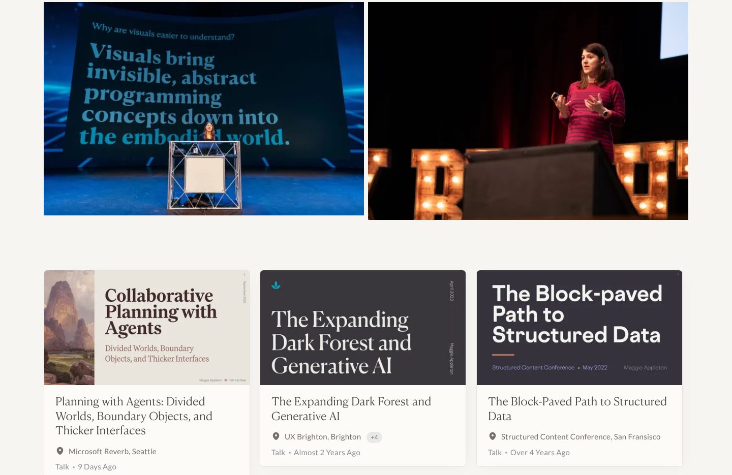
Example Maggie Appleton. Photos from the stage above a wall of talks, each with its event, city and how long ago.
- 1
Photos from the stage: at a lectern below her slide, and mid-talk with a clicker in hand. Proof she has done this, before any list.
- 2
Each talk is a card: the title slide, the name of the talk, the event and the city. The newest, at Microsoft Reverb in Seattle, is nine days old.
- 3
The title slides double as covers and carry the conference and the date: Structured Content Conference, May 2022.
- 4
A small +4 beside UX Brighton: more places on the record for the same talk.
Part 07 / 10
Books, and where to buy them
For an author the book is the offer, and a reader who has to search for a shop may not bother. The bestseller lists, praise from named people and the cover come first, then a button for each shop, so the reader buys where they already have an account. Readers abroad need their editions too.
Where it goes wrongA single Amazon link, or a cover with no way to buy at all.
Picked for the design and what it says
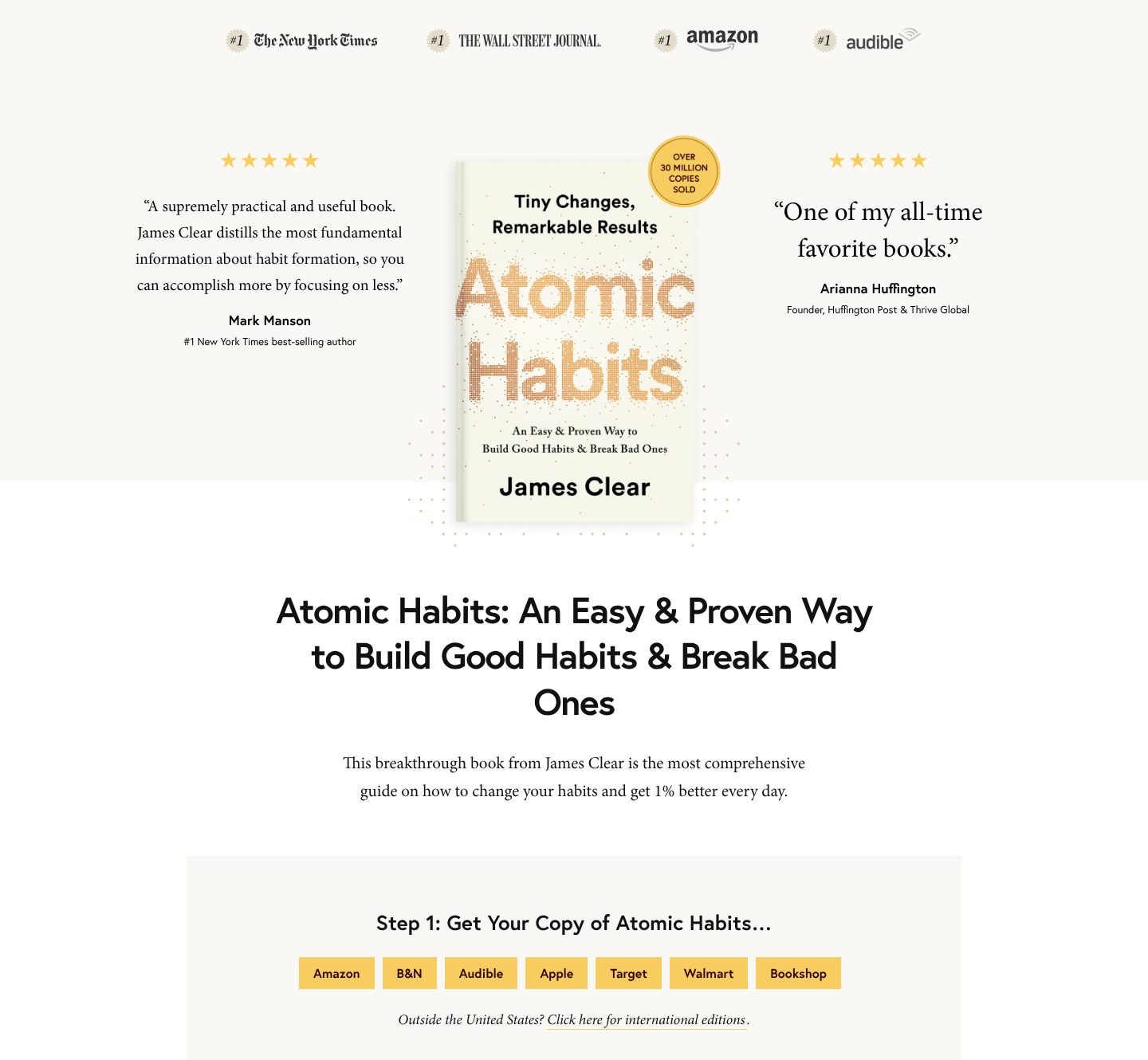
Example James Clear. A book page that stacks the proof around the cover and makes buying step one.
- 1
The bestseller lists come first, as a row of number ones: The New York Times, The Wall Street Journal, Amazon and Audible.
- 2
Praise with a name and a reason to listen: Mark Manson, a number one New York Times best-selling author. Arianna Huffington’s line sits on the other side.
- 3
The cover, large, with one number on a sticker: over 30 million copies sold.
- 4
Buying is step one, with seven shops side by side: Amazon, B&N, Audible, Apple, Target, Walmart and Bookshop.
- 5
A reader outside the United States gets a link to the international editions.
Part 08 / 10
About, told as a story
People follow people, and a story is easier to remember than a list of titles. A short account of where you started, what changed and what you do now, in your own voice and with real photos from each part of it, makes a stranger feel they know you. It should end with a way to go further.
Where it goes wrongA bio in the third person that reads like a conference programme.
Picked for the design and what it says
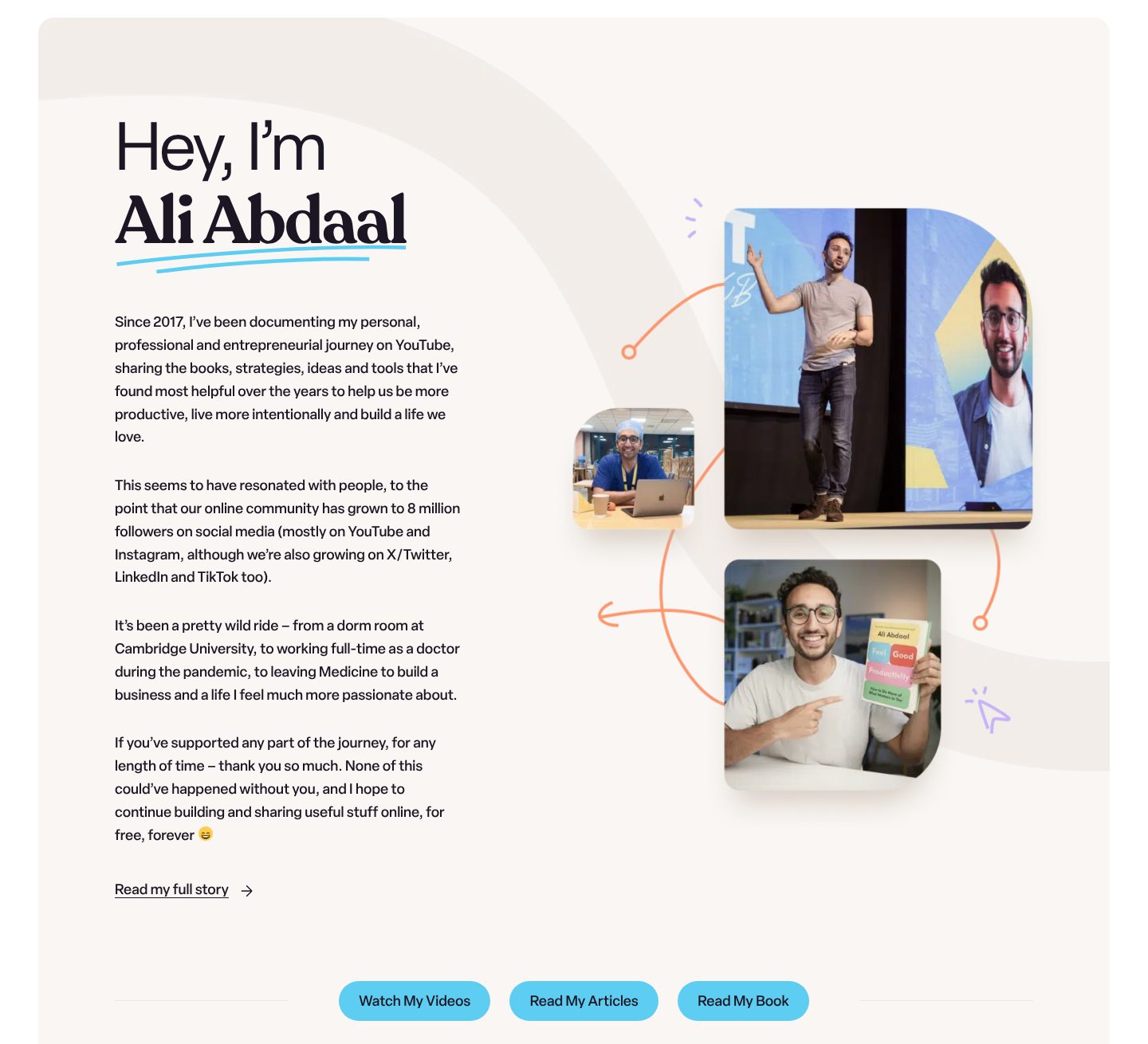
Example Ali Abdaal. An about section in his own voice, from doctor to YouTuber, with photos from each part of the story.
- 1
A greeting, then the name: hey, I’m Ali Abdaal. The section talks to the reader in the first person.
- 2
Real photos from different parts of his life: on stage, in scrubs at a laptop, and holding his book.
- 3
It starts with what he does and since when: documenting his journey on YouTube since 2017, to help people be more productive.
- 4
The turn in the story, in one sentence: from a dorm room at Cambridge, to working as a doctor in the pandemic, to leaving medicine to build a business.
- 5
It ends with three ways to go further: watch his videos, read his articles, read his book.
Part 09 / 10
A newsletter you own
Followers on a platform belong to the platform; an email list belongs to you. A newsletter with a name, a promise of what arrives and how often, and a count of readers turns a single visit into someone who hears from you every week. One field is enough.
Where it goes wrong“Subscribe to my newsletter” in the footer, with no word on what it is or how often it comes.
Picked for the design and what it says
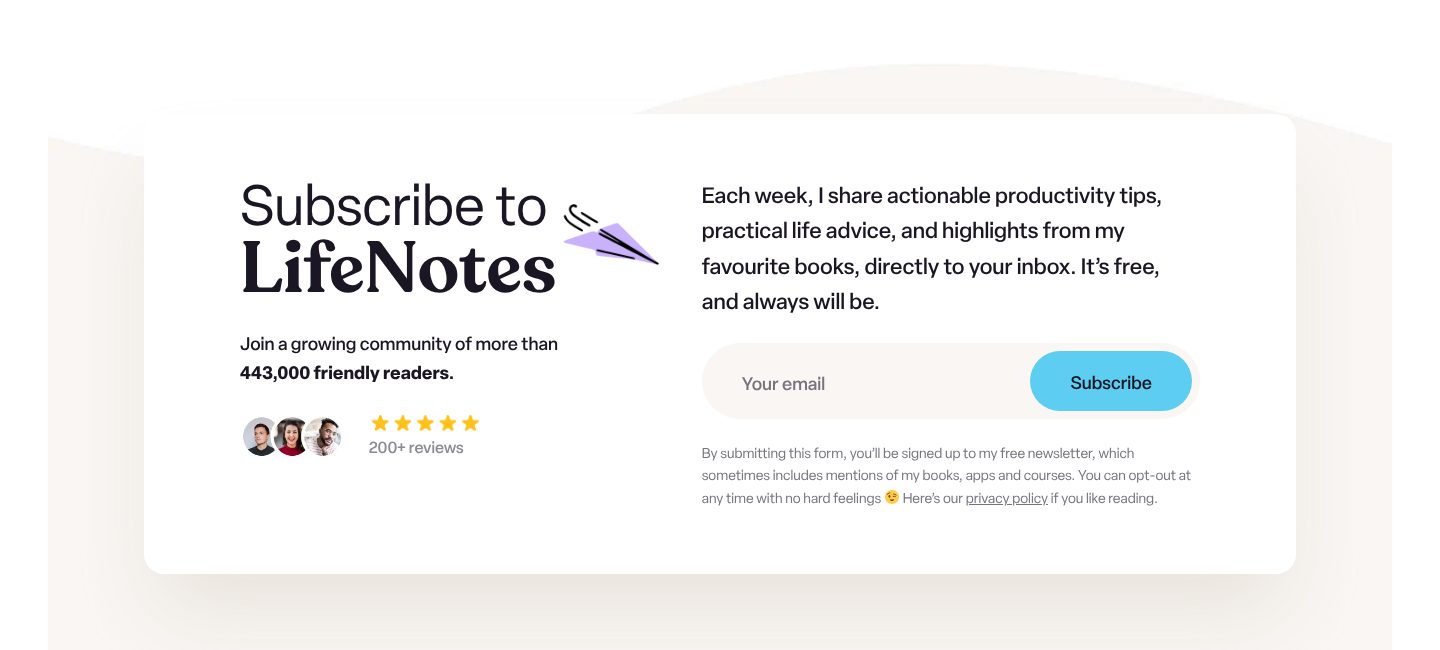
Example Ali Abdaal. A newsletter with a name, a promise, a number and one field.
- 1
The newsletter has a name, LifeNotes. Something with a name is easier to join, and to recommend, than “my newsletter”.
- 2
What arrives and how often, in one sentence: each week, productivity tips, life advice and highlights from his favourite books. Free, and always will be.
- 3
A precise count of readers: more than 443,000. A number that exact reads as true.
- 4
One field and one button. Nothing to fill in but an email address.
- 5
Faces of readers and a rating from them: five stars, from 200+ reviews.
Part 10 / 10
Contact, by reason
A known name gets mail of every kind: press, invitations to speak, partnerships, readers with a question. A separate address for each reason gets the message to the person who handles it, and one form for the rest keeps the inbox in order. Common questions can be sent to answers first.
Where it goes wrongOne contact form for press, bookings and fan mail alike.
Picked for the design and what it says
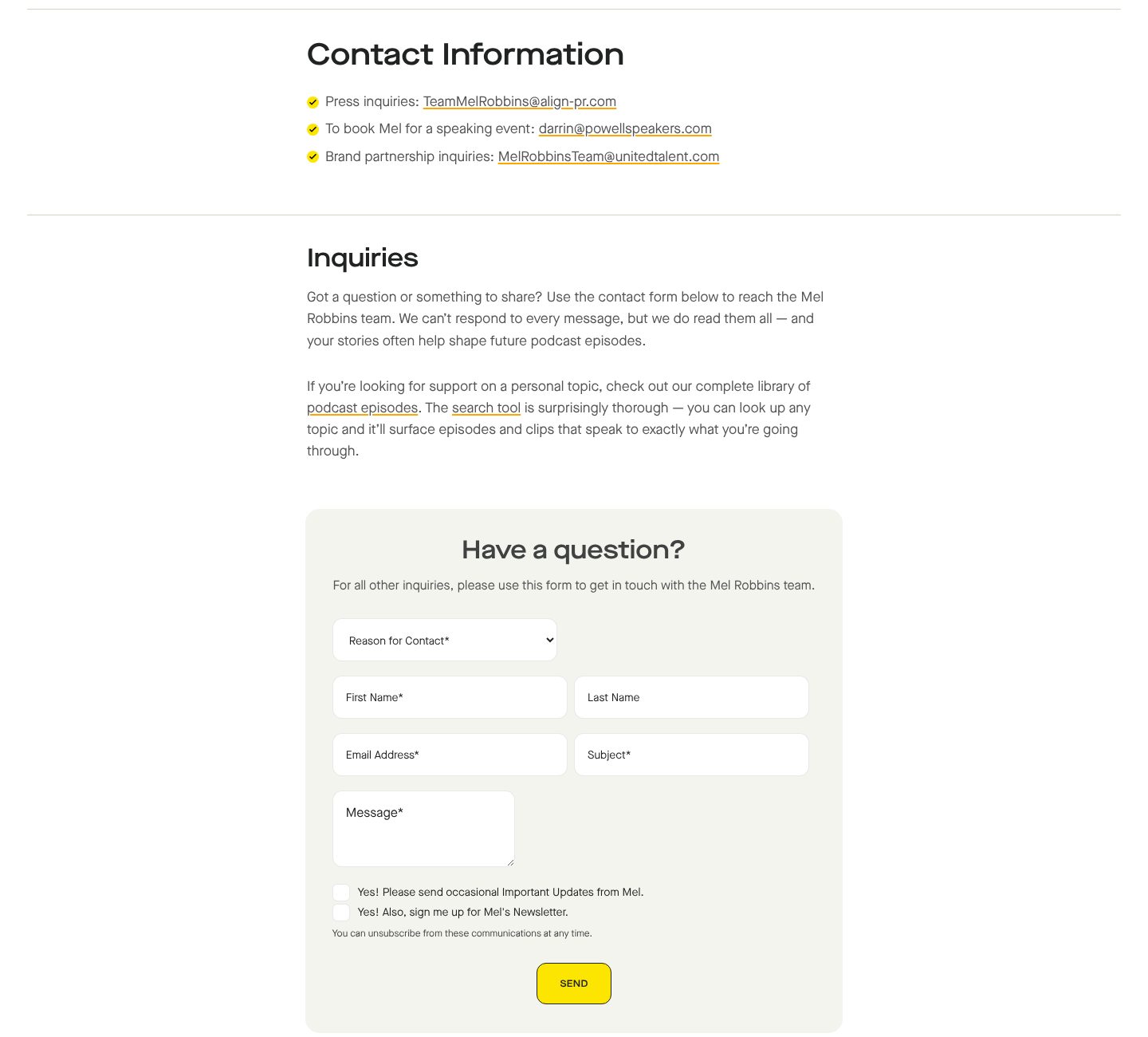
Example Mel Robbins. An address for each reason to write, then a form that asks for the reason first.
- 1
Three reasons, three addresses, written out in full: press, speaking events and brand partnerships.
- 2
A short note before the form: the team cannot answer every message, and the podcast library may already hold the answer.
- 3
Everything else goes to one form, under a plain question: have a question?
- 4
The first field is the reason for contact, before the name.
- 5
Two boxes to tick on the way out, for updates and for her newsletter. A message can also start a subscription.
The examples belong to their owners and are shown to explain an idea; the numbered frames are mine. Screenshots taken on 6 October 2026; the sites may have changed since.
Ask this about your site
Would someone who looks you up know what to do next?
People search for your name after a talk, a post or an introduction, and decide within a minute whether to hire you, invite you or follow you. These questions show whether your site makes that easy.
- 01
Does your first screen say who you are and what you do now?
- 02
Can a visitor see your best work, with proof that people use it?
- 03
Is there anything on the site dated this year?
- 04
Can a reader who is not ready to write to you stay in touch?
- 05
Do a job offer, an invitation to speak and a press request each have a clear way in?
What makes a personal website sell
Lesson 01
Your name is the search
Most visitors arrive having typed your name. The site has to confirm it is you in a second and show first the one thing you want them to know.
Lesson 02
Show the work, not the adjectives
Projects, talks, articles and books with names, numbers and dates convince where “passionate” and “experienced” do not.
Lesson 03
A living site earns trust
A dated now page, a recent talk or last week’s article shows you are active. A site that has not changed in two years makes people wonder what else has stopped.
What you get
A personal site that sounds like you, and that you can keep current.
Designed around your name and your work and built in Webflow, so a project, an article or a new talk goes live without a developer. When the site needs more than Webflow gives, such as interactive demos inside your articles or projects pulled in from GitHub, I build it in code. A fixed price after a short brief.
The pages
A home page built on the parts above, pages for work, writing, talks or books, about, now, and contact.
Work, writing and talks
Projects, articles and talks as CMS collections, so adding one is filling in a form.
Books
A page for each book, with praise, the cover and a button for each shop.
A list you own
A sign-up form connected to your newsletter tool, such as Kit, Beehiiv or Substack.
Found by your name
Titles, descriptions and structured data about you and your work, on pages fast enough for Google.
Help with the words
I shape the structure and edit your text, so it still sounds like you, only clearer.
How a personal website should look and sound
Personal, current and easy to read.
These are rules of thumb. The site itself is built around your brand, your clients and your taste.
Your name as the logo
Your name set well, in a typeface that suits you. On a personal site the name is the brand.
Real photos
Recent photographs of you at work, on stage or at your desk, not stock images.
Your own voice
Write the way you talk: first person, short sentences, your own examples.
Dates in sight
Dates on articles, talks and the now page, so visitors see the site is alive.
Questions
I already have LinkedIn and GitHub. Why a personal site?
Those profiles look like everyone else’s and belong to the platform. A site of your own shows your work the way you choose, and it can be the first thing people find when they search your name.
What if I have only a few projects?
Show two or three well, each with a picture and a line on what came of it. A short selection reads as confidence; a long list of small things does not.
How do I keep it up to date without much time?
A now section and a list of writing or talks take a few lines each. They are CMS items, so an update is filling in a form, and the dates show visitors the site is alive.
I write, speak and build. Do I need a site for each?
Usually one is enough. A home page that says what you do now, with sections for work, writing, talks and books, lets each visitor find their part.
Can I move my blog from another platform?
Yes. Articles from Medium, WordPress or Ghost can be moved into the CMS, with each old address redirected so links keep working.
What it usually takes
New site or redesign
A new Webflow site, or a redesign of the one you have, designed and built by one person. Structure, copy, CMS and launch included.
Service
Technical SEO
Broken links, missing redirects, thin metadata and pages Google skips: found, fixed and checked in Search Console.
Service
Migration to Webflow
Content moves into the CMS, every old URL gets a redirect, and rankings are checked after launch.
Service
Your site
Want me to look at your site?
Next
Sales page
03 / 09