Websites by purpose03 / 09
Sales pages that turn readers into buyers
For course creators, authors and makers who sell one product online. A good sales page answers a buyer’s questions in the order they ask them, and ends with a price they can say yes to.
What goes on a sales page
10 parts, top to bottom. Each one has a job in the sale, and each is shown on a real site that does it well. None of these sites is my work. Most are picked for how they look as well as what they say; the few picked only for what they say are marked.
Part 01 / 10
The promise
The first screen says what the buyer will be able to do afterwards, who it is for, and what it spares them. Most readers decide here whether to scroll at all, so the promise has to be a result they want, not the product’s name. Proof right under it, how many have bought or a name they know, is what makes them keep reading.
Where it goes wrongThe product’s name as the headline. Nobody wants the name; they want the result.
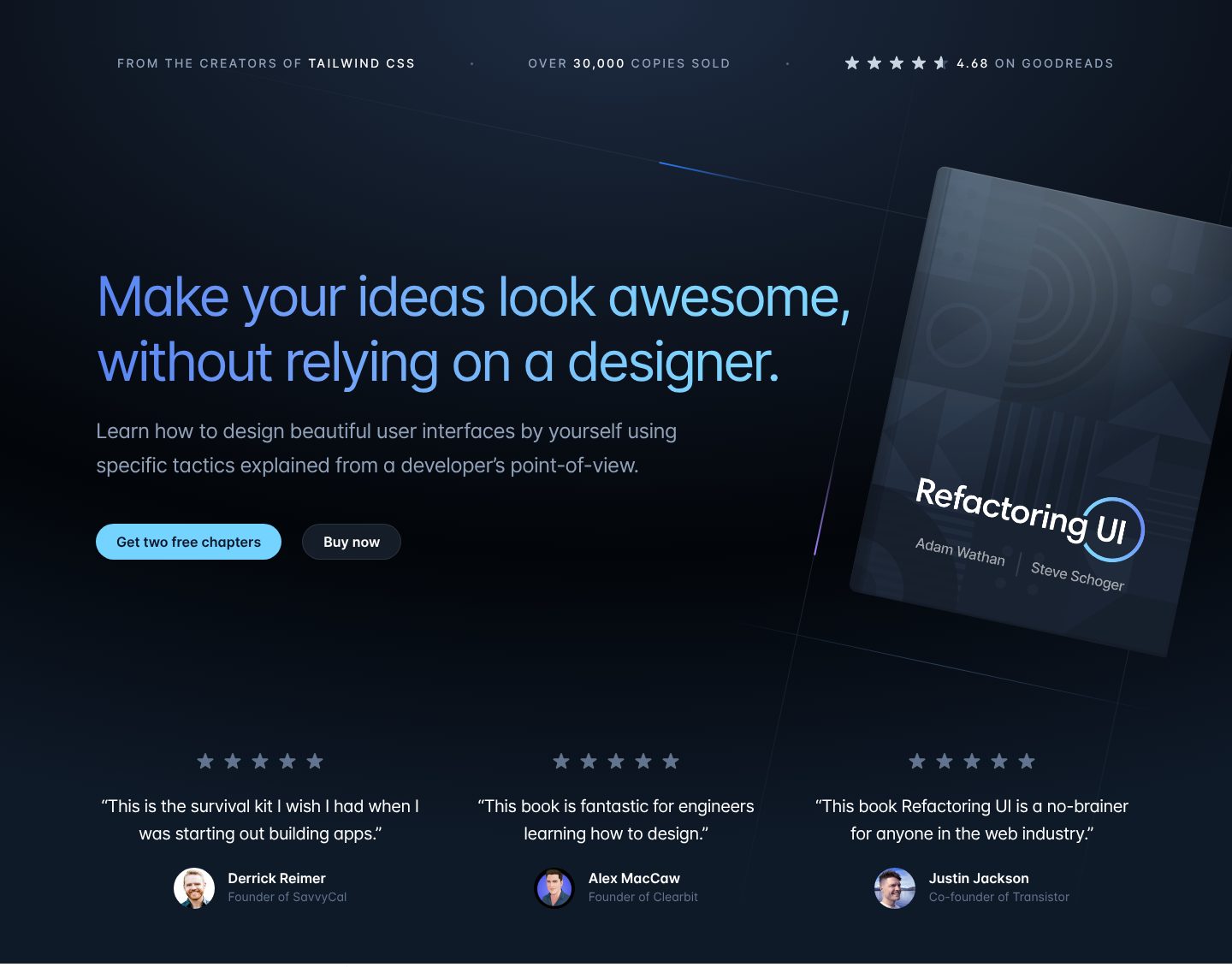
Picked for the design and what it says
Example Refactoring UI. A first screen that sells a design book to developers before they scroll.
- 1
The result and what it spares the reader, in one line: ideas that look good, without a designer. The book’s name is not in the headline at all; it is on the cover beside it.
- 2
Who it is for and how, in plain words: by yourself, with specific tactics, from a developer’s point of view. A developer reads it as written for them, not for designers.
- 3
Two doors: two free chapters for the reader who is not ready to pay, “Buy now” for the one who is. Nobody leaves the first screen without a next step.
- 4
Three kinds of proof in one quiet line, above the headline: who wrote it (the makers of Tailwind CSS, a tool its readers use), how many bought it, and a rating from outside the site. 4.68 reads as real in a way that 5.0 would not.
- 5
Founders of known companies, with faces and names, still on the first screen. Each quote also says who the book is for: engineers, people starting out, anyone in the web industry.
Part 02 / 10
The problem, before the product
People buy a way out of a situation, so the page describes the situation first: what the reader has tried, what keeps going wrong, how it feels. When they recognise themselves, they read the rest as the answer to their problem rather than as an advert.
Where it goes wrongOpening with the product and its features, before the reader knows why they would need it.
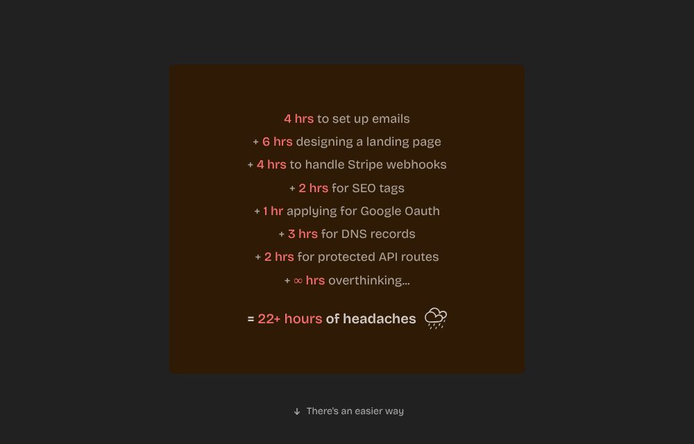
Picked for the design and what it says
Example ShipFast. The problem written as a bill, right before the product appears.
- 1
The reader’s own to-do list, line by line: emails, payments, SEO, DNS. Anyone who has launched an app has done each of these, and remembers how dull they were.
- 2
One joke, and it is the truest line: hours lost overthinking. A little humour shows the author has been in the same place.
- 3
The sum: 22+ hours of headaches. A total turns a vague annoyance into a cost, and the product will be weighed against it.
- 4
Only after the bill, a quiet line: there is an easier way. The product arrives as relief, not as an advert.
Part 03 / 10
The way out
Before the product is named, show that another way exists: one idea, one trick, one before and after. A reader who has seen a piece of the method work believes the rest more easily, and starts to want the whole of it.
Where it goes wrongDescribing the method in big words instead of showing a small piece of it.
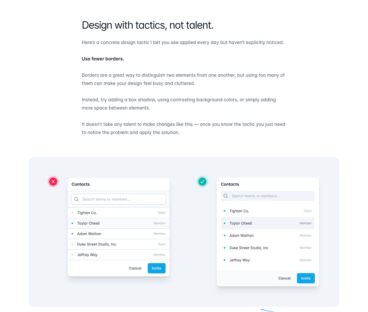
Picked for the design and what it says
Example Refactoring UI. Instead of describing the method, the page teaches one piece of it for free.
- 1
The idea in five words. “Not talent” answers the belief that stops developers from trying design at all: that it takes a gift they do not have.
- 2
One tactic, named in three words. The reader gets something they can use today, before any price is mentioned.
- 3
What goes wrong and what to do instead: shadows, background colours, more space. It is a sample of how the book teaches, so the reader judges the book by reading it.
- 4
The promise, restated as a conclusion the reader has just reached on their own: once you know the tactic, you only need to notice the problem.
- 5
The same box twice, wrong and right, marked with a cross and a tick. The difference shows in a second, and that second is the proof the method works.
Part 04 / 10
What is inside
This part turns a promise into something you can count: modules, lessons, hours, templates, bonuses. Numbers let the buyer weigh the price against what they get, and a clear outline shows that the author has thought the whole thing through.
Where it goes wrong“Everything you need to succeed”, with no list of what that is.
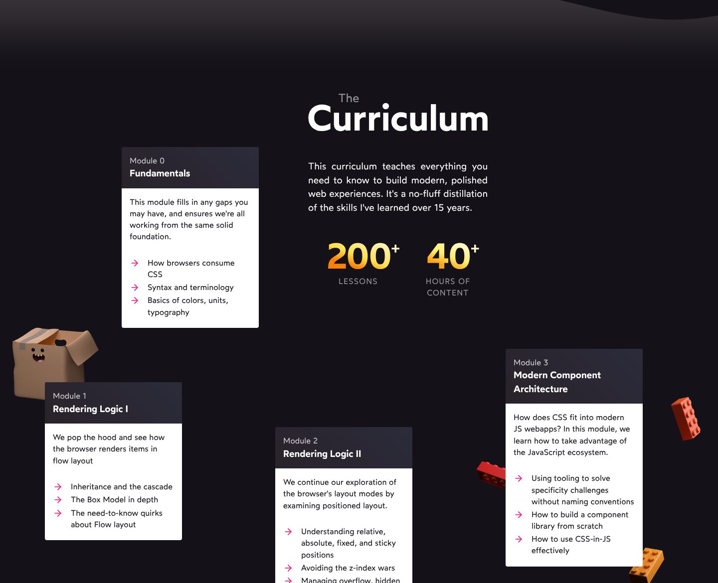
Picked for the design and what it says
Example CSS for JavaScript Developers, Josh Comeau. A course outline you can count, set out like a route.
- 1
One sentence of scope and one of origin: everything you need, distilled from 15 years of work. The second half is why the outline can be trusted.
- 2
Two numbers before any detail: 200+ lessons, 40+ hours. The reader can set them against the price at a glance.
- 3
The numbering starts at 0, with the fundamentals. It answers a doubt most buyers do not say out loud, “am I good enough for this”, by filling the gaps first.
- 4
Three concrete topics per module, in the words a developer uses. A buyer can look for the exact thing they struggle with and find it.
- 5
Modules scattered along the page among playful 3D objects. The outline reads like a route rather than a table of contents, and the tone matches a course that promises CSS can be fun.
Part 05 / 10
Buyers like them
The question now is whether it works for someone like me. Answer it with buyers who have names, faces, roles and results, and with how many people have bought. Readers look for the one story that starts where they are now.
Where it goes wrongFive stars without names, or quotes that only say the course is great.
Picked for the design and what it says
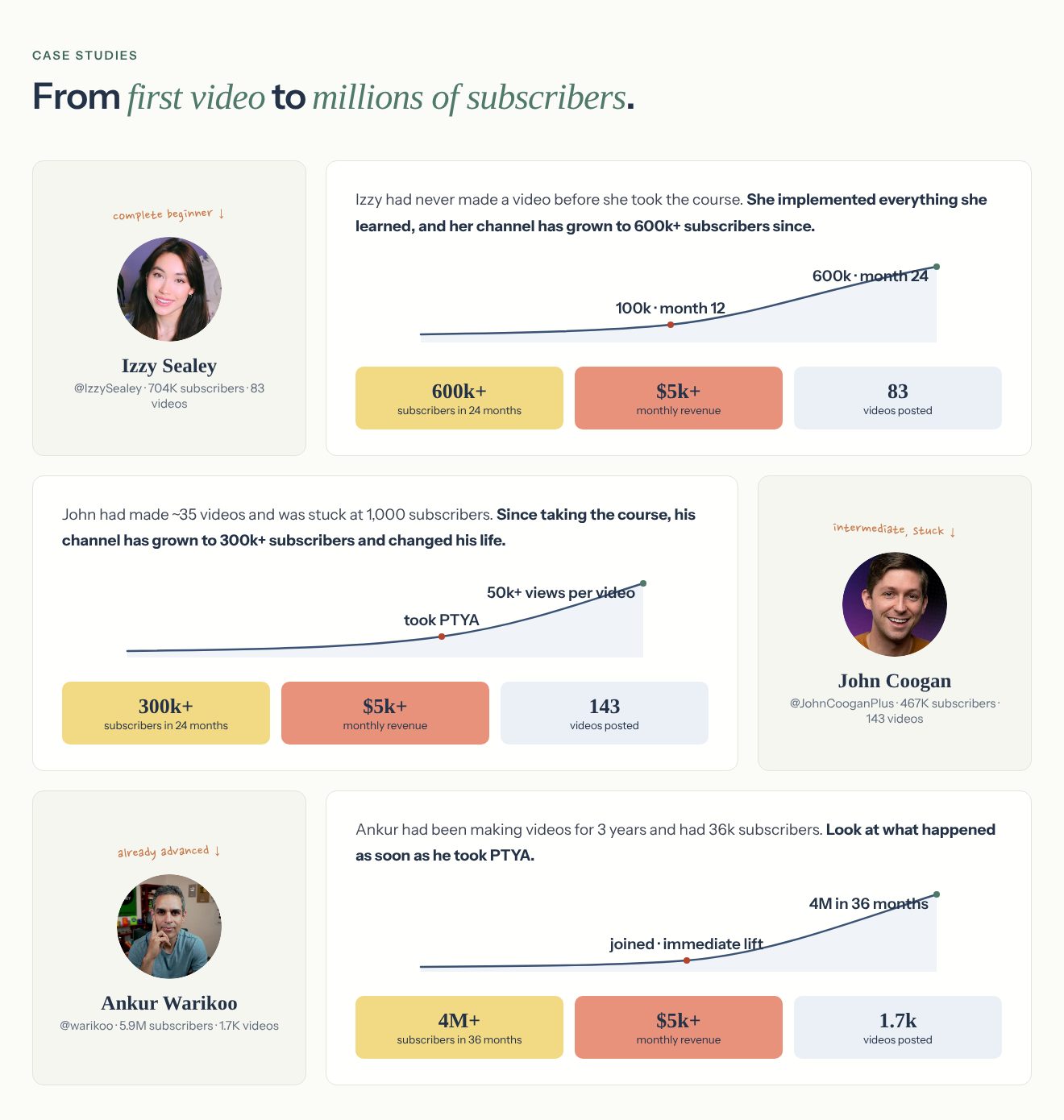
Example Part-Time YouTuber Academy, Ali Abdaal. Three case studies, chosen so that every reader finds their own starting point.
- 1
The heading is a range, from a first video to millions. Whoever is reading has a place somewhere on it.
- 2
A handwritten label says where each person started: complete beginner, intermediate and stuck, already advanced. The reader picks the one that is them.
- 3
A before and an after in one sentence, and the after in bold. The bold part is what a skimmer reads.
- 4
A growth line with dates on it: 100k at month 12, 600k at month 24. A result with a timeline is easier to believe than a result alone.
- 5
Three numbers per person: subscribers, monthly revenue and videos posted. The last one quietly says how much work it took.
Part 06 / 10
Who it is for, and who not
Saying who should not buy sounds like losing sales, and it does the opposite. It shows confidence, keeps refunds down, and lets the right reader say “that is me” with more certainty. The two lists also answer doubts the reader would never write down.
Where it goes wrongA page written for everyone, which ends up speaking to no one.
Picked for what it says, not for the look
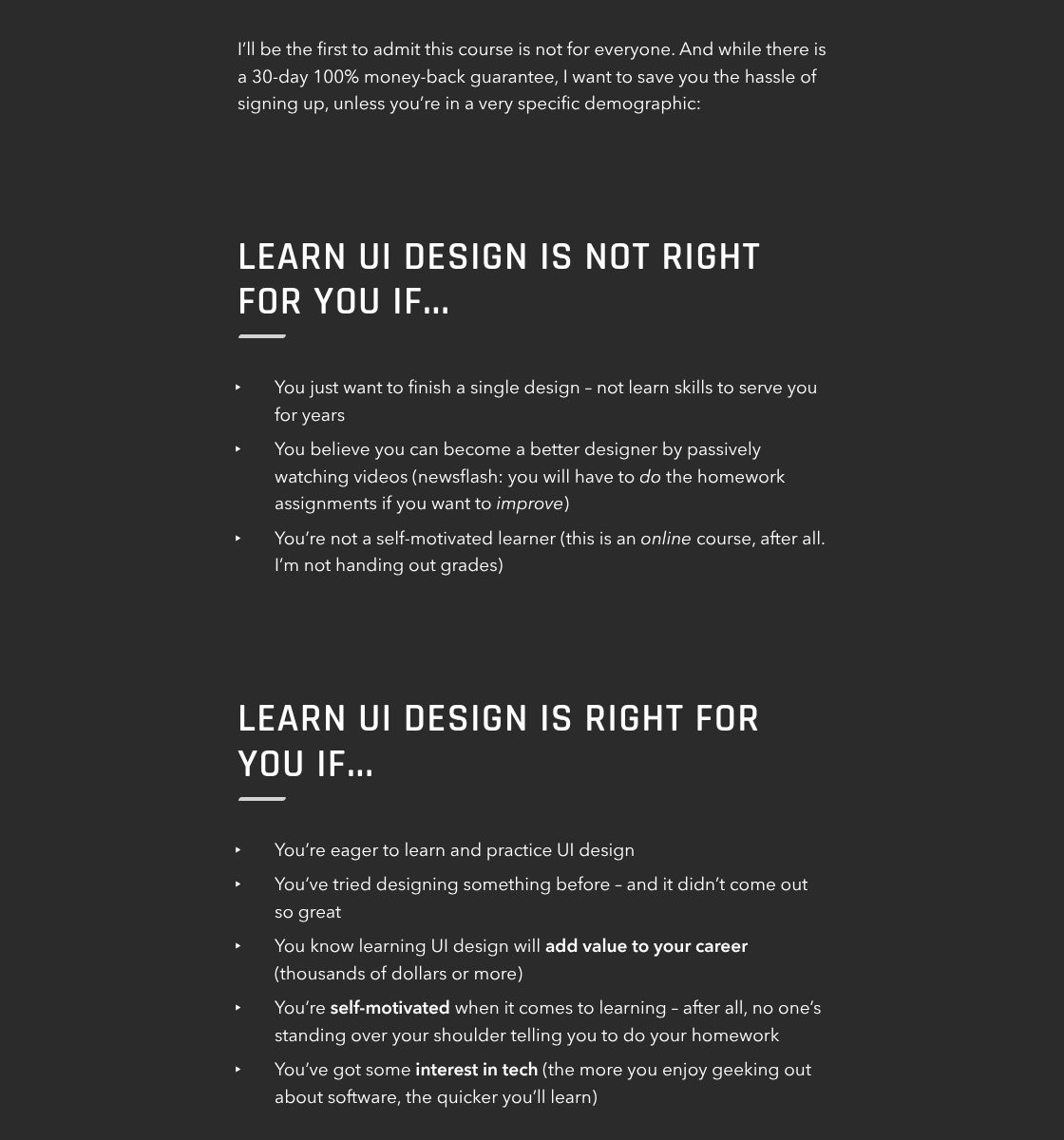
Example Learn UI Design. The author talks some buyers out of the course, and the rest trust him more for it.
- 1
An admission before the lists: this course is not for everyone. He mentions the money-back guarantee and still tries to save the wrong buyer the hassle, which makes everything after it more believable.
- 2
“Not right for you” comes first. The reader checks they are not on that list, then reads the second one already on side.
- 3
Each “not for you” is a real reason people fail at courses: they want one design, or they only watch the videos. These are the buyers most likely to ask for their money back.
- 4
The “right for you” list includes a failure: tried designing, and it did not come out great. The reader is allowed to admit it, and feels understood.
- 5
One line puts a value on the skill: thousands of dollars for a career. The course price will be weighed against that, not against nothing.
Part 07 / 10
Who is behind it
The buyer is trusting a person to teach them, so they want to know why this one. Results say it better than titles: what the author has built, how many people they have taught, where they started. A real photo and their own voice do the rest.
Where it goes wrongA long biography at the top of the page, before anyone cares who wrote it.
Picked for what it says, not for the look
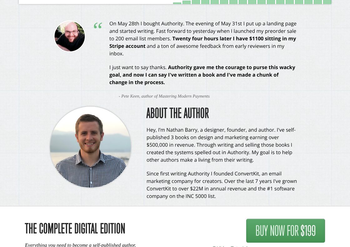
Example Authority, Nathan Barry. The author is introduced late in the page, by his results, right before the price.
- 1
The section opens under a buyer’s story: he started writing three days after buying, and had $1,100 in preorders 24 hours after launch. By the time the author appears, the reader already wants to know who he is.
- 2
A large, friendly photograph. The reader is about to trust this person with their own book.
- 3
Credentials as results in the reader’s own goal: three self-published books, over $500,000 in revenue. That says more to a would-be author than any title would.
- 4
A second, larger result: the company he built for creators. It answers the question behind every course, whether the author has done it himself.
- 5
The first package and its price come straight after. The trust built here is put to use at once.
Part 08 / 10
The price, and the guarantee
The price comes after the value is clear, so it is weighed against what the reader has just seen. Two or three packages make the choice “which one”, not “whether”. A guarantee beside the button moves the risk from the buyer to the seller, and is often the last push a careful reader needs.
Where it goes wrongA price that appears only at checkout, or a guarantee buried in the terms.
Picked for the design and what it says
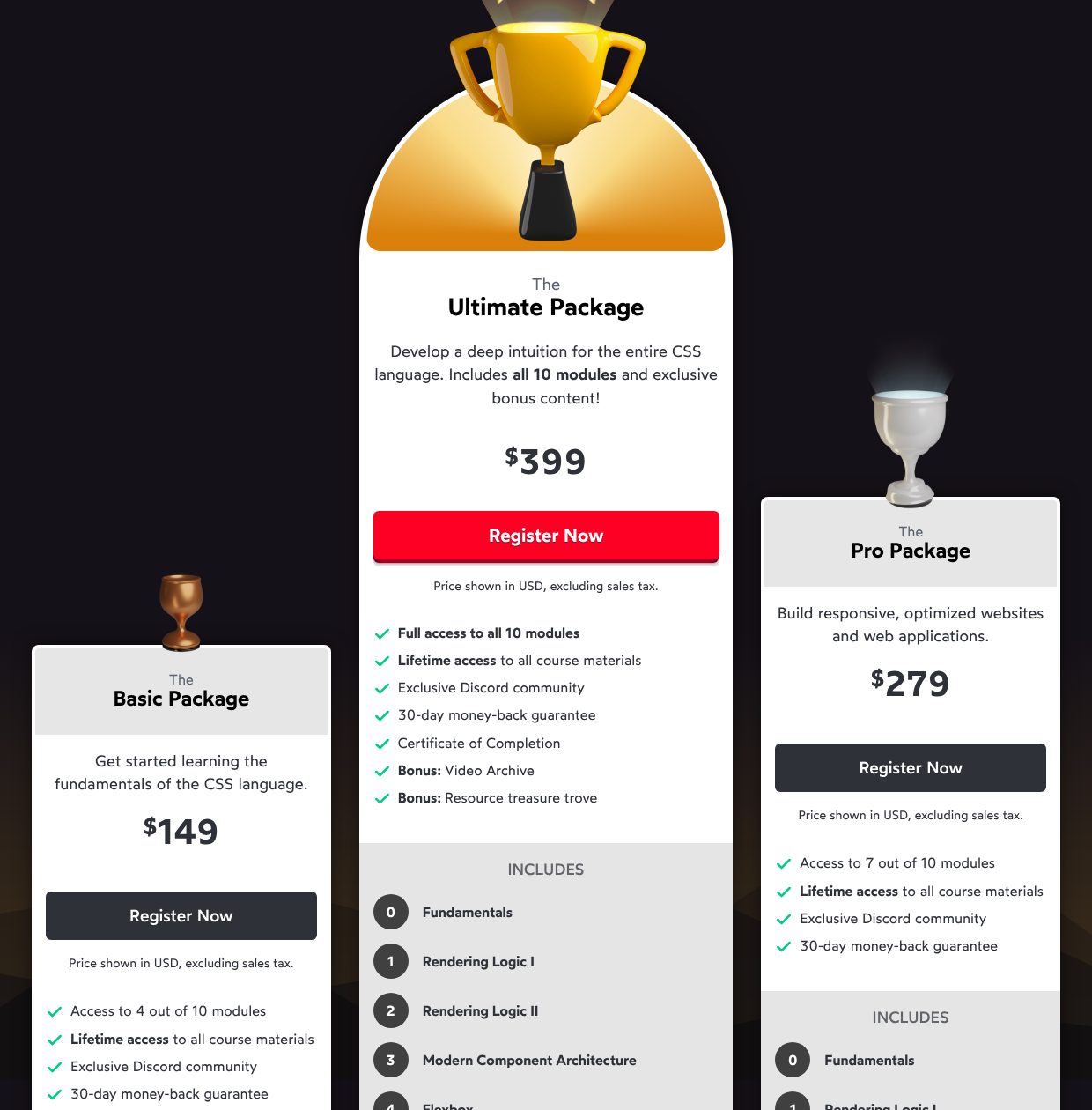
Example CSS for JavaScript Developers, Josh Comeau. Three packages, where the question becomes which one, not whether.
- 1
The most complete package sits in the middle, raised highest, under a gold trophy, with the only red button. The eye lands there first, and the other two read as smaller versions of it.
- 2
Each package says in one line who it is for: the fundamentals, responsive websites and apps, or a deep intuition for the whole language.
- 3
A small line under every button answers the question before checkout: which currency, and whether tax is extra. No surprise at the till.
- 4
The guarantee is a line in every package, right under the button, not a clause hidden in the terms.
- 5
The packages differ by one countable thing: 4, 7 or all 10 modules. The buyer compares numbers, not adjectives.
Part 09 / 10
The last doubts
By now the reader wants to buy and is looking for reasons not to: no time, the wrong level, a boss who has to approve it. Answer those doubts plainly, in the reader’s own words, and close each one.
Where it goes wrongQuestions nobody asks, written to sound good, while the real doubts stay open.
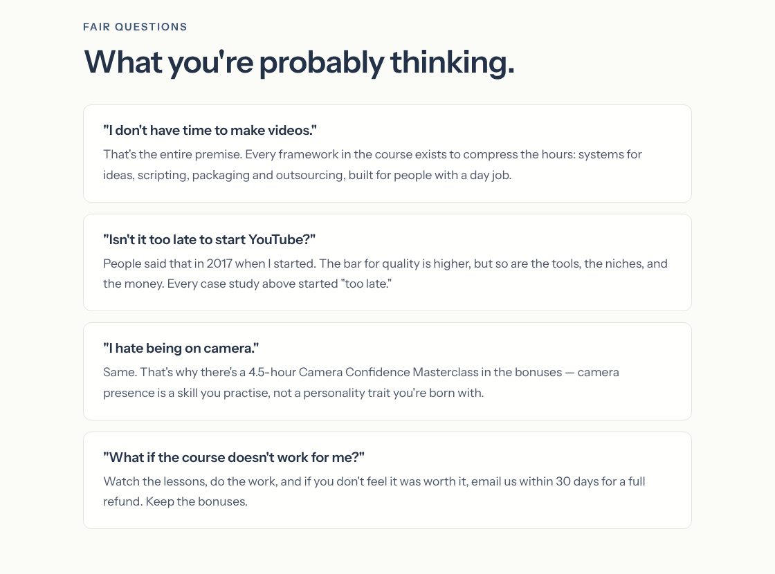
Picked for the design and what it says
Example Part-Time YouTuber Academy, Ali Abdaal. Four objections in the reader’s own voice, each one closed in two sentences.
- 1
The heading names what the reader is doing: looking for reasons not to buy. Calling them fair questions takes the awkwardness out of asking.
- 2
Written as the reader would say it, in quotes: “I don’t have time.” It is exactly the doubt of the buyer this course is for, someone with a day job.
- 3
The answer points back up the page: every case study started “too late”. Proof shown earlier now does a second job.
- 4
It starts with one word: “Same.” Agreeing with the fear before answering it sounds honest, and the answer is something concrete, a masterclass in the bonuses.
- 5
The last doubt is the risk itself, answered with the guarantee and one more line: keep the bonuses. The doubts end where the decision is made.
Part 10 / 10
The last call
Many readers scroll to the end before they decide. The end of the page repeats the promise, the price and the button, so nobody has to scroll back up to buy.
Where it goes wrongA page that simply stops after the questions, with no button in sight.
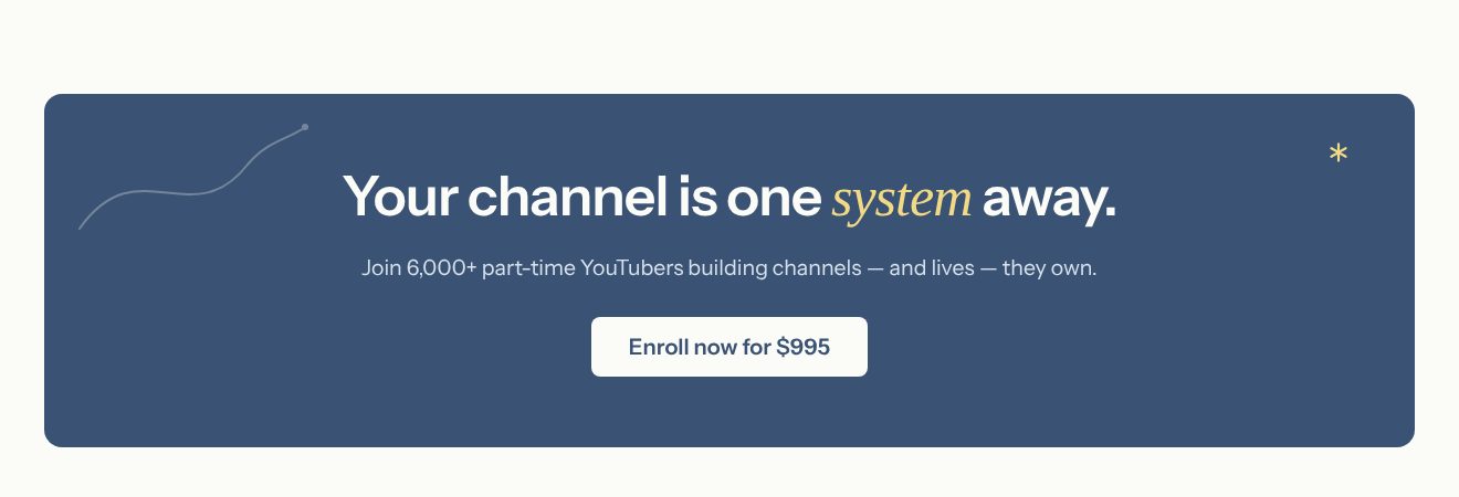
Picked for the design and what it says
Example Part-Time YouTuber Academy, Ali Abdaal. The end of the page repeats the promise, the number and the price, and offers one button.
- 1
The promise once more, in a new form: one system away. “System” is the word the whole page uses for its method, so the last line ties the argument together.
- 2
The number again, 6,000+, with a name for the group: part-time YouTubers. The reader is invited to join people like them, not to buy a course.
- 3
The price is on the button, as it was on the first screen. Nobody clicks and then meets a surprise.
- 4
Nothing else in the box: no links, no second offer. One decision is left, and one way to make it.
The examples belong to their owners and are shown to explain an idea; the numbered frames are mine. Screenshots taken on 6 October 2026; the sites may have changed since.
Ask this about your site
Does your sales page answer the buyer before they ask?
A buyer reads a sales page with a list of questions in their head. These show whether yours gets them to yes, or leaves them to email you.
- 01
Does the first screen say what the buyer will be able to do, not what the product is called?
- 02
Would a reader recognise their own problem before they see the product?
- 03
Can they count what they get: lessons, hours, files, sessions?
- 04
Are there buyers with names and faces who started where the reader is now?
- 05
Is the price easy to find, with the guarantee right beside the button?
What makes a sales page sell
Lesson 01
Questions in the right order
A buyer’s questions come in a fixed order: is this for me, does it work, what do I get, how much, what if it does not. A page that follows that order feels like a conversation; one that jumps around feels like a pitch.
Lesson 02
Long, but never slow
The higher the price, the more there is to explain, so good sales pages are long. They stay easy to read by coming in short parts, each with a heading that tells a skimmer where they are.
Lesson 03
One page, one button
Every button leads to the same place, the checkout, with the same words on it. A reader who has decided to buy should never have to choose where to click.
What you get
A sales page that sells, connected to the checkout you already use.
Designed around your product and built in Webflow, so a new testimonial, a new price or a new date goes live without me. When the page needs more than Webflow gives, such as a members’ area or a price calculator, I build it in code. A fixed price after a short brief.
The page
Every part above, in the order your buyer needs it, from the promise to the last call.
Checkout
Buttons connected to the checkout you use, such as Stripe, Lemon Squeezy, Gumroad or Kajabi. Your course or product stays where it is.
Testimonials you can add
Buyer stories as a CMS collection, so a new one goes live by filling in a form.
For readers not ready yet
A sign-up form connected to your email tool, such as Kit, Mailchimp or Beehiiv, so a reader who leaves today hears about the next launch.
Fast on a phone
Many readers come from a post or an email on their phone, so the page loads quickly and reads well on a small screen.
Help with the words
I shape the order of the page and edit your text, so it still sounds like you, only clearer.
How a sales page should look and sound
Clear, easy to read, and about one thing.
These are rules of thumb. The site itself is built around your brand, your clients and your taste.
Text that reads easily
A comfortable size, short lines and a heading every few paragraphs. A long page is fine; a hard one is not.
The product, shown
Real screens, pages and lessons instead of stock photos. Buyers want to see what they are paying for.
Calm, not loud
No countdowns that reset, no rows of exclamation marks. Confidence sells better than pressure, and buyers remember which one they got.
The same button, all the way down
One label and one colour for the buy button, repeated wherever a reader might decide.
Questions
Should the sales page sit on my main site or on its own?
Usually on your main site, at its own address, such as yoursite.com/course. It borrows the trust of your name, and readers can still check who you are. The menu on the page itself stays small, so the button stays the main way forward.
How long should it be?
As long as the buyer’s questions. A 20 dollar template needs a screen or two; a 1,000 dollar programme needs every part above.
I am launching soon and have no testimonials yet. What goes there?
Results from a beta group or early readers, your own results with the method, or words from people who know your work. Add buyer stories as they come in; the page is built for it.
Can I change the price or add a testimonial myself?
Yes. Prices, packages and testimonials are content you can edit, so a change is filling in a form.
Does my course or my checkout move to Webflow?
No. The course stays on the platform it is on, and payments stay with your checkout. The page sends buyers there.
What it usually takes
New pages and CMS templates
Landing pages, subpages and CMS templates, built from your Figma file or extended from what the site already has.
Service
New site or redesign
A new Webflow site, or a redesign of the one you have, designed and built by one person. Structure, copy, CMS and launch included.
Service
Integrations
Your Webflow site connected to the tools the company already runs on: forms into the CRM, analytics that measures the right things, and consent that holds tags back.
Service
Your site
Want me to look at your site?
Next
B2B website
04 / 09