Websites by purpose04 / 09
B2B websites that bring in enquiries
For agencies, studios and consultancies that sell services to businesses. A good B2B site lets buyers do their homework alone: they see who you work with, what it takes to start, and what happens after they write.
What goes on a B2B website
10 parts, top to bottom. Each one has a job in the sale, and each is shown on a real site that does it well. None of these sites is my work. Most are picked for how they look as well as what they say; the few picked only for what they say are marked.
Part 01 / 10
Who you work with, and the result
B2B buyers arrive with a shortlist and little time. The first screen names the kind of company you serve and the result you bring, and shows that you have done it before, so the right buyer knows in seconds they are in the right place.
Where it goes wrong“Innovative solutions for forward-thinking businesses”, which says nothing about whom you help.
Picked for the design and what it says
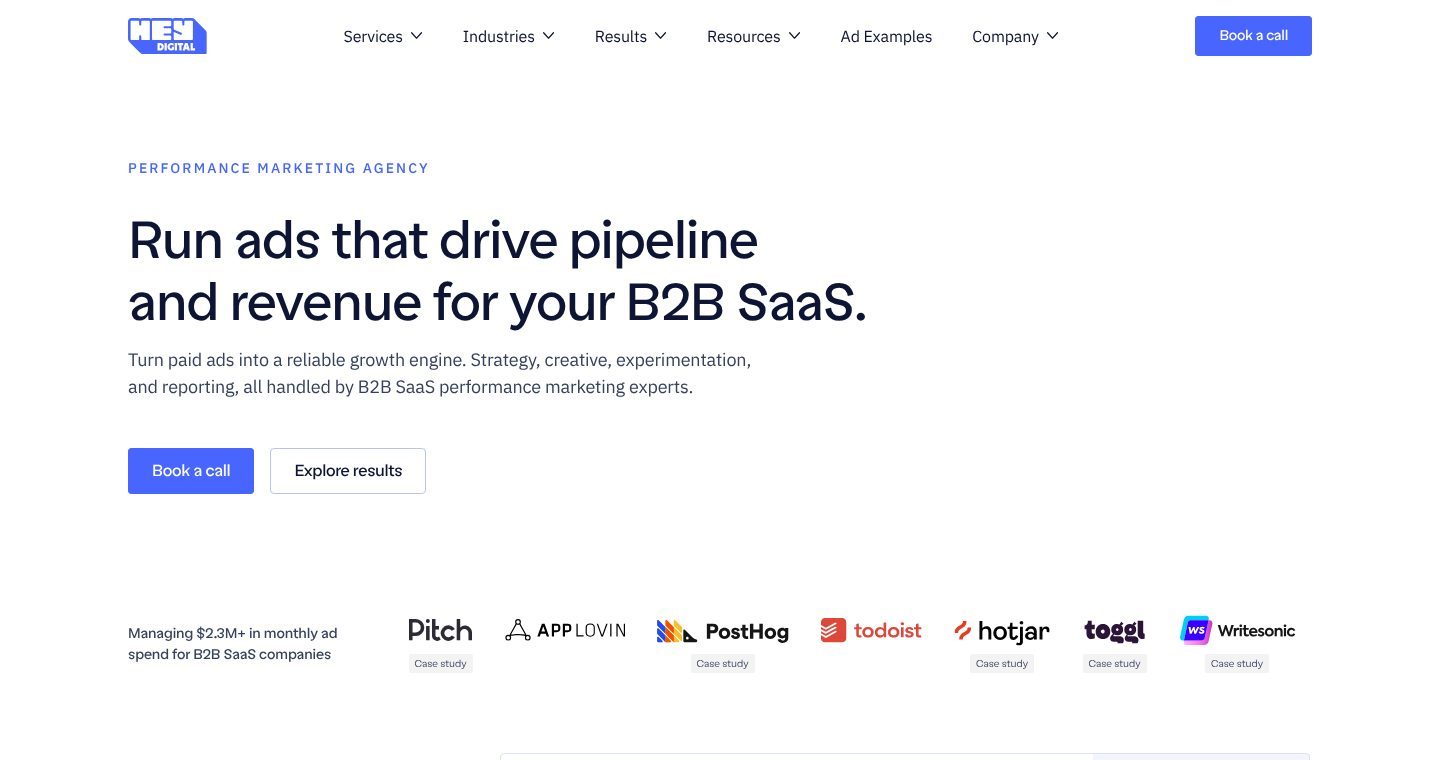
Example Hey Digital. A first screen that names the buyer, the result and the proof before any scrolling.
- 1
What they are, in a small label. The headline itself is kept for the buyer’s result.
- 2
The result and the buyer in one sentence: pipeline and revenue, for B2B SaaS. A founder of a consumer app knows at once this is not for them, and that is the point.
- 3
How, in one line: strategy, creative, experiments and reporting, done by B2B SaaS specialists. The services are listed; the specialism is the reason to trust them.
- 4
Two next steps for two kinds of visitor: book a call if you are ready, explore results if you need proof first.
- 5
Proof still on the first screen: $2.3M+ of monthly ad spend under management, then client logos with a “case study” link under each. A logo with a story behind it is worth more than a logo alone.
Part 02 / 10
Proof at a glance
Before reading, buyers look for signs that companies like theirs already trust you. A few numbers about your clients and names they recognise give a buying committee something to point at when someone asks who else works with you.
Where it goes wrongA wall of logos with no context: no numbers, no hint of what you did for them.
Picked for the design and what it says
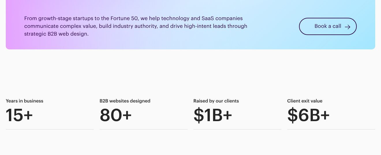
Example Ramotion. Four numbers, two about the agency and two about how far its clients went.
- 1
Who they serve, as a range: from growth-stage startups to the Fortune 50, in technology and SaaS. Then what the site has to do for them: explain complex value and bring in high-intent leads.
- 2
One button beside the summary, in plain words: book a call.
- 3
Experience in two numbers: 15+ years and 80+ B2B websites. The second matters more, because it counts work of exactly the kind the buyer wants.
- 4
Proof measured in the clients’ success, not the agency’s: $1B+ raised by the companies it worked for. For a startup buyer, that is the number that counts.
- 5
And how far those clients went: $6B+ in exits. The buyer sees companies like theirs that went all the way.
Part 03 / 10
Problems they recognise
Companies rarely shop for a service; they look for a way out of a situation. Describe those situations in the words used in their own meetings, and the reader starts forwarding the page to colleagues.
Where it goes wrongA list of your capabilities, before the reader has seen their own problem.
Picked for the design and what it says
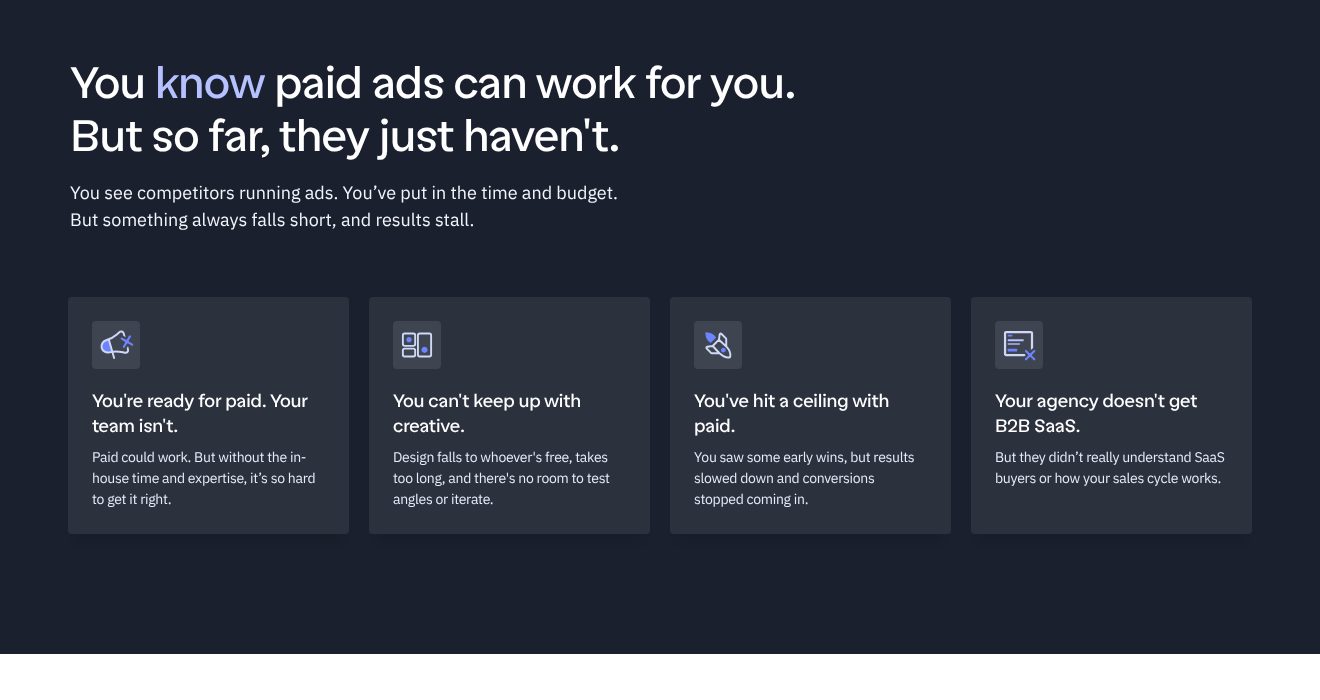
Example Hey Digital. Four situations a SaaS marketing team lives through, each in one headline and one line.
- 1
The heading says what the reader already suspects: paid ads can work, and for them they have not. It agrees with them before it sells anything.
- 2
Two plain sentences about where they are: competitors running ads, time and budget spent, results stalled.
- 3
Each card is a headline the reader could have said themselves: ready for paid, but the team is not.
- 4
Then the cause in one line: design falls to whoever is free and takes too long. The reader recognises the meeting where that was said.
- 5
The last card names the competitor: an agency that never understood SaaS buyers. It sets up why this one works only with B2B SaaS.
Part 04 / 10
Services, each with a result
Each service should say what it changes and show one result beside it. A buyer comparing three firms remembers the one that proved every claim on the spot.
Where it goes wrongServices listed as skills, such as “SEO, content, strategy”, with no outcome attached.
Picked for the design and what it says
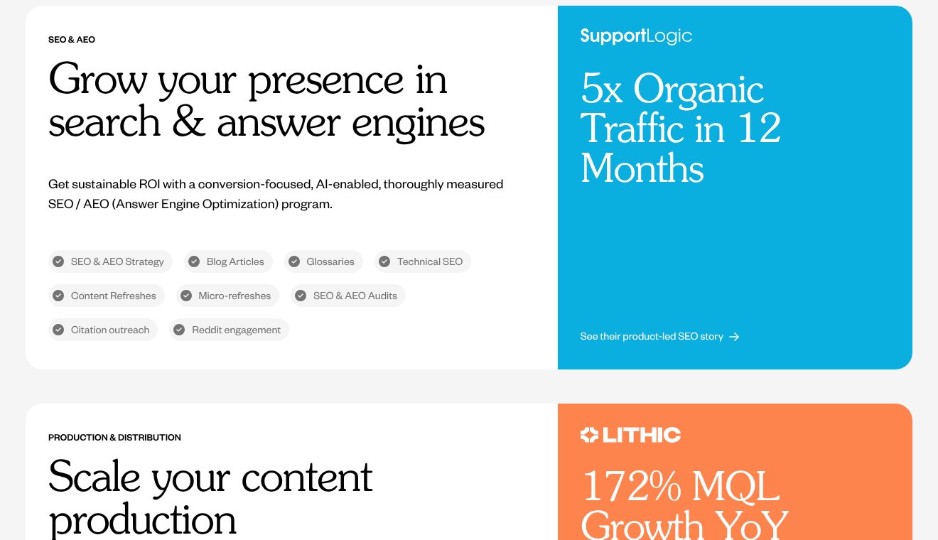
Example Animalz. Every service card carries a client result in its right half.
- 1
The service is named by its goal, growing your presence in search and answer engines, with the technical name only in the small label above.
- 2
What is included, as short tags: strategy, articles, technical SEO, audits. A buyer can check it against their own list in seconds.
- 3
Right beside the service, a client and a number: SupportLogic, 5x organic traffic in 12 months. The claim on the left is proven on the right before the reader moves on.
- 4
A link to the full story for whoever needs more, often the colleague the reader forwards it to.
- 5
The next service repeats the pattern: Lithic, 172% more marketing-qualified leads year on year. Every service gets its proof.
Part 05 / 10
Case studies with numbers
Case studies are what an internal champion forwards to the boss. Each needs a client name, a time frame and two or three numbers, so the result survives being read by someone who has never heard of you.
Where it goes wrongA story about partnership and passion, with no number anywhere.
Picked for the design and what it says
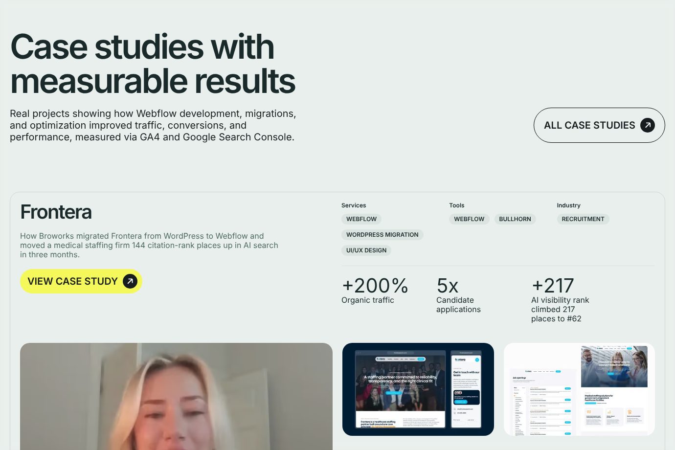
Example Broworks. A case study card with the project, the tags, three numbers and the client on video.
- 1
The heading promises measurable results, and the line under it says how they were measured: Google Analytics and Search Console. A claim with its source is harder to wave away.
- 2
Each case opens with what was done, for whom and how fast: a move from WordPress, for a medical staffing firm, in three months.
- 3
Services, tools and industry as tags. A buyer checks in seconds whether the case is close to their own project.
- 4
Three results in large type, each with what it measures: +200% organic traffic, 5x candidate applications, 217 places up in AI search.
- 5
Beside the numbers, the client on video. The numbers say what changed; the face says it really happened.
Part 06 / 10
Why you, instead of the alternatives
A B2B buyer rarely compares you only with other firms. They compare you with hiring, with freelancers, with keeping things as they are. Put those options side by side on what the buyer cares about, and you answer the question the committee will ask first.
Where it goes wrongPretending the only alternative is another firm just like yours.
Picked for the design and what it says
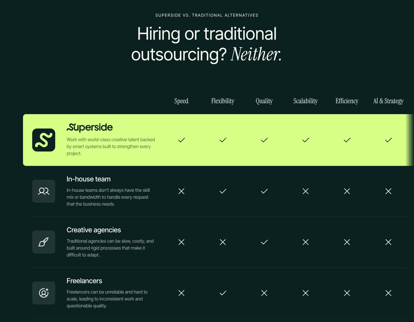
Example Superside. A table that sets the service against hiring, agencies and freelancers.
- 1
The heading names the choice the buyer is really making, hiring or outsourcing, and answers it in one word: neither. The firm places itself as a third option, not as one more agency.
- 2
The firm chooses what to compare on: speed, flexibility, quality, scale, efficiency, AI and strategy. Whoever sets the criteria usually wins the comparison.
- 3
Its own row in lime, with a tick in every column. The eye lands there first, and one glance carries the conclusion.
- 4
Each alternative gets a fair description and a tick where it wins: an in-house team scores on flexibility and quality. The table looks honest, so its conclusion is believed.
- 5
Freelancers, agencies and in-house teams are described in the buyer’s own complaints: unreliable, slow, short of hands. These are the reasons people start looking.
Part 07 / 10
How the work goes
Buying a service means trusting a process you cannot see yet. A few steps, each with what happens in it, make the work feel planned and give the buyer words to explain it inside their company.
Where it goes wrongA trademarked methodology with a clever name and no word on what happens in the first week.
Picked for the design and what it says
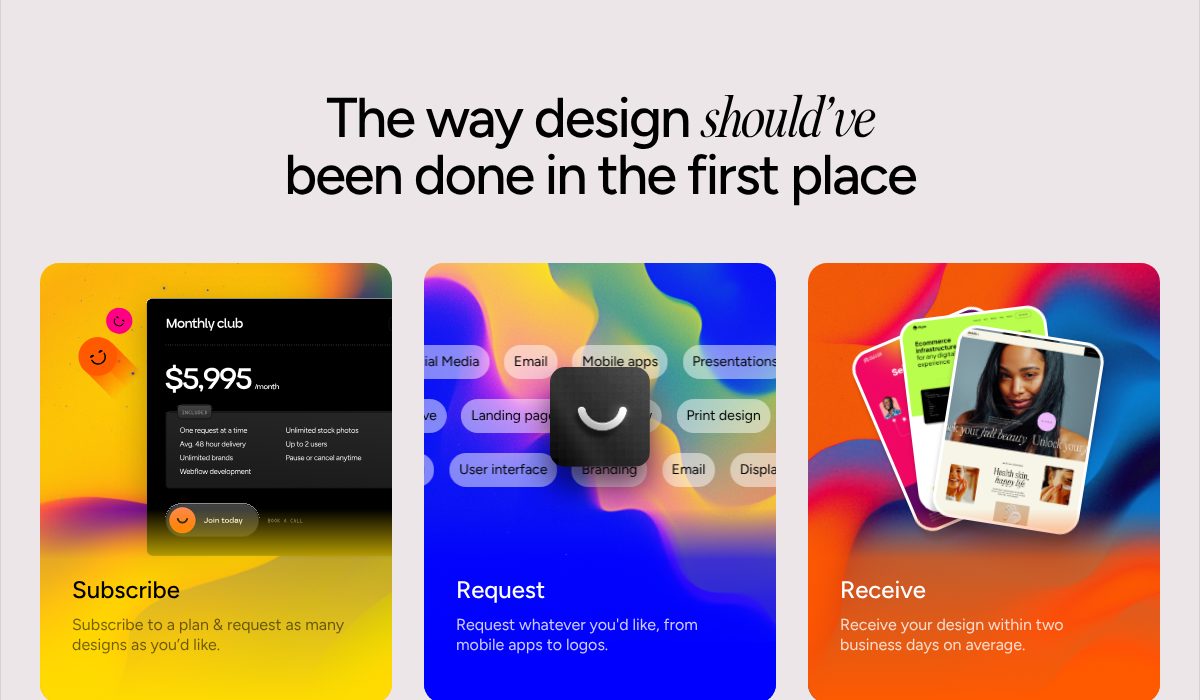
Example Designjoy. The whole way of working in three cards, with the price inside the first one.
- 1
The heading promises a better way of working, not better design. For a buyer worn out by slow agencies, the process is the product.
- 2
The price sits inside the first step: $5,995 a month, with what it covers. The cost reads as part of how it works, not as a hurdle at the end.
- 3
Step one in one verb: subscribe. A plan instead of a proposal.
- 4
Step two answers the scope question in a line: request anything, from mobile apps to logos.
- 5
Step three carries the promise with a number: designs within two business days on average. Speed is the reason to choose this over hiring.
Part 08 / 10
The people they will talk to
Companies hire firms, but they work with people. Names, faces and roles of the people a buyer will actually speak to turn the first contact into a conversation instead of a ticket in a queue.
Where it goes wrongA contact page with a form and no person anywhere on it.
Picked for the design and what it says
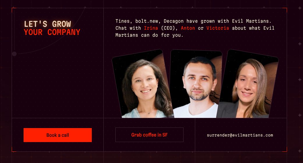
Example Evil Martians. Three named people to talk to, and three ways to start.
- 1
Proof and people in one sentence: the clients who grew with them, then three names to talk to, one of them the CEO.
- 2
Three faces under those names. A buyer sees who will answer before writing, and the first message gets easier to send.
- 3
The main way in, in the brightest colour on the page: book a call.
- 4
A warmer second door for buyers nearby: coffee in San Francisco. Not every buyer wants to start with a sales call.
- 5
And a plain email address, with a joke in it: surrender@. For the buyer who would rather just write.
Part 09 / 10
Prices, or where they start
Buyers look for price before almost anything else, and move on when they cannot find it. Packages with a starting price, the buyer each one is for and what is included let a company budget before the first call.
Where it goes wrong“Contact us for a quote” as the only word on price.
Picked for the design and what it says
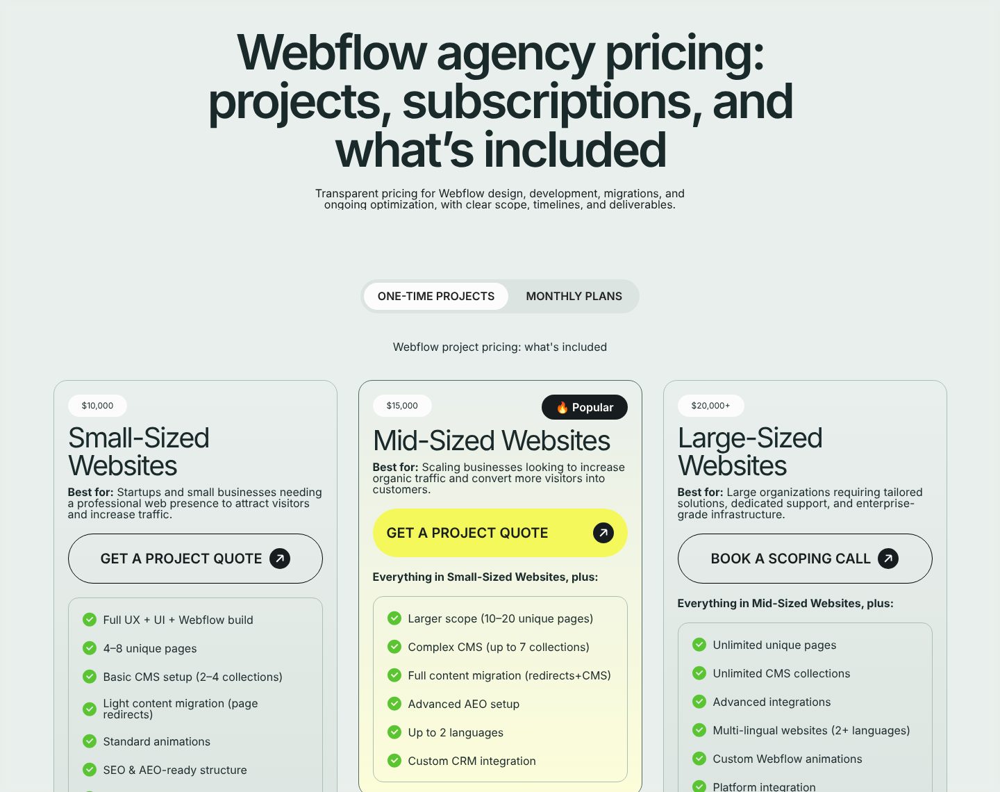
Example Broworks. Three packages with starting prices, the buyer each is for, and what is included.
- 1
Pricing in the headline, with what is included. The page answers the question most agencies leave for the call.
- 2
Two ways to buy, one click apart: one-off projects or monthly plans. The buyer picks the model before the price.
- 3
Each package opens with its starting price, before its name: $10,000, $15,000, $20,000+. Budget is the first filter, so it comes first.
- 4
“Best for” names the buyer: startups and small businesses with a professional presence to build. The buyer finds their size without reading the feature list.
- 5
The button changes with the size: a quote for small and mid-sized sites, a scoping call for large ones. Bigger projects start with a conversation, and the page says so.
Part 10 / 10
A form that says what the call will cover
The form is where interest becomes an enquiry, or nothing. Say what the first call will cover, ask what you need to make it useful, and put proof next to the button, so sending feels safe.
Where it goes wrongA bare “Contact us” form with no word on what happens after you press send.
Picked for the design and what it says
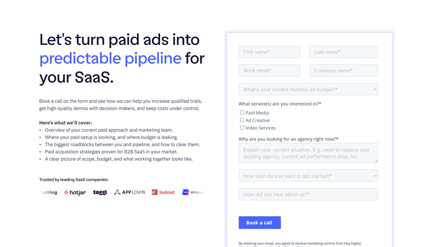
Example Hey Digital. A booking page that lists what the call will cover, beside a form that qualifies the buyer.
- 1
The promise again, at the moment of contact: predictable pipeline for your SaaS. The buyer is reminded why they are filling in a form.
- 2
Five lines on what the call will cover, ending with scope, budget and what working together looks like. The call sounds useful even if they never sign.
- 3
Client logos beside the form: proof placed where the last doubt appears, just before sending.
- 4
A required question about monthly ad budget. It sorts enquiries before anyone spends time on a call, and tells the buyer what size of client this is for.
- 5
An open question with a prompt: replacing an agency, a drop in performance. The buyer describes the problem in their own words, and the first call starts there.
The examples belong to their owners and are shown to explain an idea; the numbered frames are mine. Screenshots taken on 6 October 2026; the sites may have changed since.
Ask this about your site
Would a buyer shortlist you without calling?
Most B2B buyers research alone before they talk to anyone. These questions show whether your site answers them while they do.
- 01
Does your first screen name the kind of company you serve and the result you bring?
- 02
Can a stranger see, without scrolling far, which companies already work with you?
- 03
Does every service show a result next to it?
- 04
Can a buyer see your prices, or at least where they start?
- 05
Does your contact form say what the first call will cover?
What makes a B2B website sell
Lesson 01
Written for the committee
A B2B site is read by several people, often without you in the room. Every claim should survive being forwarded: names, numbers and plain words a colleague can repeat.
Lesson 02
Price is information
Buyers look for price more than anything else, and move on when they cannot find it. A starting price or a paid first step keeps the right buyers and saves everyone a call that ends on budget.
Lesson 03
Make writing to you safe
A short form, a named person who answers, and a promise of when. Every unknown after “send” is a reason to wait another week.
What you get
A site that brings in enquiries, and that your team can run.
Designed around how your buyers choose and built in Webflow, so a new case study, service or team member goes live without a developer. When the site needs more than Webflow gives, such as a client portal or a pricing calculator, I build it in code. A fixed price after a short brief.
The pages
A home page built on the parts above, a page for each service, case studies, about and contact.
Case studies
A CMS collection with fields for the client, the time frame and the numbers, so every new one comes out complete.
Forms that reach a person
Connected to your CRM, such as HubSpot or Pipedrive, or to a shared inbox, with the next steps written beside them.
Booking
A calendar tool, such as Calendly or HubSpot Meetings, for buyers who would rather pick a time.
Found by what you do
Titles, descriptions and structured data for each service, on pages fast enough for Google.
Help with the words
I shape the structure and edit your text, so it stays yours and reads plainly.
How a B2B website should look and sound
Clear, credible and specific.
These are rules of thumb. The site itself is built around your brand, your clients and your taste.
Real people, real work
Photos of the team and screens of client work, not stock handshakes or abstract shapes.
Numbers that stand out
Results set large enough to see while skimming, with the client and the time frame beside them.
Calm, structured pages
Clear headings, short sections and one main button. Buyers skim before they read.
The same next step everywhere
One button with one wording on every page, so nobody has to look for the way in.
Questions
Our clients come from referrals. Why invest in the site?
A referral starts the interest; the site is where the buyer and their colleagues check you before the first call. A clear site turns more of those referrals into meetings.
Should we show prices?
At least a starting point or a paid first step. Buyers expect it, and it saves calls that would end on budget. The exact figure can still wait for the proposal.
We cannot name our clients. What can we show?
Case studies without the name still work when they keep the industry, the size and the numbers, and so do quotes signed with a role. It is also worth asking a few clients for permission to be named.
Can our team add case studies and services?
Yes. They are CMS items, so publishing is filling in a form.
Will the forms connect to our CRM?
Yes. Forms can send enquiries to HubSpot, Pipedrive or another CRM, or to a shared inbox.
What it usually takes
New site or redesign
A new Webflow site, or a redesign of the one you have, designed and built by one person. Structure, copy, CMS and launch included.
Service
Integrations
Your Webflow site connected to the tools the company already runs on: forms into the CRM, analytics that measures the right things, and consent that holds tags back.
Service
Technical SEO
Broken links, missing redirects, thin metadata and pages Google skips: found, fixed and checked in Search Console.
Service
Your site
Want me to look at your site?
Next
Launch website
05 / 09