Websites by industry09 / 12
Therapist websites that bring the right clients to a first session
For psychologists, therapists and counsellors in private practice or a small practice. A good therapy site shows the right person that you understand what they carry, lets them see whom they would sit with, and makes the first step small: a short free call or a session booked online.
What goes on a therapist website
10 parts, top to bottom. Each one has a job in the sale, and each is shown on a real site that does it well. None of these sites is my work. Most are picked for how they look as well as what they say; the few picked only for what they say are marked.
Part 01 / 10
Whom you help, and the first step
Someone looking for a therapist is often tired and unsure where to start. The first screen says whom you help and with what, whether you meet in person or online, and offers one gentle next step. The right person feels recognised, and the step is small enough to take today.
Where it goes wrongA stock photo of a calm beach and “Healing starts here”, with no word on whom you work with.
Picked for the design and what it says
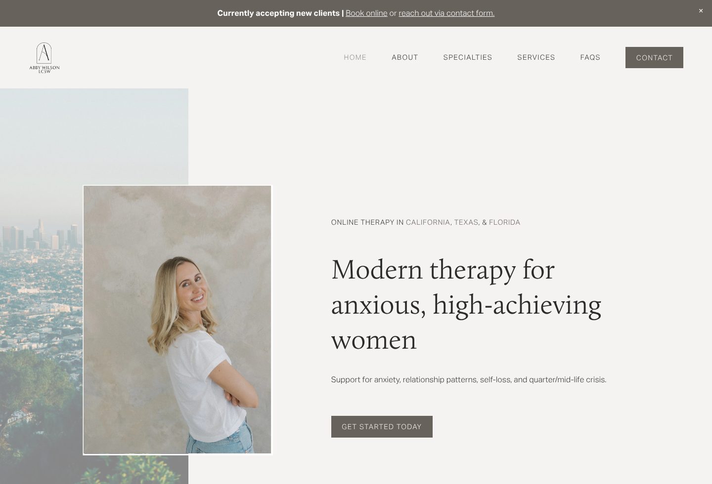
Example Abby Wilson. A first screen that names the client, her worries and where the therapy happens, beside a real photo and one button.
- 1
A thin bar above everything answers the first worry: she is accepting new clients. It gives two ways to start, booking online or the contact form.
- 2
A real photo of her, smiling, arms loosely crossed. The visitor sees whom they would talk to before reading a word.
- 3
Where, in one small line: online therapy in California, Texas and Florida.
- 4
Whom she helps, in words a client would use about herself: anxious, high-achieving women. The line under it names the worries: anxiety, relationship patterns, self-loss and a quarter or mid-life crisis.
- 5
One quiet button, Get started today, with nothing competing with it.
Part 02 / 10
What people come with
People rarely search for a method. They search for what hurts: anxiety, a relationship, burnout, grief. Naming those areas in plain words, with a line on what each looks like in real life, lets a visitor find their own situation and trust that you have seen it before.
Where it goes wrongA list of diagnoses and acronyms, written for colleagues rather than clients.
Picked for the design and what it says
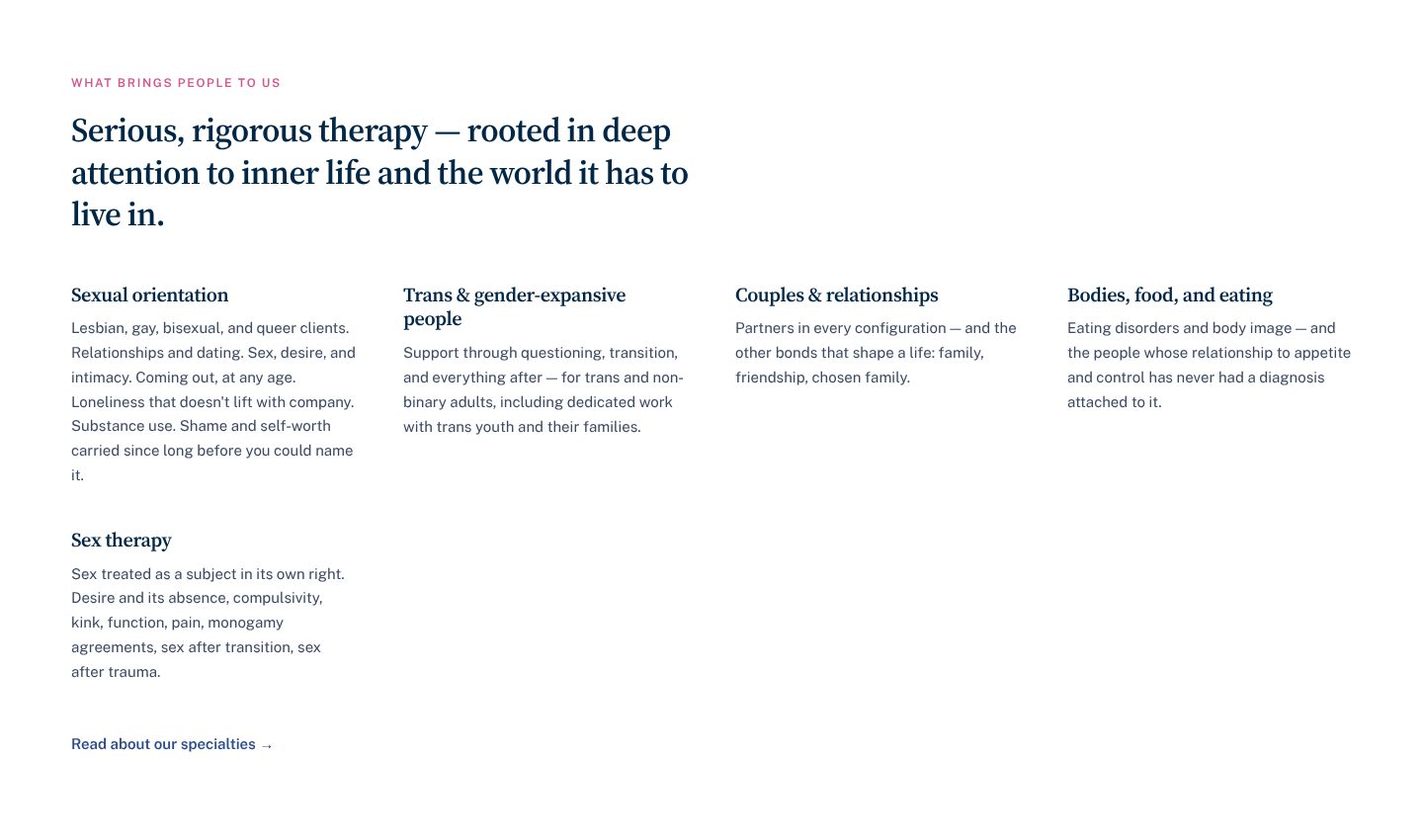
Example Kip. Five areas of focus, each described in the words a client would use.
- 1
A heading with a point of view: serious, rigorous therapy, rooted in deep attention to inner life and the world it has to live in. The reader knows what kind of practice this is before the list starts.
- 2
Each area is a short run of real situations, not a definition: relationships and dating, coming out at any age, loneliness that doesn’t lift with company.
- 3
Couples are described broadly: partners in every configuration, and the other bonds that shape a life, such as family, friendship and chosen family.
- 4
A line for people without a label: those whose relationship to appetite and control has never had a diagnosis attached to it.
- 5
One link at the end, Read about our specialties, for the reader who wants more.
Part 03 / 10
How you work, in plain words
Clients cannot judge a method by its name, but they can picture a conversation. Say what actually happens in the room, in a sentence or two without jargon, and a nervous visitor can imagine sitting there. Calm words and a warm picture do as much as the description.
Where it goes wrongA row of acronyms and named methods, with no word on what a session feels like.
Picked for the design and what it says
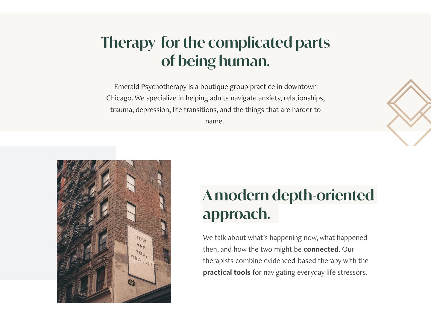
Example Emerald Psychotherapy. A warm promise, then the approach explained in one plain sentence.
- 1
The headline is human, not clinical: therapy for the complicated parts of being human.
- 2
One paragraph says who, where and with what: a boutique group practice in downtown Chicago, helping adults with anxiety, relationships, trauma, depression and life transitions. It ends with “the things that are harder to name”, for the reader whose trouble has no label.
- 3
A sign on a brick building asks “How are you, really?”. The picture asks the question a first session asks.
- 4
The approach gets a name, then one plain sentence explains it: what is happening now, what happened then, and how the two might be connected. Practical tools for everyday stress come last.
Part 04 / 10
The person they would sit with
Clients choose a therapist the way they choose someone to confide in: by feel. A warm, recent photo and a few lines in your own voice, about what you have seen and why you do this work, matter more than a list of qualifications. The full CV can wait one click away.
Where it goes wrongA formal headshot above a list of degrees and memberships, written in the third person.
Picked for the design and what it says
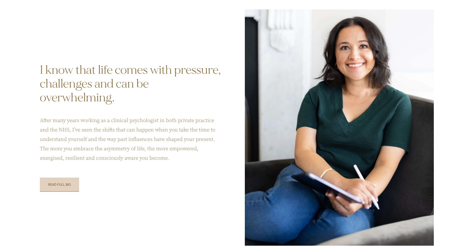
Example Dr Ramona Burrage. An about page that opens with the reader’s life and a relaxed portrait, with the full biography one click away.
- 1
A relaxed portrait: sitting on a sofa, tablet and pen in hand, smiling at the camera. She looks like someone you could talk to.
- 2
She starts with the reader’s life, not her own: “I know that life comes with pressure, challenges and can be overwhelming.”
- 3
Experience told as what she has seen: after many years in private practice and the NHS, the shifts that happen when people take the time to understand themselves.
- 4
The full biography waits behind one button, Read full bio, for those who want the details.
Part 05 / 10
What happens first
The unknown keeps people from booking. Say what the first contact and the first sessions look like, and what comes after, in two or three steps. A visitor who can picture the start is far more likely to take it.
Where it goes wrong“Contact me to discuss your needs”, and nothing about what happens next.
Picked for the design and what it says
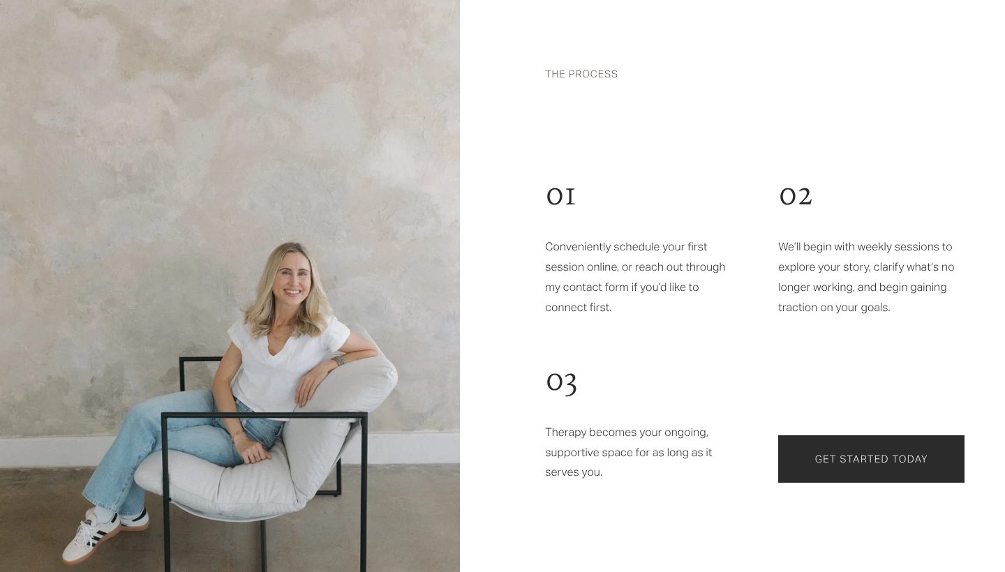
Example Abby Wilson. Three short steps from the first booking to ongoing therapy, beside a relaxed photo.
- 1
Her photo again, at ease in a chair. The steps sit beside a person, not a diagram.
- 2
Step one gives a choice: schedule the first session online, or reach out through the contact form to connect first.
- 3
Step two says what the early weeks are for: weekly sessions to explore your story, see what is no longer working and gain traction on your goals.
- 4
Step three answers how long: therapy stays a supportive space for as long as it serves you.
- 5
The button comes right after the last step: Get started today.
Part 06 / 10
A free first conversation
The fit between client and therapist matters more than anything else, and people know it. A free short call or intro session lets them check that fit before they pay, and turns “maybe one day” into a date in the diary.
Where it goes wrongA free consultation mentioned once, at the bottom of the contact page.
Picked for the design and what it says
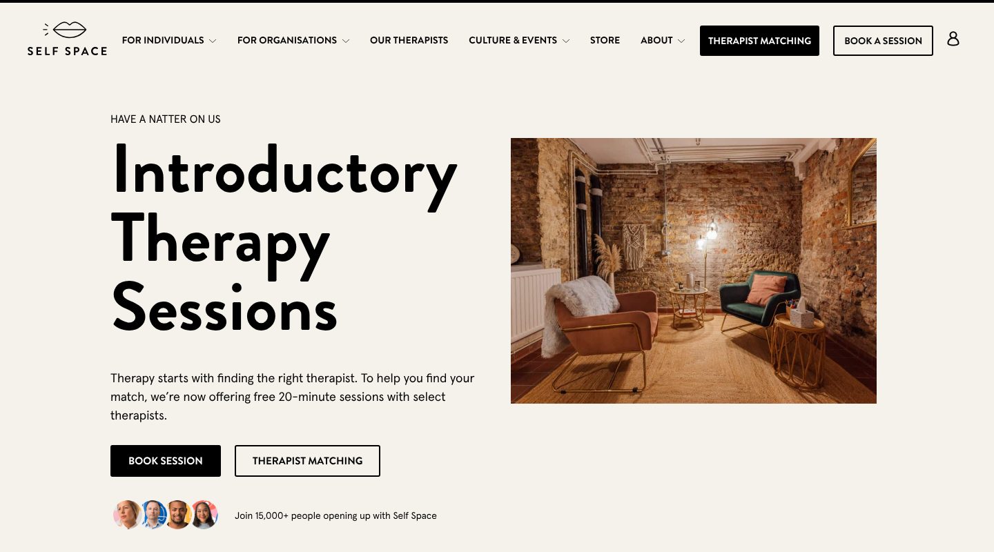
Example Self Space. A page of its own for a free 20-minute session, with the reason for it in one sentence.
- 1
A friendly label, Have a natter on us, above a plain name for the offer: Introductory Therapy Sessions.
- 2
A photo of a room, not a logo: two armchairs, a lamp and brick walls. The visitor can picture the conversation before booking it.
- 3
Why it exists, in one sentence: therapy starts with finding the right therapist, so there are free 20-minute sessions with select therapists.
- 4
Two ways forward: book a session, or try therapist matching for help choosing.
- 5
Faces and one line of proof under the buttons: join 15,000+ people opening up with Self Space.
Part 07 / 10
Fees and session length
Price is the question many people are too shy to ask. Show the fee, the length of a session and whether it is in person or online, next to a way to book. People who can afford you book sooner, and the ones who cannot are spared an awkward call.
Where it goes wrong“Please get in touch to discuss fees.”
Picked for the design and what it says
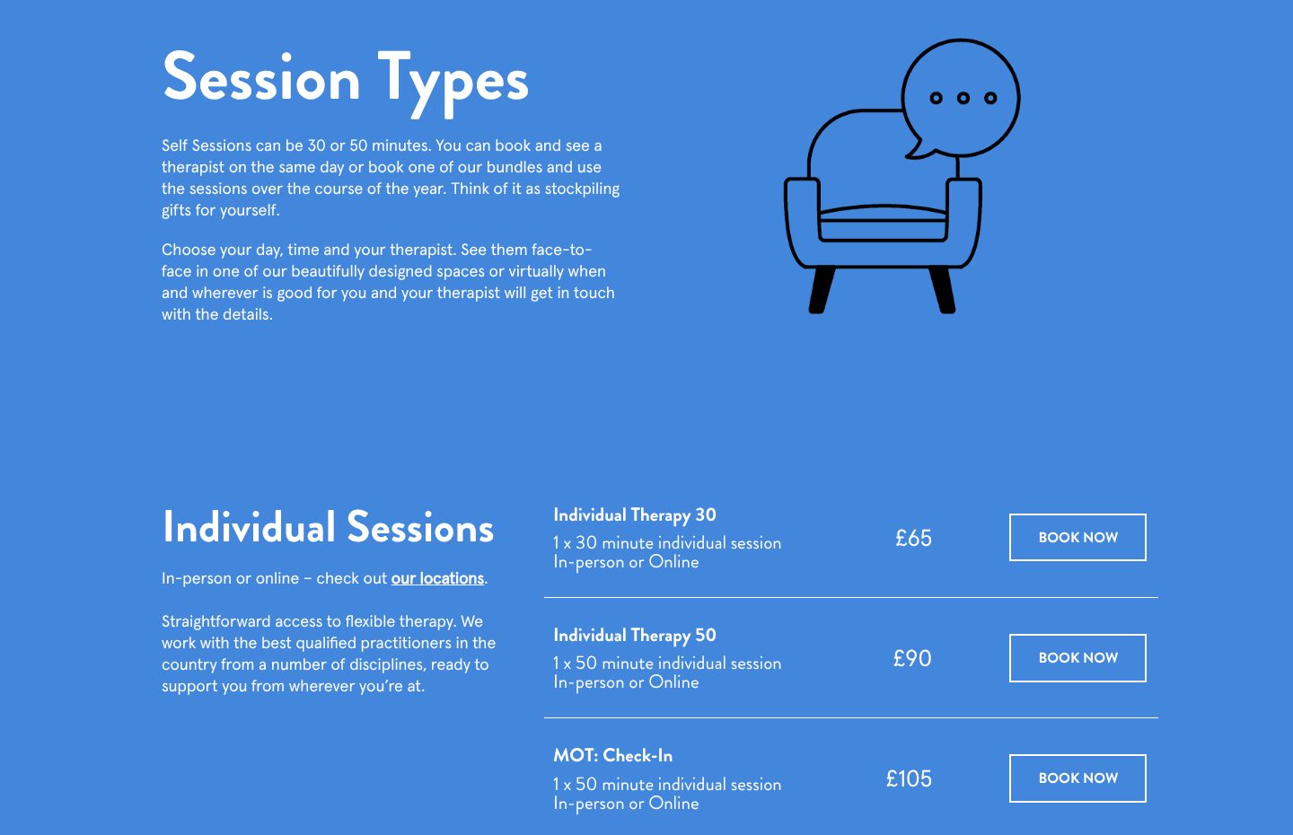
Example Self Space. Every kind of session with its length, format and price, and a booking button on the same line.
- 1
The length comes first: sessions are 30 or 50 minutes, and you can see a therapist the same day or buy a bundle.
- 2
Choice is part of the offer: your day, your time and your therapist, face to face in one of their spaces or online.
- 3
In person or online is said once more, with a link to the locations.
- 4
Each row reads the same way: name, length, format and price. Individual Therapy 50 is one 50-minute session, in person or online, for £90.
- 5
Book Now on every row, so the price and the booking are one step apart.
Part 08 / 10
In person, online, or both
Many clients choose a therapist by where and how they can meet. Show the rooms in real photos, say how to get there, and treat online sessions as an equal choice, not a footnote. A visitor can picture walking in, or staying on their own sofa.
Where it goes wrongAn address in the footer, and “online sessions available on request”.
Picked for the design and what it says
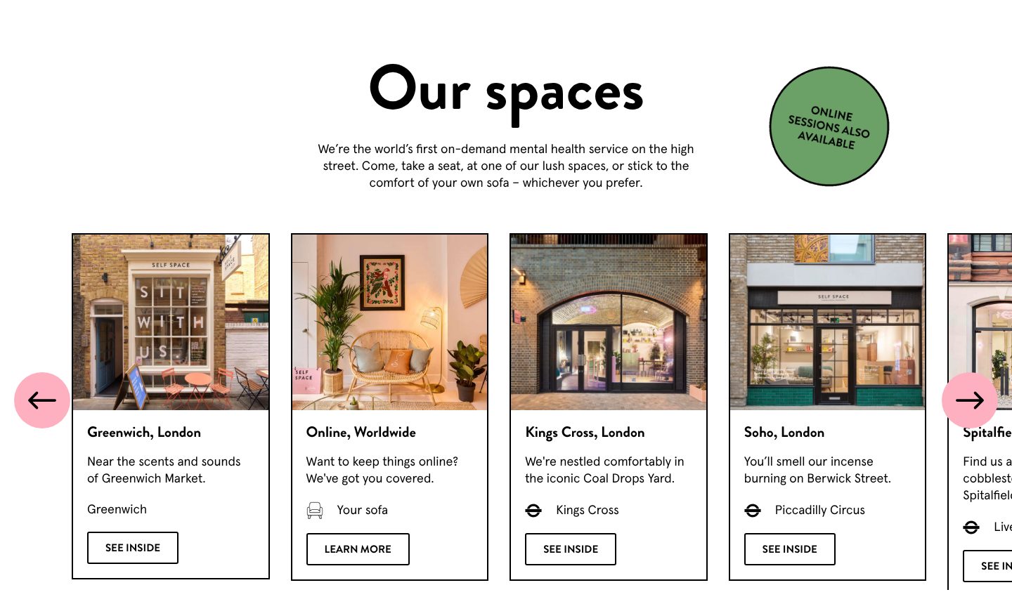
Example Self Space. Every studio as a card with a real photo and a line of character, and online as a place of its own.
- 1
One sentence gives both options: take a seat at one of their spaces, or stick to the comfort of your own sofa, whichever you prefer.
- 2
A round green sticker says it again for skimmers: online sessions also available.
- 3
Each studio has a real photo of its front, a line with some character, near the scents and sounds of Greenwich Market, and a See inside button.
- 4
Online sits in the same row as a place of its own, Online, Worldwide: want to keep things online? We’ve got you covered.
- 5
Under each studio, the nearest tube station, so a visitor knows how they would get there.
Part 09 / 10
Answers before the first session
Before a first session people wonder about cost, place, online sessions and how to begin, and many will not call to ask. A page that welcomes those questions in a calm voice answers them in private and keeps the visitor moving towards a booking.
Where it goes wrongNo questions at all, or answers that read like terms and conditions.
Picked for the design and what it says
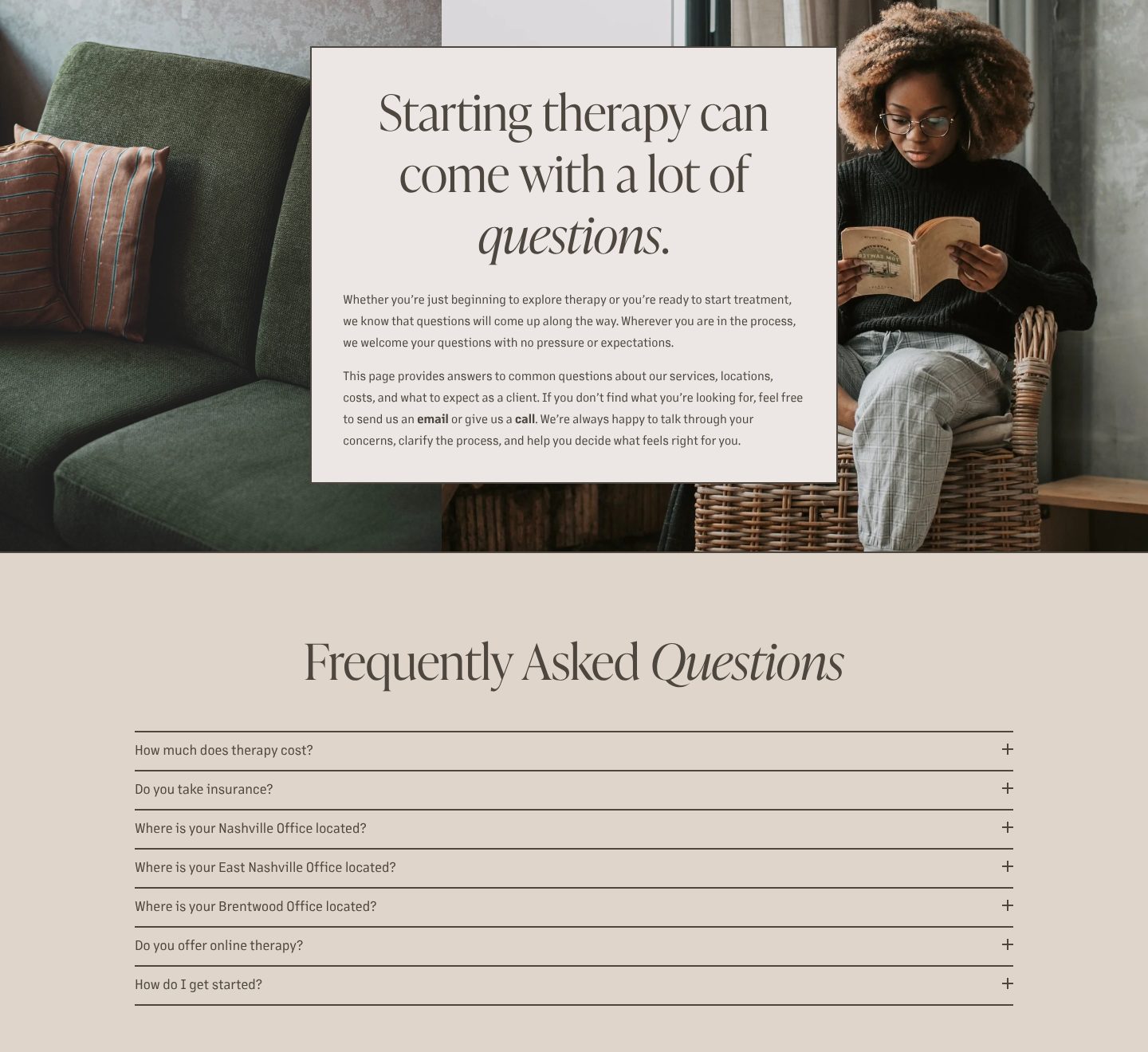
Example Nashville Therapy Group. A questions page that opens by saying questions are welcome, then lists the practical ones.
- 1
A woman reading in a wicker chair beside a green sofa. Calm, warm, and nothing like a clinic.
- 2
The page opens by naming the feeling: starting therapy can come with a lot of questions.
- 3
It welcomes questions “with no pressure or expectations”, and offers an email or a call for anything the page does not answer.
- 4
The first question is the one people are shy to ask: how much does therapy cost?
- 5
Practical questions in the client’s words, do you offer online therapy and how do I get started, each with a plus to open the answer.
Part 10 / 10
Writing for the questions people carry
Many clients read a therapist for weeks before they book. Articles on the questions people carry, sorted by topic, help them in the meantime, show how you think and bring visitors from search. When they are ready to book, they already know your voice.
Where it goes wrongA blog of practice news, or articles written for other therapists.
Picked for the design and what it says
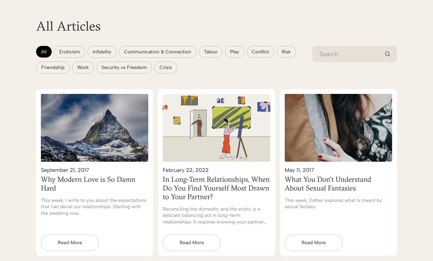
Example Esther Perel. Articles sorted by the topics readers bring, with titles phrased as their own questions.
- 1
Topics as filters, in the reader’s words: infidelity, communication and connection, conflict, friendship, work, crisis.
- 2
A search box, for the reader who comes with a question of their own.
- 3
Each article is a card with a picture, a date, a title and a short teaser, so the page reads like a magazine.
- 4
Titles are questions a reader asks in private: in long-term relationships, when do you find yourself most drawn to your partner?
The examples belong to their owners and are shown to explain an idea; the numbered frames are mine. Screenshots taken on 6 October 2026; the sites may have changed since.
Ask this about your site
Would someone who needs you book a first session after one visit?
People looking for a therapist compare a few sites, often late at night and on a phone, and choose by feel. These questions show whether yours makes the first step easy.
- 01
Does your first screen say whom you help, with what, and whether you meet in person or online?
- 02
Would a client recognise their own worry in the words on your site?
- 03
Is there a recent, warm photo of you, and a few lines in your own voice?
- 04
Can a visitor see your fee and the length of a session without asking?
- 05
Is the first step small and clear, such as a free short call or a session booked online?
What makes a therapist website sell
Lesson 01
Recognition before credentials
People choose the therapist who seems to understand them. Their worries, in their own words, do more than any list of qualifications.
Lesson 02
Make the first step small
Reaching out to a therapist is hard for many people. A free short call, an online calendar and a clear fee turn a hesitant visit into a booked session.
Lesson 03
Calm is the design
Soft colours, real photos and plenty of space tell an anxious visitor this will be gentle, before they read a line.
What you get
A practice site that brings the right clients to a first session, and that you can keep up to date yourself.
Designed around how your clients choose a therapist and built in Webflow, so fees, availability, articles and therapist profiles change without a developer. When the site needs more than Webflow gives, such as a matching questionnaire that suggests the right therapist or booking tied to your practice software, I build it in code. A fixed price after a short brief.
The pages
A home page built on the parts above, a page for each area you help with, about, fees, questions and contact.
Booking
Your booking or practice software on the page, such as Calendly, Jane or SimplePractice, or a short form to ask for a free call.
Fees and availability
Fees, session lengths and whether you have space for new clients, set up so you change them yourself.
Therapist profiles
For a small practice, a profile for each therapist with a photo, their focus and a way to book with them.
Articles and search
A blog sorted by topic, and titles, descriptions and structured data on every page, so people find you through the questions they search for.
Help with the words
I shape the structure and edit your text, so it sounds like you and not like a template.
How a therapist website should look and sound
Calm, warm and quietly confident.
These are rules of thumb. The site itself is built around your brand, your clients and your taste.
Real photos
You, your room and your street, in natural light. Not stock images of beaches and stones.
Soft colours, clear type
A gentle palette and plenty of space, with text that is easy to read on a phone late at night.
Your own voice
Write the way you talk in a first session: plain, kind and direct, without jargon or acronyms.
One gentle step
One clear button on every page, such as booking a free call, and nothing pushy.
Questions
Most of my clients come through referrals and directories. Do I need my own site?
A referral or a directory listing starts the interest. Before booking, most people look you up, and your own site is where they decide whether you feel right. It also says far more than a directory profile allows.
Should I show my fees?
Yes, with the length of a session. It answers the question many people are shy to ask, and the clients who book know what to expect.
Can clients book online?
Yes. The site can carry your booking or practice software, such as Calendly, Jane or SimplePractice, or a short form to ask for a free call.
We are a small practice with several therapists. How should the site handle that?
Each therapist gets a profile with a photo, their focus and a way to book with them. A short questionnaire can also suggest the right person for a new client.
Can I write the articles and update my availability myself?
Yes. Articles, fees and availability are CMS items, so a change is filling in a form.
What it usually takes
New site or redesign
A new Webflow site, or a redesign of the one you have, designed and built by one person. Structure, copy, CMS and launch included.
Service
Technical SEO
Broken links, missing redirects, thin metadata and pages Google skips: found, fixed and checked in Search Console.
Service
Integrations
Your Webflow site connected to the tools the company already runs on: forms into the CRM, analytics that measures the right things, and consent that holds tags back.
Service
Your site
Want me to look at your site?
Next
Law firms and professional services
10 / 12