Websites by industry10 / 12
Law firm and professional services websites that win trust before the first meeting
For law firms, accountants, architects, engineers and advisers. A firm’s site is where a referral gets checked: it has to say whom you act for and on what, put your people and your work in front, and make the first conversation easy to start.
What goes on a professional services website
10 parts, top to bottom. Each one has a job in the sale, and each is shown on a real site that does it well. None of these sites is my work. Most are picked for how they look as well as what they say; the few picked only for what they say are marked.
Part 01 / 10
Whom you act for, and on what
Clients of a professional firm look for a specialist, not a generalist. The first screen says whom you act for and on what, and why that focus is worth trusting, such as how long you have kept it.
Where it goes wrong“Excellence, integrity, client service”, which every firm in the city also claims.
Picked for the design and what it says
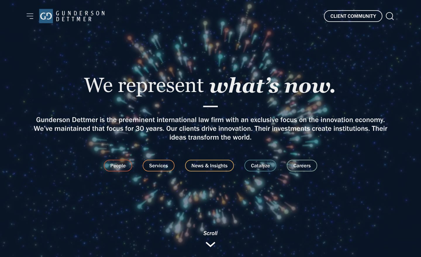
Example Gunderson Dettmer. A first screen that names its one market and how long the firm has served it.
- 1
A short line with a point of view: we represent what’s now. It speaks to founders and investors, not to everyone.
- 2
The sentence under it does the real work: an international law firm with an exclusive focus on the innovation economy, kept for 30 years.
- 3
Five ways in, right on the first screen: People, Services, News & Insights, Catalyze and Careers.
- 4
A link for existing clients, Client Community, sits top right, away from the pitch to new ones.
Part 02 / 10
Clients by situation
A client wants to know you handle cases like theirs. Grouping the work by the client’s situation, such as a startup, a family business or a listed company, lets each one find their door without reading a list of every service.
Where it goes wrongA long list of practice areas in alphabetical order.
Picked for the design and what it says
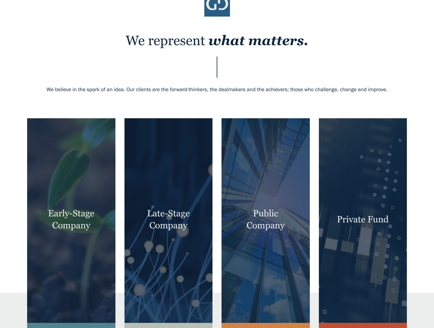
Example Gunderson Dettmer. Four kinds of client, each with a door of its own, under one line about who they are.
- 1
A heading about the clients, not the firm: we represent what matters.
- 2
One line on who the clients are: the forward-thinkers, the dealmakers and the achievers.
- 3
Four doors, one for each stage a client may be at: early-stage company, late-stage company, public company, private fund.
- 4
Each door is a whole card that links on, with nothing on it but the client’s stage, so the choice takes a second.
Part 03 / 10
People you can find
In a professional firm the client hires a person. A directory with a photo, a name, a role and an office for everyone, searchable by office, sector and service, lets a client find the right partner in seconds, and shows the firm is real.
Where it goes wrongA page with the founding partners only, or stock photos of a meeting room.
Picked for the design and what it says
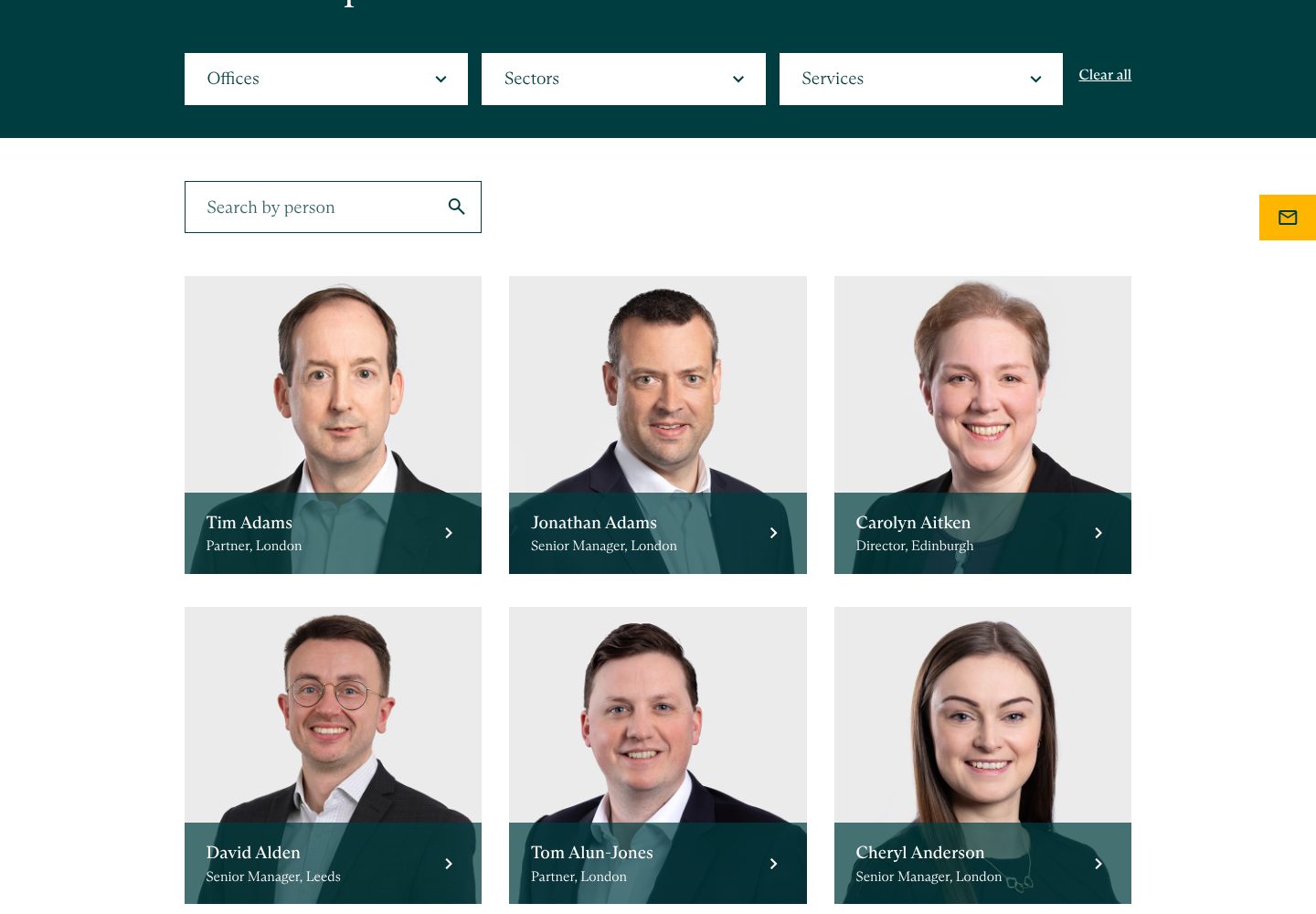
Example Saffery. Everyone in the firm, with filters by office, sector and service.
- 1
Filters in the words clients use: office, sector and service.
- 2
Search by name, for the client who already knows whom they want.
- 3
Real portraits, all shot the same way against the same background.
- 4
A name, a role and an office on every card: Partner, London. A client sees seniority and place at once.
Part 04 / 10
Recognition, and recent work
A ranking from someone else says more than anything you say about yourself. Put it next to news of recent work for clients, and a visitor sees a firm that is both trusted and busy.
Where it goes wrong“Award-winning” with no award named.
Picked for the design and what it says
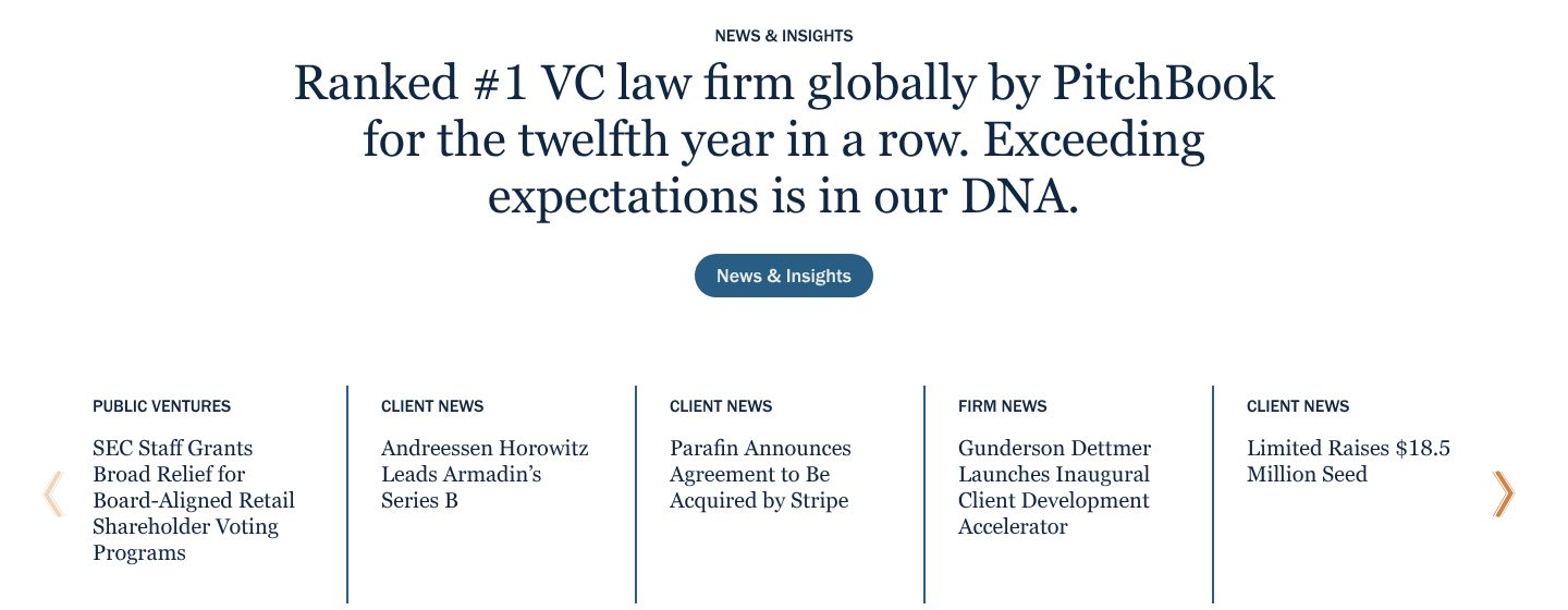
Example Gunderson Dettmer. An outside ranking as the headline, above a row of recent client news.
- 1
The headline is a ranking with a source and a run: number one VC law firm worldwide by PitchBook, for the twelfth year in a row.
- 2
Each item is labelled by kind: public ventures, client news, firm news.
- 3
Client news with names a buyer knows: Andreessen Horowitz leads Armadin’s Series B.
- 4
And another: Parafin agrees to be acquired by Stripe. Recent deals show the firm is in the middle of the market it serves.
Part 05 / 10
Work you can name
For architects, engineers and designers, the work is the proof. A list of projects a visitor has heard of, each with one line on what it does, says more than a page about your approach.
Where it goes wrongA grid of pretty images with no names, places or purpose.
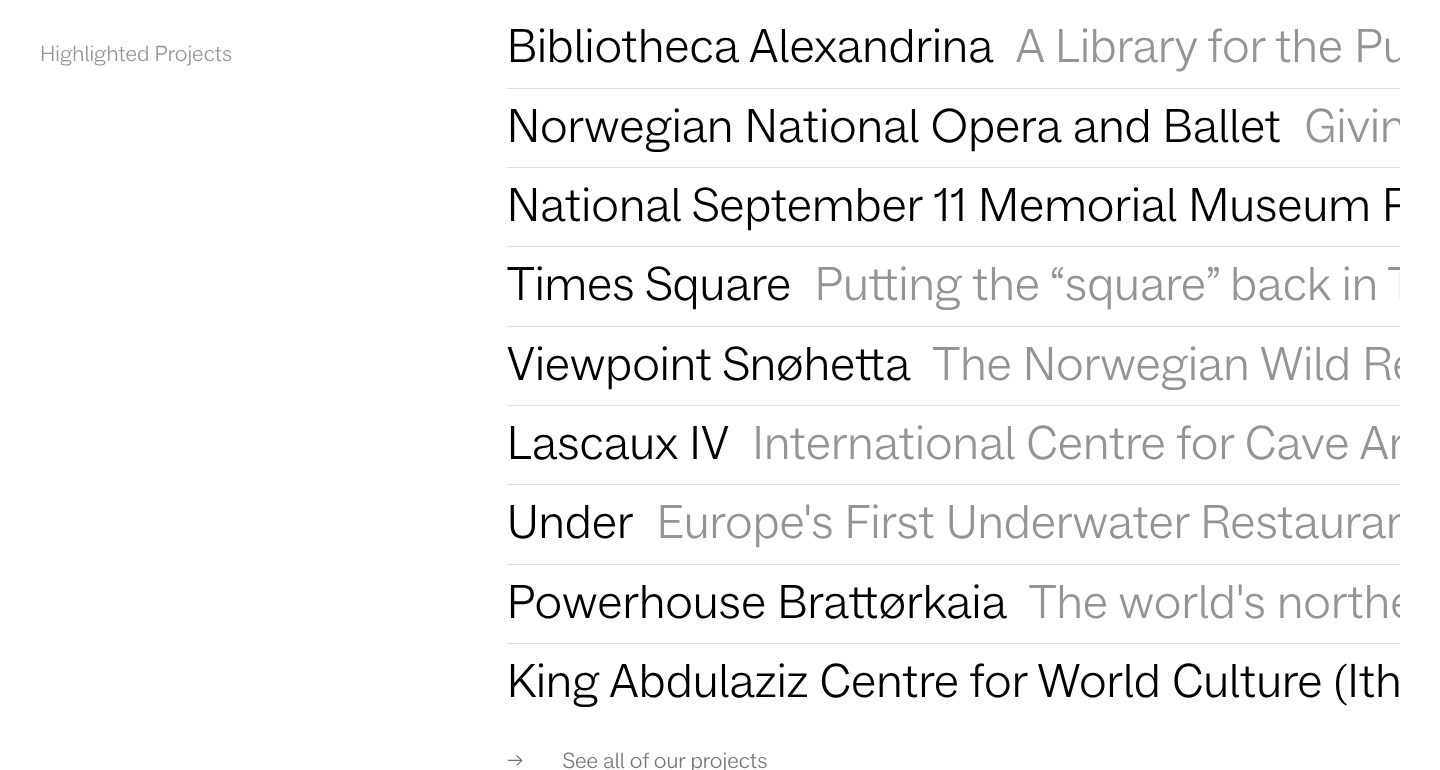
Picked for the design and what it says
Example Snøhetta. Nine well-known projects as a plain list of names, each with one line.
- 1
A quiet label, Highlighted Projects, and then only the work.
- 2
Each project is a name a visitor may know, set large: Bibliotheca Alexandrina, the Norwegian National Opera and Ballet.
- 3
Beside each name runs a line in grey on what the project is: the name first, the story second.
- 4
The range shows in two rows: a centre for cave art next to Europe’s first underwater restaurant.
- 5
One link to the full list, for the visitor who wants more.
Part 06 / 10
Know-how clients can use
Clients choose the firm that helped them before they paid. Guides and tools for the client’s next step show expertise better than a list of credentials, and bring the client back when that step comes.
Where it goes wrongA news page of press releases about the firm itself.
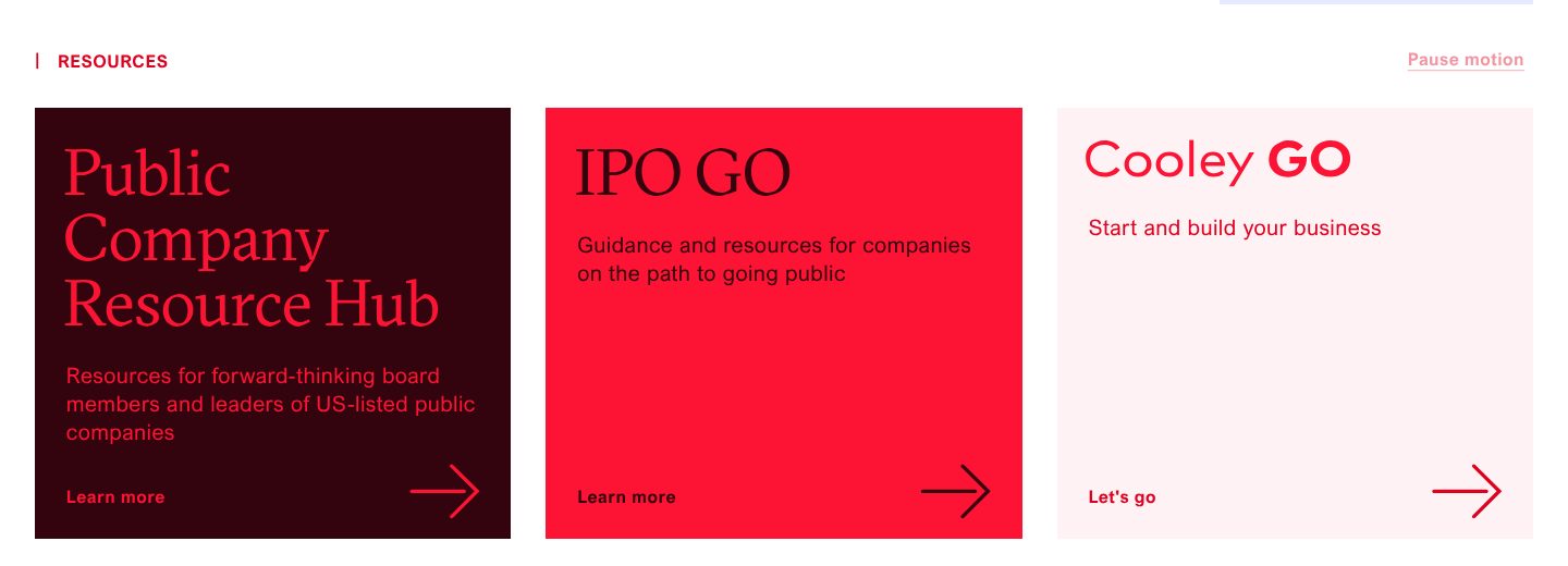
Picked for the design and what it says
Example Cooley. Three free resource hubs, each for a different stage of a client company.
- 1
A hub for the leaders of listed companies, with its own name and a line on whom it is for.
- 2
A guide for a step many clients are preparing for: the path to going public.
- 3
And one for the start: Cooley GO, to start and build a business.
Part 07 / 10
A way in for each visitor
People come to a firm’s site for different reasons: to find a lawyer, to check a capability, to find an office, to apply for a job. Four clear doors near the top send each of them the right way without a long menu.
Where it goes wrongA mega menu with forty links and nothing on the page itself.
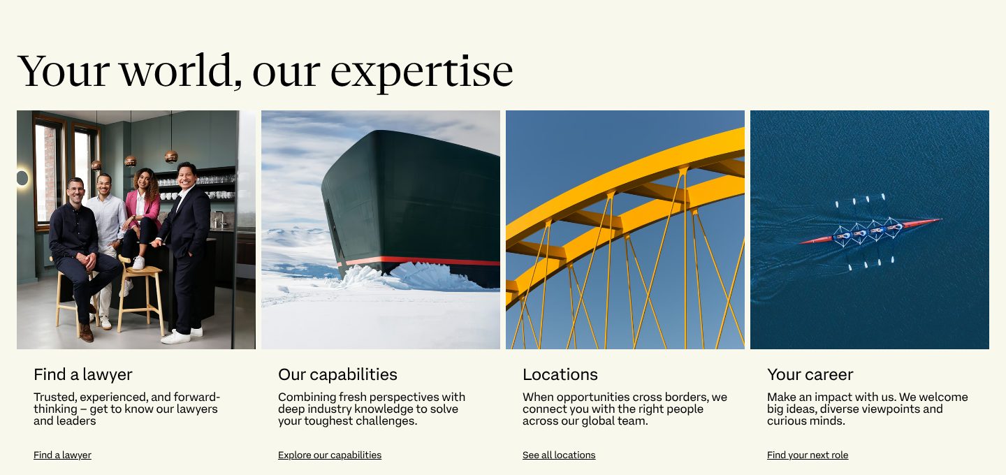
Picked for the design and what it says
Example Freshfields. Four doors, each with a photo, a line and a link that says where it leads.
- 1
A heading that puts the client first: your world, our expertise.
- 2
Finding a lawyer comes first, with a photo of people rather than a skyline.
- 3
Each door has one line on what you will find, and a link that names it: explore our capabilities.
- 4
Locations are a door of their own, for clients whose work crosses borders.
Part 08 / 10
How fees work
Clients of lawyers, accountants and advisers fear the bill they cannot predict. Saying how you charge, a fixed fee, a flat membership or a clear hourly rate, and what it covers, removes the biggest reason not to call.
Where it goes wrong“Fees on request”, and nothing more.
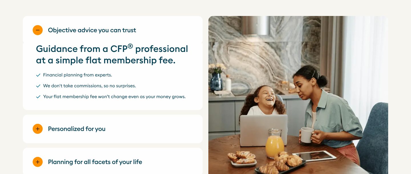
Picked for the design and what it says
Example Facet. The fee model stated as the main promise, with what it means for the client.
- 1
The fee model is the headline: guidance from a certified planner at a simple flat membership fee.
- 2
Three short lines on what that means: no commissions, so no surprises, and a fee that does not grow with your money.
- 3
The other promises wait behind short headings, one click away: personalised, and planning for all of life.
- 4
A mother and daughter at home, not a trading floor: the photo says whom the service is for.
Part 09 / 10
Results in numbers
Clients buy an outcome: time saved, money kept, a deal closed. Three numbers in the client’s terms, each saying what it measures, carry more weight than any adjective.
Where it goes wrong“Proven results” with no number.
Picked for the design and what it says
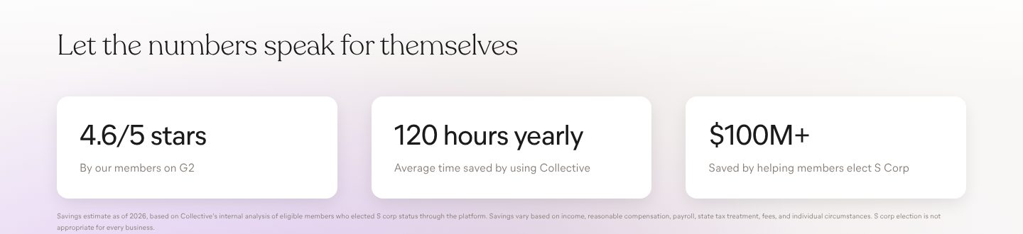
Example Collective. Three numbers, each with one line on what it measures.
- 1
A plain heading that hands over to the numbers.
- 2
A rating, with where it comes from: 4.6 out of 5 from members on G2.
- 3
Time, the thing a busy client wants back: 120 hours a year, on average.
- 4
Money: over 100 million dollars saved for members.
- 5
Small print under the numbers says how the estimate was made, which makes the big number easier to believe.
Part 10 / 10
Contact, by reason
A prospective client, a journalist and a student all write to the same firm. A separate route for each reason, and real offices with addresses and phone numbers, get the enquiry to the right person and show where the firm actually is.
Where it goes wrongOne contact form for everything, and no address.
Picked for the design and what it says
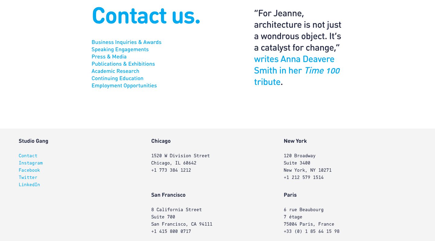
Example Studio Gang. Seven reasons to get in touch, each its own link, above four offices with phone numbers.
- 1
A short, direct heading: Contact us.
- 2
One link per reason, business enquiries first, then speaking, press, publications, research, education and jobs.
- 3
A line from a well-known writer about the founder, as quiet proof beside the contact links.
- 4
Four studios with full addresses and direct phone numbers: Chicago, New York, San Francisco and Paris.
The examples belong to their owners and are shown to explain an idea; the numbered frames are mine. Screenshots taken on 6 October 2026; the sites may have changed since.
Ask this about your site
Would someone referred to you call after seeing the site?
A quick way to judge the site you have. Where the honest answer is no, recommendations are being lost on the way.
- 01
Does your first screen say whom you act for and on what, and what work you do not take?
- 02
Can a visitor find the right person by name, office or specialism, with a face and a short record?
- 03
Is there proof from others: rankings, named work, clients or writing?
- 04
Is it clear how you charge, and what the first conversation costs?
- 05
Does each kind of enquiry have a clear way in?
What makes a professional services website sell
Lesson 01
You are being checked, not discovered
Most visitors already have your name. The site has to confirm what they were told.
Lesson 02
People hire people
In a professional firm the client is buying someone’s judgement. Profiles that show who each person is and what they have done carry more of the sale than the home page.
Lesson 03
Focus is the credential
A firm that says whom it serves best is easier to trust than one that serves everyone. Naming a market, a kind of client or a kind of work makes the rest believable.
What a good professional services website gives you
01
Referrals that turn into calls
Most new clients look you up after someone mentions your name. The site decides whether they call.
02
The right enquiries
Clear practice areas and fees bring the work you want, and fewer matters you would have to turn away.
03
Partners who look like experts
Profiles and articles that show what each person knows.
What you get
A firm’s site that wins trust, and that your team can keep current.
Designed around how your clients choose and built in Webflow, so people, insights and work go live without a developer. When the site needs more than Webflow gives, such as a client portal or a fee calculator, I build it in code. A fixed price after a short brief.
The pages
A home page built on the parts above, a page for each service and sector, people, work, insights, offices and contact.
People profiles
A CMS collection for every person, with photo, role, office, specialisms and contact, and filters to find them.
Work and insights
Case studies, projects and articles as CMS collections, linked to the people and services they belong to.
Enquiries to the right person
Contact forms by reason or by service, sent to the right inbox or to your CRM.
Found by specialism
Titles, descriptions and structured data for the firm, its people and its services, on pages fast enough for Google.
Help with the words
I shape the structure and edit your text, so it sounds like your firm and not like every other firm.
How a professional services website should look and sound
Composed, precise and personal.
These are rules of thumb. The site itself is built around your brand, your clients and your taste.
Portraits in one style
Everyone photographed the same way, so the team looks like one firm.
Restraint
Few colours, generous space, good type. A firm that looks calm looks capable.
Plain words
Explain the work the way you would to a client, not to a colleague.
Work up front
Named clients, projects and results where people look for them, not in a brochure.
Questions
How do I know whether our site wins us work?
Ask new clients how they found you and what they looked at. If people who were referred do not call, the site is where they dropped out.
Most of our work comes from referrals. Why invest in the site?
A referral starts the interest. Before calling, the client checks you on the site, and that is where they compare you with the other name they were given.
Should we show fees?
At least how you charge: fixed fees, a retainer or hourly, and what a typical piece of work involves. It sets expectations and saves calls that go nowhere.
Can each person edit their own profile?
Profiles are CMS items, so whoever you choose can update them by filling in a form.
We have many articles. Can they move to the new site?
Yes, with their dates, authors and addresses, so search rankings carry over.
We have offices in several cities. How should the site handle that?
Each office gets its own page with the address, the team and the work done there, which also helps the firm show up in local searches.
Can the site link to our client portal?
Yes. A login for existing clients can sit apart from the pages for new ones, and if you need a portal, I can build one.
What it usually takes
New site or redesign
A new Webflow site, or a redesign of the one you have, designed and built by one person. Structure, copy, CMS and launch included.
Service
Technical SEO
Broken links, missing redirects, thin metadata and pages Google skips: found, fixed and checked in Search Console.
Service
Migration to Webflow
Content moves into the CMS, every old URL gets a redirect, and rankings are checked after launch.
Service
Your site
Want me to look at your site?
Next
Real estate and property
11 / 12