Websites by industry07 / 12
Nonprofit websites that turn visitors into donors and volunteers
For charities, foundations, nonprofits and campaigns. A good site moves someone from caring to acting: it says what you do in one sentence, shows what a gift changes and where the money goes, and makes giving, signing or volunteering take a minute.
What goes on a nonprofit website
10 parts, top to bottom. Each one has a job in the sale, and each is shown on a real site that does it well. None of these sites is my work. Most are picked for how they look as well as what they say; the few picked only for what they say are marked.
Part 01 / 10
The mission in one sentence, and a way to give
A visitor decides in a few seconds whether your cause is one they want to back. The first screen says what you do in one plain sentence, shows the people it is for, and puts a way to give right there, so a visitor who is already convinced does not have to look for it.
Where it goes wrongA slideshow of slogans about hope and change, with the donate button lost in the menu.
Picked for the design and what it says
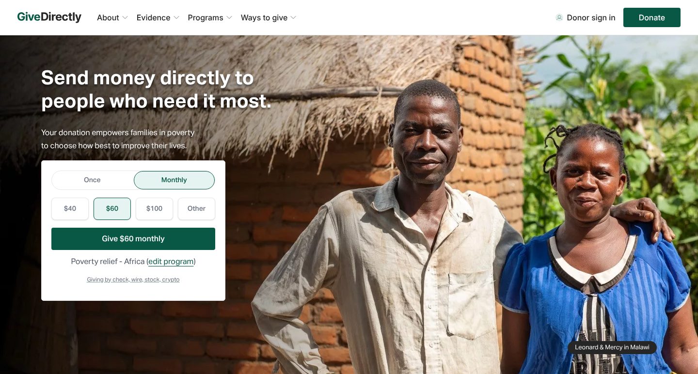
Example GiveDirectly. A first screen that states the whole idea in one line and puts a gift form under it.
- 1
The mission in one line: send money directly to people who need it most. The sentence under it says what the gift does: families in poverty choose how best to improve their lives.
- 2
The form sits on the first screen. Monthly is the option chosen, and $60 is picked among four amounts, so a visitor sees what a usual gift looks like.
- 3
The button says exactly what will happen: give $60 monthly. Under it, the programme the gift goes to, Poverty relief - Africa, with a link to change it.
- 4
The people in the photo have names and a place: Leonard & Mercy in Malawi. A visitor sees whom the money reaches.
Part 02 / 10
Impact in numbers
Donors want to know that something changed because people gave. A few numbers, each inside a short sentence that says what it counts, show the size of the work in a way a visitor can repeat to a friend.
Where it goes wrong“Thousands of lives changed”, with no number, no unit and no date.
Picked for the design and what it says
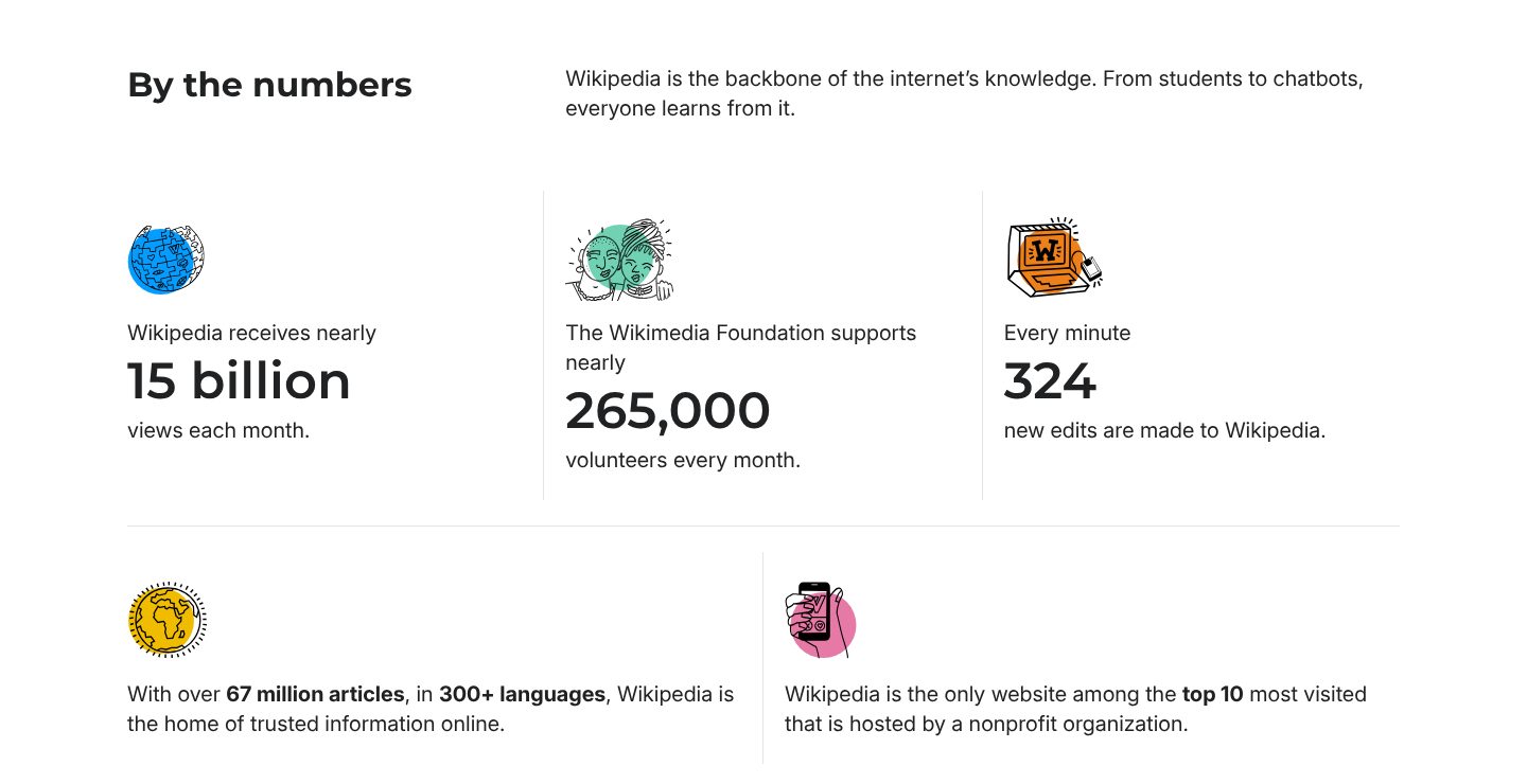
Example Wikimedia Foundation. Five facts, each a number inside a sentence, with a small drawing for each.
- 1
A plain heading, By the numbers, and one line on why they matter: from students to chatbots, everyone learns from Wikipedia.
- 2
Each number sits inside a sentence that says what it counts: nearly 15 billion views each month. The small drawing above it makes the row easy to scan.
- 3
One number is about the people who give their time: nearly 265,000 volunteers every month.
- 4
A number at human scale: 324 new edits every minute. Anyone can picture a minute.
- 5
Two more facts in a second row: over 67 million articles in 300+ languages, and the only site among the top 10 most visited that is hosted by a nonprofit.
Part 03 / 10
What you do, and where
A donor gives to work they can picture. Say whom you serve, where you work and what you actually do, in a few short steps that end with the result, so the visitor sees the line from their gift to the change.
Where it goes wrongA list of programmes with internal names that mean nothing outside the office.
Picked for the design and what it says
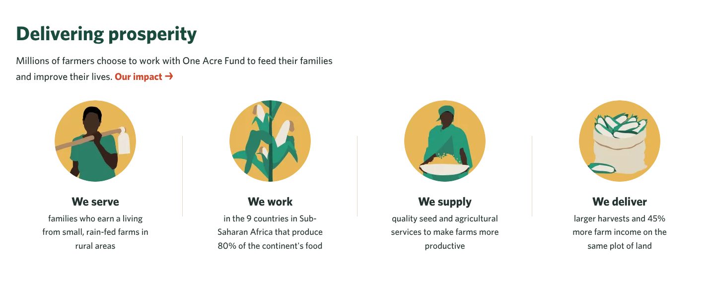
Example One Acre Fund. The whole model in four short steps, from whom they serve to what it brings.
- 1
The heading is the result, delivering prosperity, and the line under it says who chooses the work: millions of farmers, to feed their families and improve their lives.
- 2
Whom they serve comes first: families who earn a living from small, rain-fed farms in rural areas.
- 3
Where, with a reason for the choice: the 9 countries in Sub-Saharan Africa that produce 80% of the continent’s food.
- 4
What they give and what it brings: quality seed and agricultural services, then larger harvests and 45% more farm income on the same plot of land.
Part 04 / 10
Real people, by name
People give to a person more readily than to a statistic. Show the people your work is for, with a name, an age, a place and a few lines about their life, and let the donor choose whom to help.
Where it goes wrongStock photos of smiling children with no names, or one story buried in a blog.
Picked for the design and what it says
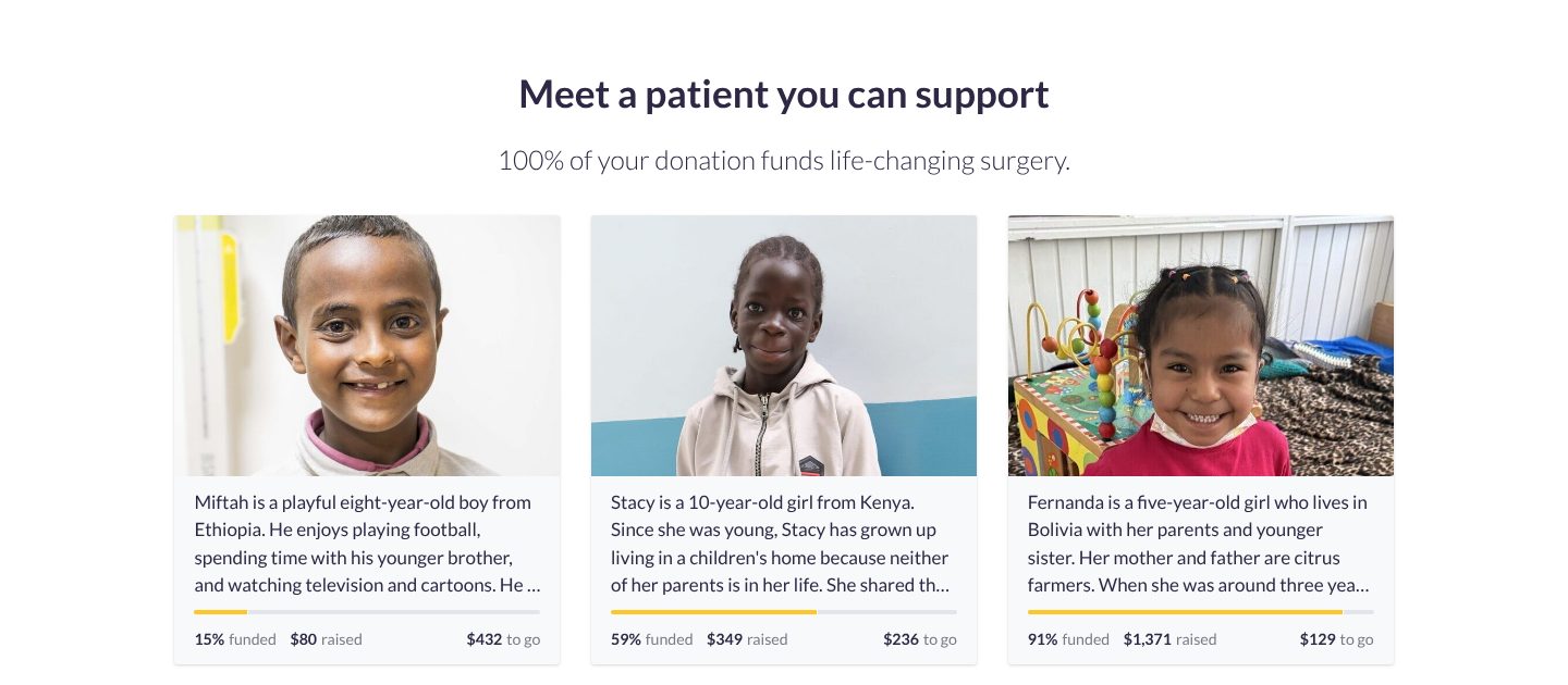
Example Watsi. Three patients by name and photo, each with a bar that shows how much is already funded.
- 1
An invitation to meet one person: meet a patient you can support. The line under it is the promise: 100% of your donation funds life-changing surgery.
- 2
Each card starts with a life, not a diagnosis: Miftah is a playful eight-year-old boy from Ethiopia who enjoys playing football.
- 3
A bar and three figures show where the money stands: 15% funded, $80 raised, $432 to go.
- 4
A donor can choose the one closest to the goal: Fernanda is 91% funded, with $129 to go.
Part 05 / 10
Where the money goes
The first doubt about any charity is how much of a gift reaches the work. Answer it in plain numbers: what share goes to the cause, who pays for the rest, and how you keep the two apart. A clear answer turns a careful visitor into a donor.
Where it goes wrong“Your donation makes a difference”, and no word on what share of it reaches the work.
Picked for the design and what it says
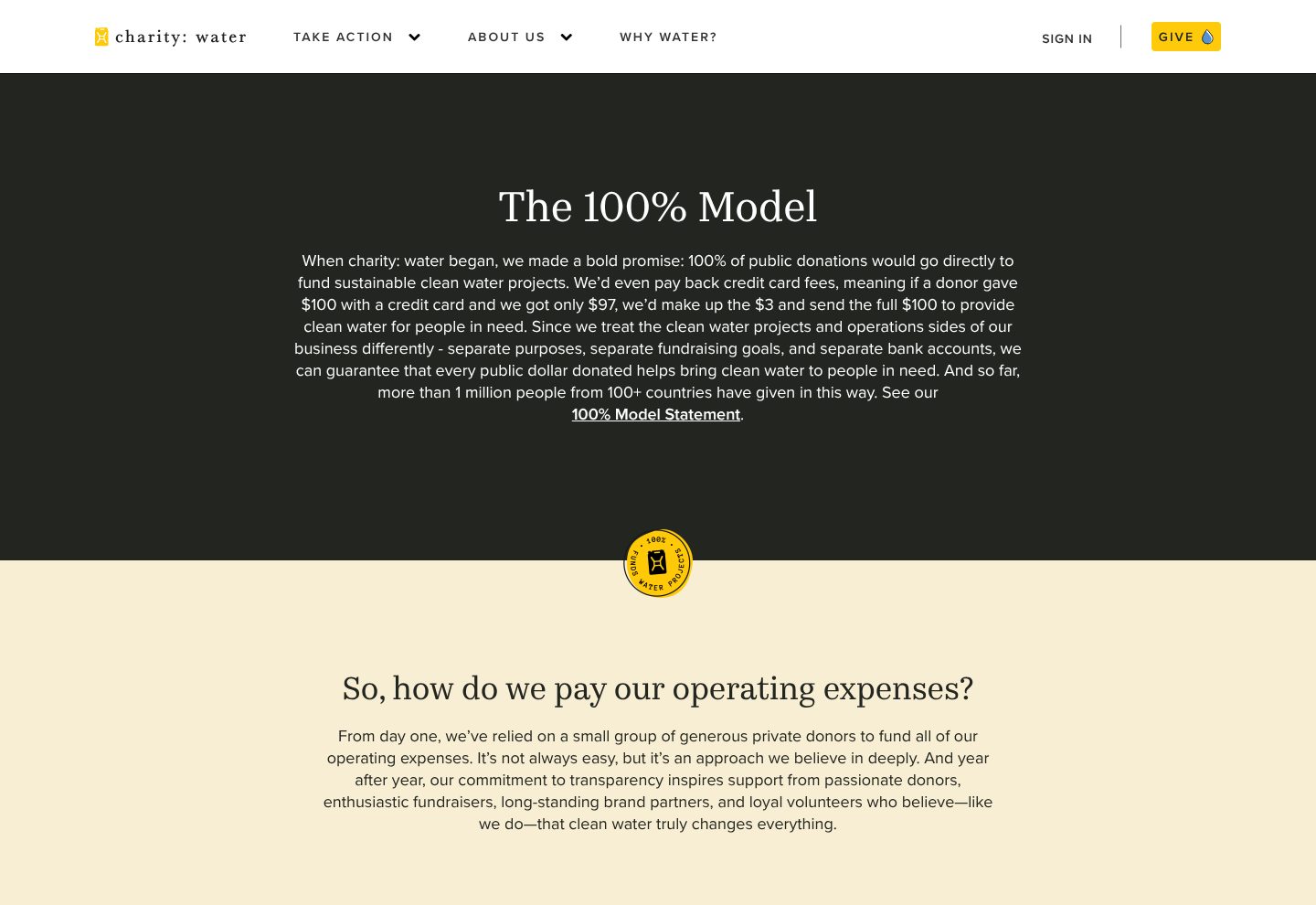
Example charity: water. A promise with a name, explained with one worked example and the question donors ask next.
- 1
The promise has a name, The 100% Model, and a page of its own. A name is something donors can remember and repeat.
- 2
The promise with a worked example: if a $100 card gift arrives as $97, they make up the $3 so the full $100 goes to water. Then how they keep it: separate purposes, fundraising goals and bank accounts for the water projects and the running of the charity.
- 3
Scale, and a way to check: more than 1 million people have given this way, and a link to the 100% Model Statement itself.
- 4
The next question is the heading of the next section, so how do we pay our operating expenses?, and the answer follows: a small group of private donors.
Part 06 / 10
A gift you can picture
An amount on its own means little. Next to each sum, say what it does in the unit of your work, a meal, a bottle, an acre, and the donor sees the result before they pay. Few fields and a sensible default make the form quick to finish.
Where it goes wrongAn empty amount field and nothing about what the money will do.
Picked for the design and what it says
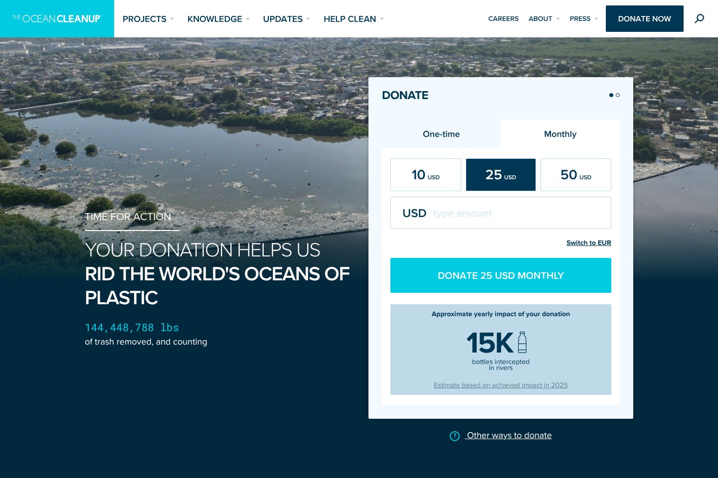
Example The Ocean Cleanup. A donation form that turns the amount into bottles caught in rivers, beside a running total of the work.
- 1
The headline puts the donor first: your donation helps us rid the world’s oceans of plastic.
- 2
A running total under it: 144,448,788 lbs of trash removed, and counting.
- 3
One-time or monthly, three amounts and a field for any other sum. Monthly is the tab in use, and 25 is already picked.
- 4
The button repeats the choice in full: donate 25 USD monthly.
- 5
Under the button, the gift in the unit of the work: about 15K bottles intercepted in rivers a year, with a note that the estimate is based on what was achieved in 2025.
Part 07 / 10
Monthly giving with a name
Monthly gifts let a charity plan, and over a year they add up to more than most single gifts. Give the monthly gift its own page and a name, say in people what a small sum does, and show the community the donor joins.
Where it goes wrongA small “make it monthly” tick box at the bottom of the one-off form.
Picked for the design and what it says
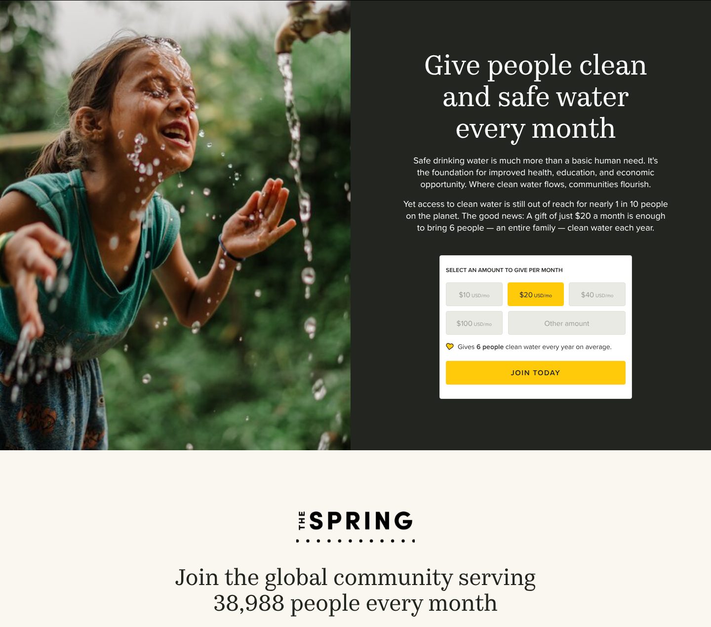
Example charity: water. A page only for monthly giving, with the sum turned into people and a community with a name.
- 1
The page sells one thing: give people clean and safe water every month.
- 2
A small sum turned into people: a gift of $20 a month is enough to bring 6 people, an entire family, clean water each year.
- 3
Four monthly amounts and a field for any other, with $20 already picked.
- 4
Under them, the gift in people again: gives 6 people clean water every year on average. The button says join today, not donate.
- 5
Monthly donors have a name of their own, The Spring, and a number to be part of: a community serving 38,988 people every month.
Part 08 / 10
Ways to help besides giving
Not every supporter can give money, and many would rather do something. Volunteering, hosting an event or raising money from friends brings in people a donate button never reaches, and each fundraiser brings their own circle. Name the ways to take part and make signing up one click.
Where it goes wrongA “Get involved” page that ends in a contact form.
Picked for the design and what it says
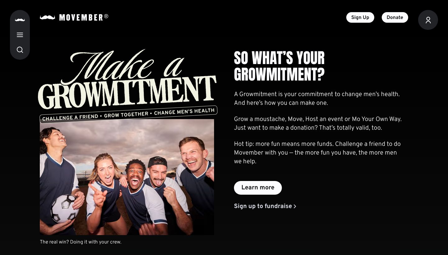
Example Movember. A first screen that asks for a commitment rather than a donation, with four ways to take part.
- 1
The ask has its own name and lettering, Make a Growmitment, with three steps under it: challenge a friend, grow together, change men’s health.
- 2
The heading is a question to the reader, so what’s your growmitment?, and the line under it says what one is: a commitment to change men’s health.
- 3
Four ways to take part come first: grow a moustache, move, host an event, or Mo Your Own Way. Then, kindly: just want to make a donation? That’s totally valid, too.
- 4
A photo of friends doing it together, with the caption: the real win? Doing it with your crew.
- 5
Two next steps: learn more, or sign up to fundraise straight away.
Part 09 / 10
Proof from outside
A charity praising itself convinces no one. Ratings from charity evaluators, coverage in papers a donor reads and the names of funders who back you let the visitor borrow someone else’s judgement. Put them in one place, with the source on each.
Where it goes wrongA wall of partner logos with no words, or “award-winning” with no award named.
Picked for the design and what it says
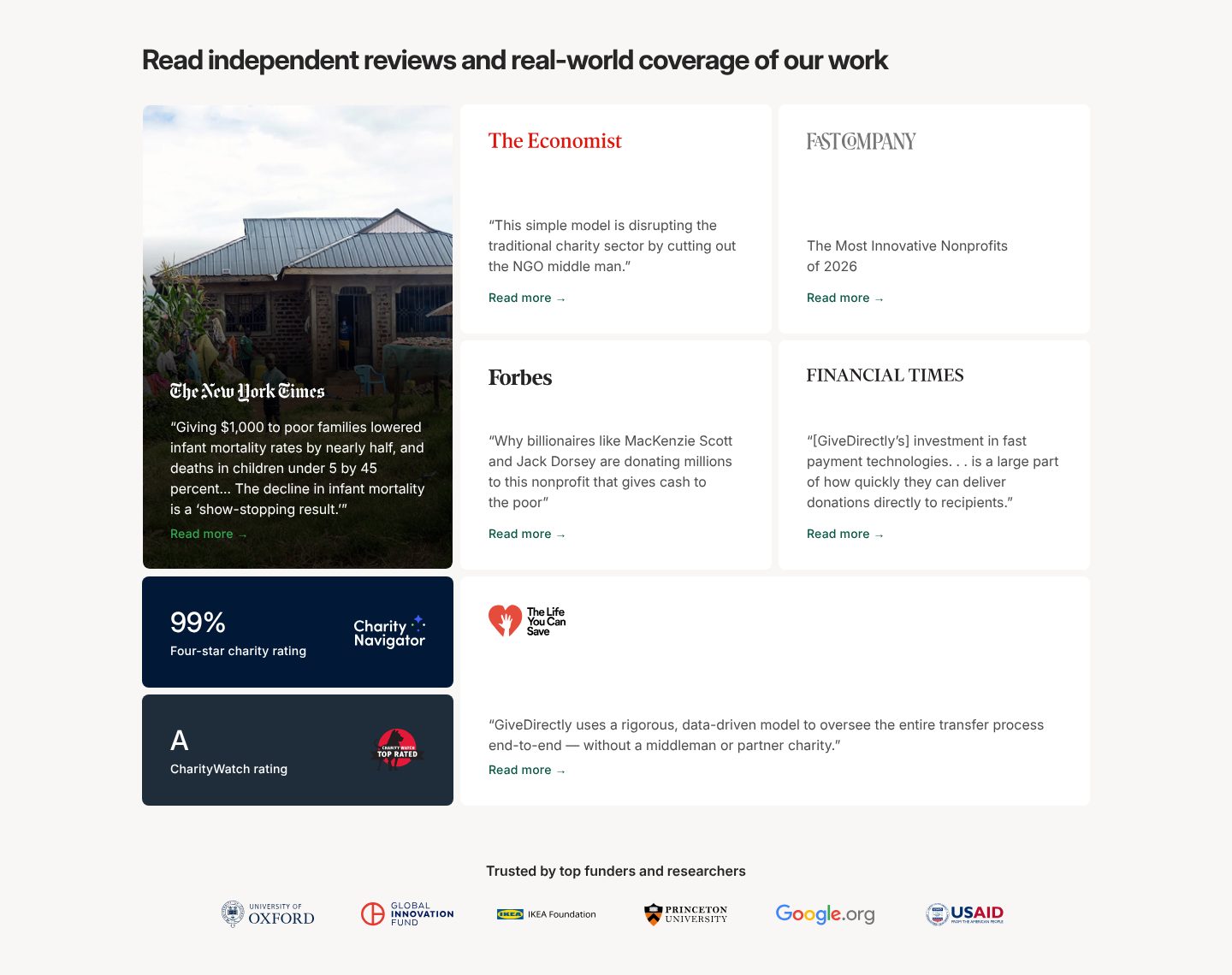
Example GiveDirectly. Press, ratings and funders in one block, each with its source.
- 1
The heading says whose words these are: independent reviews and real-world coverage, not the charity’s own.
- 2
The strongest quote gets the largest card: The New York Times on infant mortality falling by nearly half when poor families were given $1,000.
- 3
Four more names a donor knows, The Economist, Fast Company, Forbes and the Financial Times, each with one line and a link to read more.
- 4
Ratings from charity evaluators, in figures: 99% and four stars from Charity Navigator, an A from CharityWatch.
- 5
Under them, the funders and researchers who back the work, among them Oxford, the IKEA Foundation, Princeton and Google.org.
Part 10 / 10
Reports anyone can open
Foundations, large donors and journalists check the numbers before they trust a charity, and many small donors like knowing they could. An annual report with a short summary, audited accounts and past years one click away show you have nothing to hide.
Where it goes wrongReports sent only on request, or a single PDF from three years ago.
Picked for the design and what it says
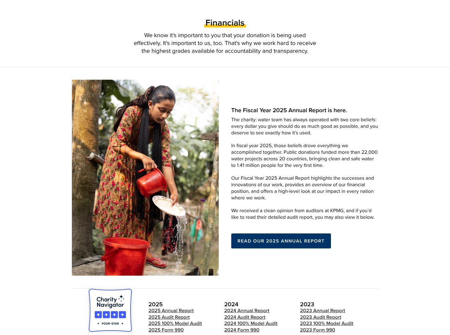
Example charity: water. The latest annual report summed up in plain words, then each year’s reports and audits in a tidy list.
- 1
The page opens with why it exists: donors want to know their money is used well, so the charity works for the highest grades for accountability and transparency.
- 2
The latest report comes with a short summary in plain words: more than 22,000 water projects in 20 countries, and clean water for 1.41 million people. The auditor is named too: KPMG.
- 3
One clear button to the full document: read our 2025 annual report.
- 4
An outside rating beside the documents: four stars from Charity Navigator.
- 5
Each year has the same set of links: the annual report, the audit report and an audit of the 100% promise itself.
The examples belong to their owners and are shown to explain an idea; the numbered frames are mine. Screenshots taken on 6 October 2026; the sites may have changed since.
Ask this about your site
Does a visitor know what to do within a minute?
A quick way to judge the site you have. Where the honest answer is no, people who care leave without acting.
- 01
Does your first screen say what you do in one sentence, with a way to give right there?
- 02
Can someone give or sign in under a minute, on a phone?
- 03
Is it clear what share of a gift reaches the cause, and who pays for the rest?
- 04
Can a visitor give every month as easily as once?
- 05
Can your team launch a campaign page without a developer?
What makes a nonprofit website sell
Lesson 01
One story beats ten statistics
A single person or place makes the problem real. The numbers then show its size.
Lesson 02
Answer the doubt about money
The first question about any charity is how much of a gift reaches the work. Say it plainly, back it with reports, and the doubt stops costing you donations.
Lesson 03
Plan for the second gift
A first gift is a start. Monthly giving, stories and updates bring the donor back, and the second gift is where a charity’s income becomes steady.
What a good nonprofit website gives you
01
More people who act
One clear ask per page, and a way to answer it that takes less than a minute.
02
Trust from donors and funders
Results, reports and the people behind the work, where a careful giver looks.
03
Campaigns your team can launch
Templates for a new appeal or petition, so the site keeps pace with events.
What you get
A charity site that turns interest into gifts, and that your team can keep current.
Designed around how your donors decide and built in Webflow, so stories, programmes, numbers and reports change without a developer. When the site needs more than Webflow gives, such as a donation form tied to your payment provider and CRM or a live impact counter, I build it in code. A fixed price after a short brief.
The pages
A home page built on the parts above, a page for each programme, where the money goes, ways to help, reports, and donate.
Giving on your site
Your donation tool on the page, such as Stripe, Donorbox or PayU, with one-off and monthly gifts and amounts tied to what they do.
Stories and programmes
People, projects and places as CMS collections, linked to each other, so a new story goes live by filling in a form.
Numbers you can update
Impact figures kept in one place in the CMS, so a change shows everywhere on the site at once.
Found by your cause
Titles, descriptions and structured data for the organisation, its programmes and its events, on pages fast enough for Google.
Help with the words
I shape the structure and edit your text, so it sounds like your cause and not like every other appeal.
How a nonprofit website should look and sound
Honest, direct and human.
These are rules of thumb. The site itself is built around your brand, your clients and your taste.
People, not stock photos
The ones you help and the ones who do the work, shown with respect.
One colour for giving
A single colour for every donate button, used for nothing else, so the way to give is always easy to find.
One ask at a time
A page that asks for a gift, a signature and a newsletter sign-up gets none of them.
Numbers set large
Impact figures big enough to read at a glance, each with the words that say what it counts.
Built by me
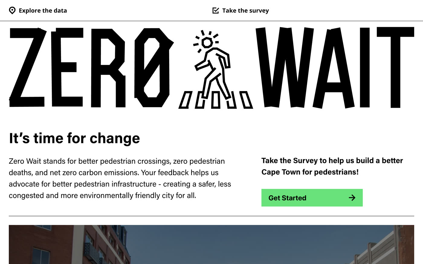
Non-profit, urban mobility
Zero Wait
An interactive crossing map for a road-safety campaign.
View caseQuestions
How do I know whether our site helps the cause?
Count what people do on it: gifts, signatures, sign-ups. If visits are high and actions are few, the ask is unclear or too hard to complete.
We are a small organisation. Do we need more than a social media page?
A social page is good for news. Donors, funders and journalists still check your website before they give or write, and only there can you show where the money goes and take a gift without sending people elsewhere.
Can people give on the site itself?
Yes. The form sits on your pages, through the donation tool you already use or one you choose, with one-off and monthly gifts.
How do we keep impact numbers up to date?
They live in the CMS, in one place. Change a number once and it updates on every page that shows it.
Can staff add news, campaigns and stories themselves?
Yes. News, campaigns, stories and reports are CMS items, so a new appeal is a form to fill in.
Do we need the site in more than one language?
If your donors or partners read another language, yes. Webflow can run a second language, such as Polish and English, with the pages kept in step.
What it usually takes
New site or redesign
A new Webflow site, or a redesign of the one you have, designed and built by one person. Structure, copy, CMS and launch included.
Service
New pages and CMS templates
Landing pages, subpages and CMS templates, built from your Figma file or extended from what the site already has.
Service
Integrations
Your Webflow site connected to the tools the company already runs on: forms into the CRM, analytics that measures the right things, and consent that holds tags back.
Service
Your site
Want me to look at your site?
Next
Clinics and healthcare
08 / 12