Websites by industry06 / 12
Websites for energy and cleantech
An energy site has to make something technical easy to grasp, and turn interest into an enquiry worth answering. Whether you sell to homeowners or to utilities, the visitor wants to know what it saves and why to believe you.
Ask this about your site
Can a visitor see what they would save, and why to believe it?
A quick way to judge the site you have. Where the honest answer is no, a good technology loses to a clearer page.
- 01
Is it clear who the offer is for: homeowners, businesses or utilities?
- 02
Can a visitor estimate their own saving or return without a call?
- 03
Is the technology explained so that a non-engineer can follow?
- 04
Do your projects show, with real figures and places?
- 05
Does an enquiry reach you with enough detail to act on?
What makes an energy website sell
Lesson 01
Lead with what it saves
The buyer cares about the bill, the payback or the output. How the technology works comes second.
Lesson 02
Let them run their own numbers
An estimate a visitor works out alone is more convincing than one you state.
Lesson 03
Proof with figures and addresses
Finished projects, with numbers and places, answer the question every buyer has: has this worked before?
What a good energy website gives you
01
Enquiries worth answering
A form that asks the right questions sends you people who can buy, with the facts you need to reply.
02
A technology people understand
Diagrams and short explanations that let a buyer repeat your pitch to their own boss.
03
Credibility with investors and partners
Projects, figures and the team in one place, for the people who check you before they call.
How an energy website should look and sound
Clear, grounded and specific.
These are rules of thumb. The site itself is built around your brand, your clients and your taste.
Figures with their basis
A saving or an output means more with the assumptions next to it.
Real projects in real places
Photos and locations of work you have done say more than a stock wind farm.
Diagrams over adjectives
Show how it works. A reader trusts what they can follow.
Natural, restrained colours
Green has been overused. A calm palette with one accent looks more serious than a page full of leaves.
Built by me
Energy marketplace
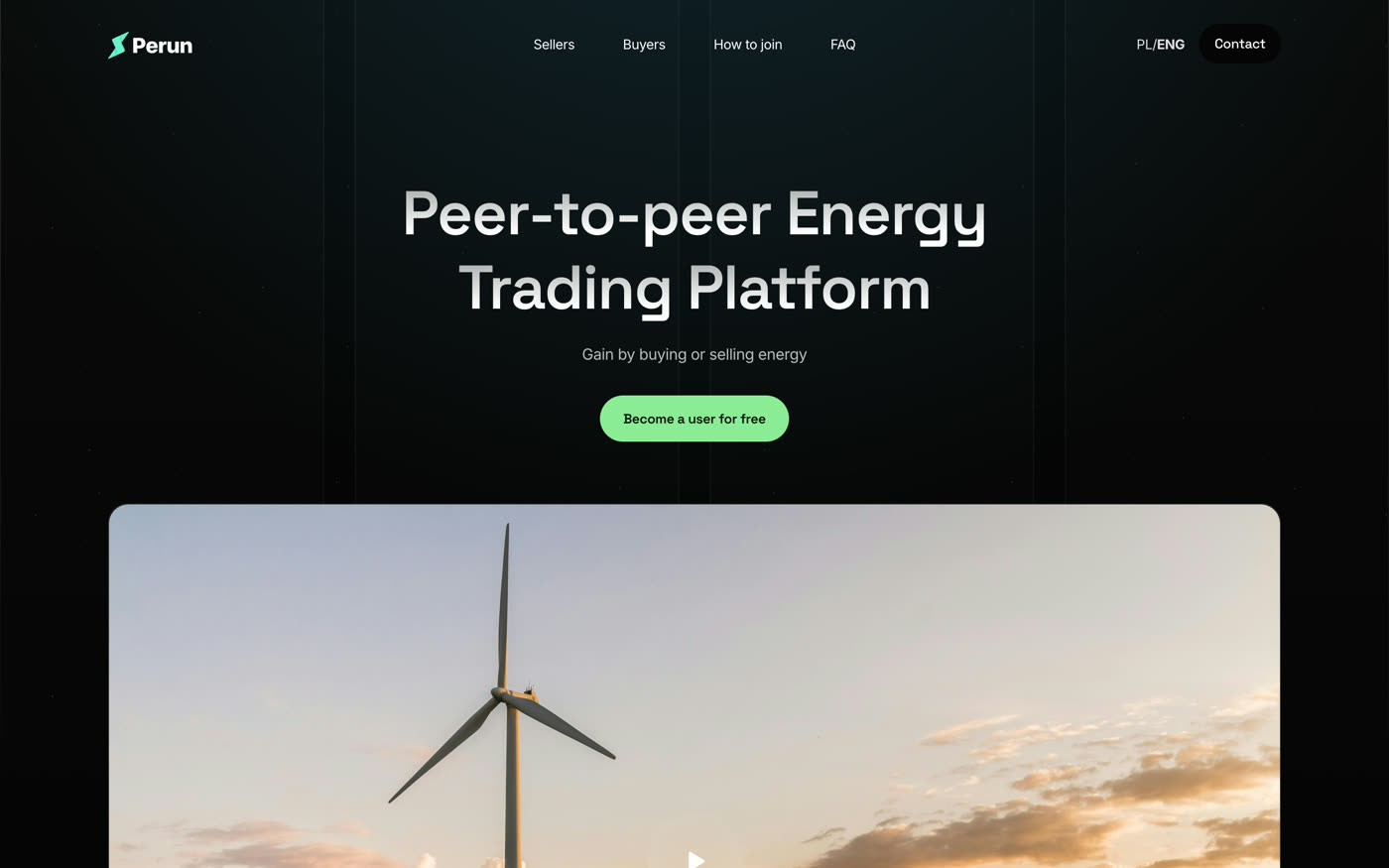
Perun
Peer-to-peer energy trading, explained in one scroll.
View caseQuestions
How do I know whether our site is working?
Look at how many enquiries arrive and how many are worth a call. A site that brings in many poor ones is explaining the offer badly.
We sell a complicated product. Can a website explain it?
Usually in one scroll, if it starts from what the buyer gains and leaves the engineering for a second page.
Can the site run in two languages?
Yes. Perun’s site runs in Polish and English from one build.
What it usually takes
New site or redesign
A new Webflow site, or a redesign of the one you have, designed and built by one person. Structure, copy, CMS and launch included.
Service
Language versions
Your site in a second or third language with Webflow Localization: translated pages and CMS, localized SEO, hreflang, and a way to keep the versions in step.
Service
Custom code
Calculators, filters, multi-step forms and maps: the parts of a site that Webflow does not build on its own.
Service
Your site
Want me to look at your site?
Next
Non-profits and campaigns
07 / 12